All posts tagged: monochrome

Laurel Marble Hex Tiles

The Loft Bathroom – Final Reveal

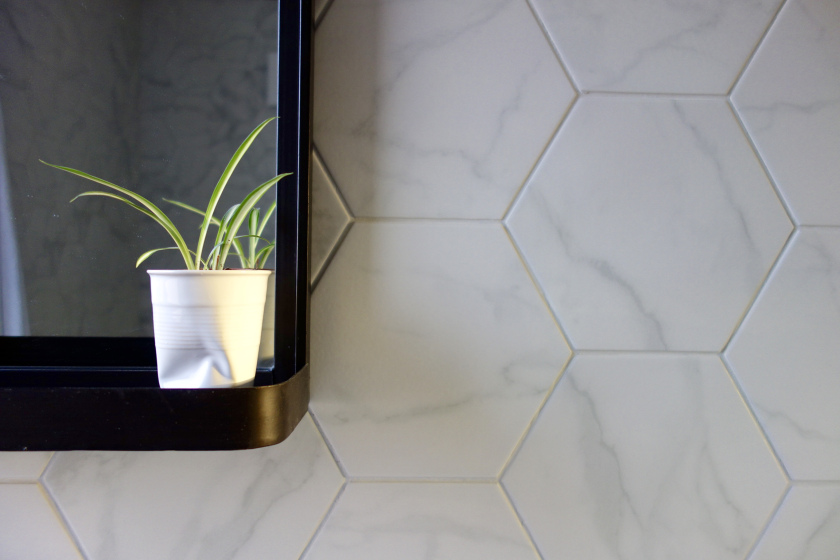
It’s here. It’s flipping HERE! Week 20 or something are we now? I dunno, I stopped counting after 17… My ideas for the bathroom are finally up and at ’em and I can’t wait for a sit down and a biscuit. I don’t think i’ve had a day off since September. God, I need a day off. Anywaaaay, here was the vibe I had in mind for the bathroom. Strictly monochrome, in keeping with the loft bedroom. If you haven’t seen that yet, I reckon you should have a quick pop over here so you can see how the two spaces connect. Our new bathroom was going to be 2m x 2m. So, small, but a good size for a second bathroom i’d say. These tiny spaces are certainly not easy to plan at all. And i’ve lost a fair amount of beauty sleep over this space, i’ll tell you that for free. Here’s where we were at the beginning of December. Before And here’s where we are now. After We have a bathroom! I …

Plywood floorboards, ply flooring

The Loft Bedroom – Final Reveal

We did it! We have our new loft bedroom, all done and ready to rock. Four months after we started our build, i’m finally able to share the final reveal photos with you. I’m going to warn you right now, this post is PIC HEAVY. Initially I took about 70 photos. I know. That’s ridiculous. I’ve managed to whittle it down to about 30. Still far too many, but ya know what, just scroll along if any aren’t floating your boat. Here’s where we were back in September 2016: And here was my plan for the bedroom: Ok. So here we go. Do come in… The view from the landing into the bedroom. Gets me every time. Chooch the cat, can not get enough of this room. Mainly because she’s got a load of new rugs and blankets to paw at and ruin. We had to be clever with space here as we were limited with how much width we had with the two chimney stacks bookending each side of the bed. The Factorylux Maria Banjo wall …

The elusive black tap

As you may have twigged by now, we’re currently in the middle of our loft conversion. The design of the two new spaces are a mix of Scandinavian and industrial design. Simple, raw materials, paired back with mainly a monochrome scheme. It was easy to add black to the bedroom. Sliding timber doors, furniture, window frames, bedsides… but it was more difficult to add it to the bathroom. Bathrooms by their very nature have a lot white in, what with 99% of ceramic sinks, loos, shower trays and baths being white (why is that?). Pair that with the chrome finish of nearly all taps, bottle traps, wastes, showers etc. and you’ve got a pretty restrictive palette to work around. I knew I wanted a black bathroom tap, but man, they’re not an easy find. And the more difficult it was for me to find one, it just made me want one more. I WILL FIND A BLACK TAP (and waste, and bottle trap). Around the same time as I was on Tap Hunt, one of my …

There is art inside…

We’ve had a gallery wall at home for the last 18 months. It’s grown a fair bit over that time. As has my taste in art and design in general I guess. Bits and pieces have been added, changed, updated and moved about. Photo by Oliver Gordon It’s not a huge wall, but big enough to do something with. We can’t place furniture here or hang shelves as a door opens onto it. It’s not big enough to take a statement piece of art either because of where the light switch is. It’s a pretty limited space actually, but that hasn’t stopped me having itchy fingers. I wanted something more compact. A more cohesive look. I also wanted to save money by re-using the original frames. So, bright and early on a Sunday morning, the frames were taken down, walls filled and sanded, skirting board masked up, sheets put down and paint pots brought out. I was armed and ready. I’d also already received a cheeky little delivery earlier that week. Cue, Desenio a Stockholm based online art retailer …

We have paint

I’ve had an exciting delivery this week, even the Fedex guy mentioned how “posh” these paints are. It’s not for me mind, it’s for the Masonic Villas project. I’ve never worked with Farrow and Ball paints before and have heard so much about it; how the natural pigments enhance the colours, making them richer, deeper and more complex, subtly changing in tone throughout the day. Am really looking forward to the next few weeks. Time to see F&B, up on some walls, doing its thing. And as it’s arrived, I thought it was only fair of me to share what colours we’ve chosen for all three spaces. A re-cap. The living room: The hallway, stairs and landing: And the office space (aka. The Pod) Farrow and Ball provided us with the most perfect palette for these three rooms. Including a whopping four from their nine new colours announced and released earlier this year. So let me take you on the colour palette tour…. For the living room: Farrow and Ball’s Off Black and Shadow White We …

The Italic Poster

  The Italic Poster How cool is that? The Italic Poster by Eivind Molvær. I spotted it during a little peruse through at{mine} and it sparked me to do a bit of research and find out why a) I’d never seen it before and b) why I don’t own one. How is this even possible? It was designed and produced in 2007 which is when I really started getting into art, prints and all things “wall”. It’s such a simple concept, but aren’t the best ones always simple?! A clean, monochrome poster with three simple words in bold, cap locks typography. But whack the traditional poster shape on it’s head, make it Italic, and you’ve got a completely genius piece of art. “If only i’d thought of that??”   rikiki The first run sold out pretty quickly by all accounts, but another run of 77 (good number) was done in collaboration with rikiki in Germany. They’re currently for sale at €75 (about £53). Not bad for a limited edition, signed, and numbered piece of genius. Although I can foresee trying …