All posts tagged: decorating

Benjamin Moore

Benjamin Moore #paintlikenoother

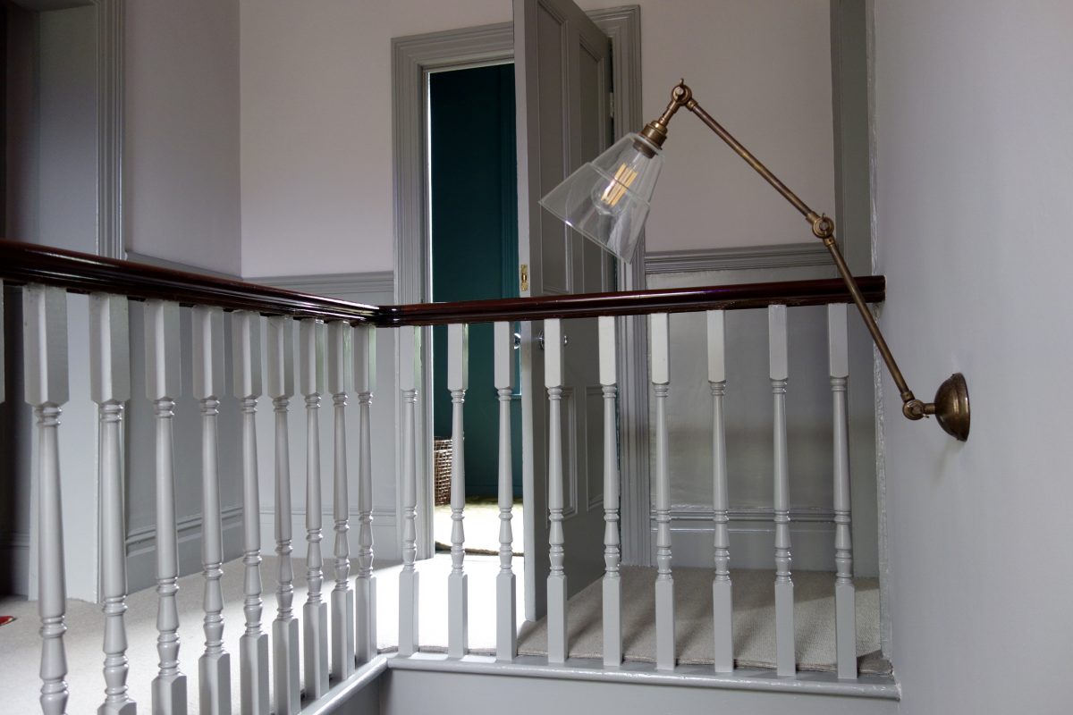
Sorry for not posting last week. I’m sure you were all refreshing your inboxes every 30 minutes wondering where my weekly post was? Call off the search party everyone, i’m fine, if a little stiff around the ole joints. I’ve done the equivalent of 39 step classes this weekend, working hard on the decorating of our bedroom makeover. Remember our proposed new bedroom colour that divided opinion? Nude Bedroom – Moodboard Now let me make it clear from the off so the ASA don’t come and arrest me, I was gifted the paint for this project. BUT I chose the paint and colour, Benjamin Moore‘s ‘Fox Hedge Tan’, before i’d secured a collaboration. I’ve been wanting to try Benjamin Moore’s paints for ages and always prefer to try new products in my own home before recommending them to others to try in theirs. After i’d bought a tester and settled on the colour, I emailed Benjamin Moore to see if they’d let me review their paints on the blog in exchange for a few litres of …

Colour Consult – Inspiration for your walls with Paint & Paper Library

I did a colour consult yesterday for someone that’s recently bought their own home. They’d always rented previously, so painting walls wasn’t an option and therefore not a concern. Now he’s got a four bedroom, three storey house to decorate and furnish, it’s not surprising he’s overwhelmed. We’ve already worked on his living room and it’s been completely transformed by choosing the right paint colour. I’m not exaggerating either. Will share some photos with you guys when the rest of the work is done. The Brits’ fear of colour Most people’s homes are off white, cream, ivory, dare I say, magnolia… there might be a feature wall somewhere or a splash of jazzy wallpaper in the downstairs loo, but generally us Brits are pretty scared of living with colour. I don’t just mean dark colours, but richer colours and pigments. Dulux nailed the Brit’s fear of colour with their infamous, still going strong, Natural Hints collection. Apple White, Apricot White, Jade White… see where i’m going with this…? We like colour, but only a little bit, …

Making Spaces Living Room update

Living Room Update – Pt 2 #styleitdark

Ok, if you didn’t read Part I, then this post might not make that much sense. So you might want to pop back a couple of posts and catch up so you know what the heck i’m going on about today. Or just keep reading… you’re in charge. I think it’s fair to say I wasted spent a week painting various sections of this room. This bit that colour, that bit this colour. There are some sections of wall that have been painted four times over the space of a fortnight, I swear the room is smaller. https://www.instagram.com/p/BTRQx3RA0GD/?taken-by=makingspacesnet As much as I loved the tone of Dulux’s Rich Praline 3, it just did not work with our oak furniture or pine door. It was also a perfect match for the carpet (which I don’t like) making the room feel a bit “blah”. Not exactly the look I was going for when I started this room update. So after, repeatedly telling my hubster how the room would’t work unless I painted the door in with the …

A living room update – Pt 1 #styleitdark

Ok. First off. Massive thanks for the ace feedback from my last post. It seems like I have unleashed some design demons, which makes me smile very much indeed. So pleased to hear some of you guys have been trying out my online tutorial on how to create your own mood boards, had a few PM’s and DM’s since last week letting me know how helpful it’s been, including this message: “Just thought i’d let you know, i spent the afternoon at work doing your step by step mood board! For work purposes obvs, but found it really useful!! Im defo guna become a bit addicted. Just need to get myself a Mac book for home now. Cheers!! X” And that’s what I like to hear. People sacking off work to design room sets on a work computer. My work here is done ladies and gentlemen. (**disclaimer – Making Spaces does not condone idle mood board-ery at a place of work or during work hours. Proceed with caution**) Ok, onto today’s topic. Our living room. I’m not going …

What’s going on with paint? Water based? Solvent based?

I’ve been planning to write this post for months, but wanted to collate as much info and evidence as possible before shooting my mouth. I haven’t seen anyone else tackle this issue yet and it’s about time someone did. **Serious face** Over the past few years, there’s been a huge shift in the paint industry.  Read this: “Since the latest Volatile Organic Compounds (VOC) Regulations came into force in the UK back in 2010, many paint products containing high levels of VOCs – the solvents that determine a paint’s viscosity, flow and drying time – were no longer be able to be manufactured.” Dulux Ok, that’s very interesting, Karen, but what does this actually mean? I’ll tell you. It meant the paints we’re used to painting our wood/metal work with have had to change in order to comply with the new VOC regs. Oil or solvent based paints as we knew them could no longer be sold because of environmental reasons. You know how old school gloss paint stinks and takes ages to dry? It’s also …

Identity Papers

Today’s post is all about independent wallpaper designer, Linda Hasking, also known as Identity Papers. Linda Hasking – Identity Papers Here she is, well, half of her. Linda’s story behind Identity Papers began with two hundred and twenty two photos. “Shots I took of every single object in my living room became my first wallpaper, Mi Casa Su Casa.” Mi Casa Su Casa That very first wallpaper design became the foundation for her brand. Linda views her wallpapers as a portrait, this design itself being a self-portrait. This idea of the self-portrait developed further, and now her photo-collage wallpapers can be custom made using your very own images. Mi Casa Su Casa – Monochrome Great idea no? A wallpaper you’ll see something new in every day and something that means something to you and only you. Miniature pieces of art for you to discover every day. Linda’s newest design, Woodsman 1 and 2 wallpapers are another prime example of her designing with us in mind. We all like to have something a little bit different don’t we? …

Farrow & Ball Peignoir Worsted

Peignoir & Worsted

I could barely contain my excitement yesterday. I was off to visit the Masonic Villas project for the first time since the hallway, stairs and landing were given its new Farrow & Ball colour palette. I won’t lie. I did a little cry when I arrived to finally see it, worse still I found it impossible to leave… I just kept gawping. Truly beautiful. Please bear in mind, we’ve still got artwork and mirrors to hang, brass stair rods to fit and the final finishing touches to sort, but I thought it was only fair you got to see it. I mean, we’ve all been waiting so long to see F&B’s Peignoir and Worsted up on these walls haven’t we? **Major pic heavy post** Before After – Farrow & Ball’s Peignoir and Worsted Everything from the dado rail and below was painted in Worsted Estate Eggshell, including all the door frames, staircase and spindles. Everything above the dado was painted Peignoir Estate Emulsion. I didn’t want lots of fussy colour changes around all the detail like the picture rail, …