All posts tagged: colour

The Colour Blocking Project

The Colour Blocking Project – A complete house refurb in West Leeds

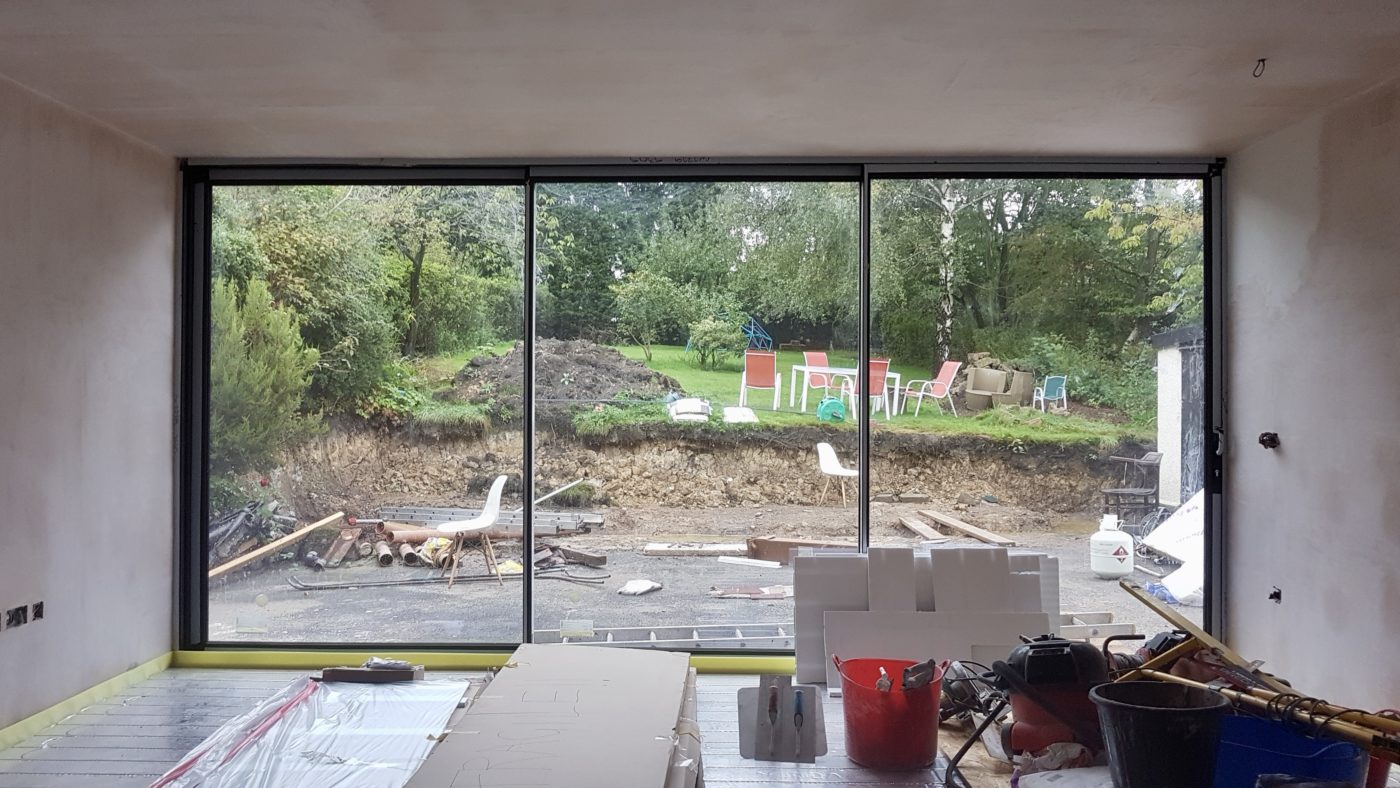
Hello there! Firstly, I just wanted to say thank you for all the very kind comments, emails and messages I had after my last blog post. They were very much appreciated and meant a great deal. Thank you!! It’s less about me today and back to interiors (yay!). Time to introduce you to a new project, one that’s been simmering for over a year. My role for this project has been a combination of sense checker, sounding board, design consultancy and some good old fashioned interior design. I certainly can’t take credit for all of the incredible work that’s been undertaken by this family, but I have managed to add some design details that I think have really helped pull things together. Let me walk you around the kitchen as it was back in August 2018… Estate agent photo Quickly after moving in, the new homeowners had architects plans drawn up to completely remodel the downstairs, upstairs, plus extend at the back. Budget constraints meant they had to park the first floor remodel and put …

Pantone Living Coral

How to live with Living Coral – Pantone’s choice for 2019

Living Coral!? Well that was a nice turn up for the books wasn’t it? After the disastrous announcement of Ultra Violet for 2018, (so bad I didn’t even write about it) and Greenery back in 2017 (which I did write about, mainly because it meant I could add a picture of Kermit to my blog), Pantone have finally relented and given us something we can get our teeth in to for 2019. It’s a real pop. And not one for the faint of heart. But actually, Coral is one of the easiest colours to add into your interiors. Don’t believe me? Well, come and see how some of my brilliant colleagues from the Interior Design Collective have worked their magic with Pantone’s chosen hue for 2019. GREAT WITH BLUE Given the UK’s love of blue, partly because of the ease it fits our UK rooms (we have very blue, light here), coral is the perfect accent colour with blue as they sit opposite one another on the colour wheel, otherwise known as complementary colours. Now, …

PeachBaby_Earthborn

Would you go nude? – The interior trend that’s barely there – Nude Walls

So yeah, a bit of a click-baity title I admit. No bums, boobs or body parts to see here people. It’s all about the nude walls today. Monument, New Black, and Temple Maybe it’s all this gorgeous weather we’re having that’s got me focussing on just how pale my pins are (like, really!) but since writing the Paint and Paper Library post where this picture above featured, i’ve been busy researching the best fleshy toned, nude paint colours out there. Because if you don’t already know, pink or “blush” aint going anywhere for a while… it is however, getting a little darker than those candy sweet pinks we’ve seen over the past four years or so. Think flesh tones, American tan tights, foundation samples, a touch more terracotta, peach… or dare I say it, “beige”. Yes, neutrals are on their way baby, but not in a boring way. Oh bloody hell no siree. Check out some of the best nude shades i’ve found and note how these barely there, neutrals can really pack a punch. …

Colour Consult – Inspiration for your walls with Paint & Paper Library

I did a colour consult yesterday for someone that’s recently bought their own home. They’d always rented previously, so painting walls wasn’t an option and therefore not a concern. Now he’s got a four bedroom, three storey house to decorate and furnish, it’s not surprising he’s overwhelmed. We’ve already worked on his living room and it’s been completely transformed by choosing the right paint colour. I’m not exaggerating either. Will share some photos with you guys when the rest of the work is done. The Brits’ fear of colour Most people’s homes are off white, cream, ivory, dare I say, magnolia… there might be a feature wall somewhere or a splash of jazzy wallpaper in the downstairs loo, but generally us Brits are pretty scared of living with colour. I don’t just mean dark colours, but richer colours and pigments. Dulux nailed the Brit’s fear of colour with their infamous, still going strong, Natural Hints collection. Apple White, Apricot White, Jade White… see where i’m going with this…? We like colour, but only a little bit, …

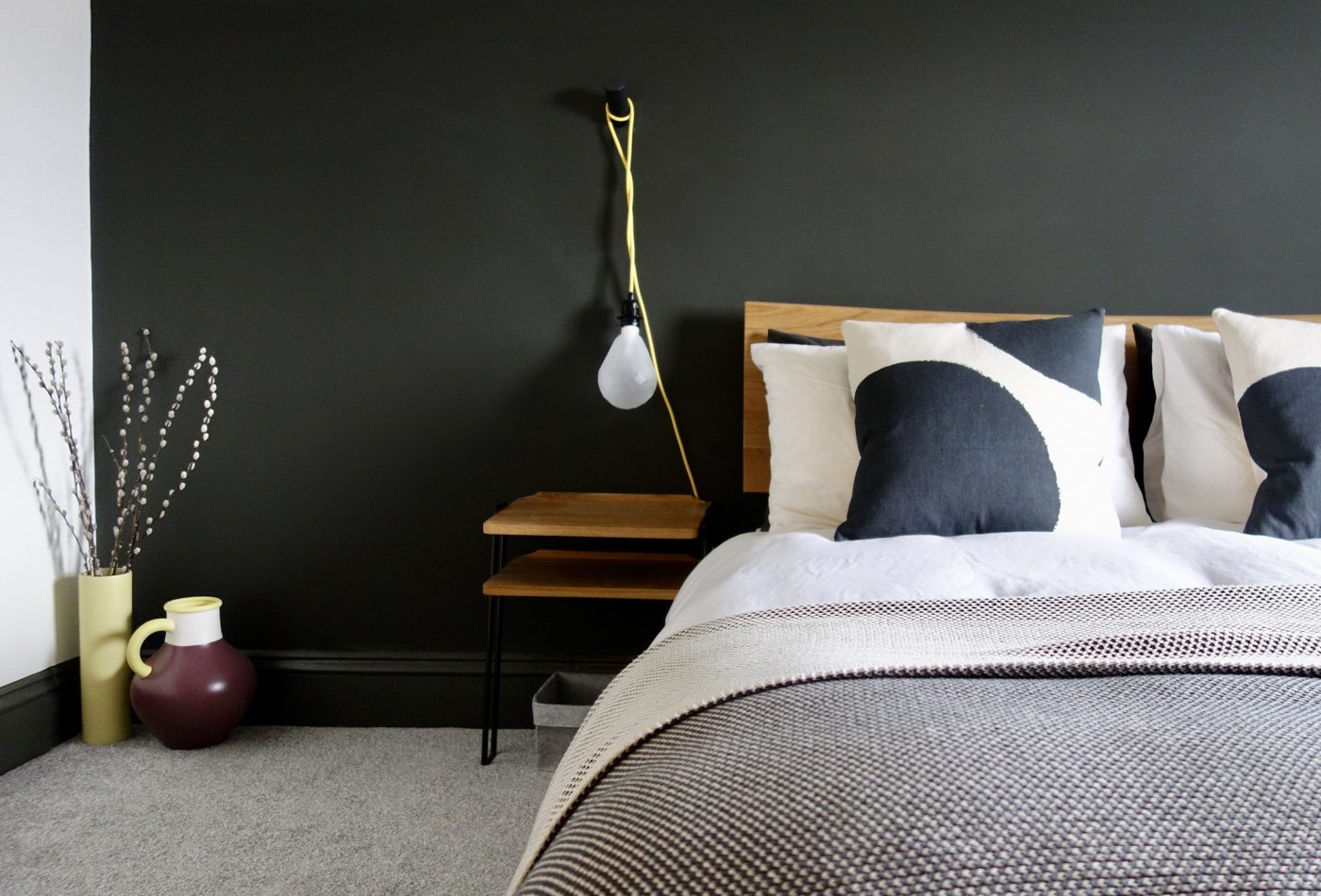
Monochrome Bedroom with pops of yellow

How to Connect your Rooms – Choosing a Colour Palette

Hello everyone, I’m back this week with a little look at how to connect your rooms at home. What does that mean exactly? One of the keys to a successful home interior is having a sense of cohesion and “flow”. The rooms and spaces between should connect with the surrounding ones. For example, let’s say you’ve got three bedrooms on a floor, like most people and you want them all to have their own identity but also not look like a patchwork quilt from the landing, it’s good to consider how these spaces connect as a whole. Often, people run the flooring throughout to make the overall space feel larger. We all know that the less breaks in a colour or pattern, the better, as the eye continues further along the space. Flooring continues on from our loft bedroom to landing with no threshold to break the line’s eye. Another way to do is is choose a colour palette, and stick to that for a floor, even better, a whole house if you’re being really clever. …

Making Spaces Living Room update

Living Room Update – Pt 2 #styleitdark

Ok, if you didn’t read Part I, then this post might not make that much sense. So you might want to pop back a couple of posts and catch up so you know what the heck i’m going on about today. Or just keep reading… you’re in charge. I think it’s fair to say I wasted spent a week painting various sections of this room. This bit that colour, that bit this colour. There are some sections of wall that have been painted four times over the space of a fortnight, I swear the room is smaller. https://www.instagram.com/p/BTRQx3RA0GD/?taken-by=makingspacesnet As much as I loved the tone of Dulux’s Rich Praline 3, it just did not work with our oak furniture or pine door. It was also a perfect match for the carpet (which I don’t like) making the room feel a bit “blah”. Not exactly the look I was going for when I started this room update. So after, repeatedly telling my hubster how the room would’t work unless I painted the door in with the …