
Hello there! Firstly, I just wanted to say thank you for all the very kind comments, emails and messages I had after my last blog post. They were very much appreciated and meant a great deal. Thank you!! It’s less about me today and back to interiors (yay!).
Time to introduce you to a new project, one that’s been simmering for over a year. My role for this project has been a combination of sense checker, sounding board, design consultancy and some good old fashioned interior design. I certainly can’t take credit for all of the incredible work that’s been undertaken by this family, but I have managed to add some design details that I think have really helped pull things together.
Let me walk you around the kitchen as it was back in August 2018…
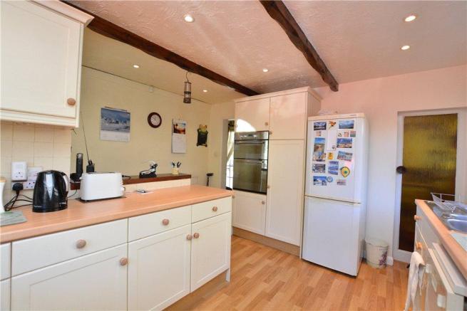
Estate agent photo
Quickly after moving in, the new homeowners had architects plans drawn up to completely remodel the downstairs, upstairs, plus extend at the back. Budget constraints meant they had to park the first floor remodel and put the majority of their savings towards creating the dream downstairs space whilst redecorating the upstairs. Sensible.
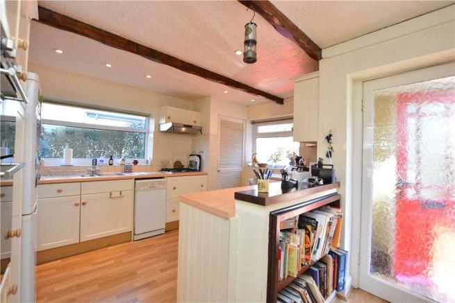
Before – August 2018
The kitchen was a mess of a layout, all kinds of awkward with doors coming off it here, there and everywhere. So the whole back of the house was opened up and extended backwards into the large rear garden.
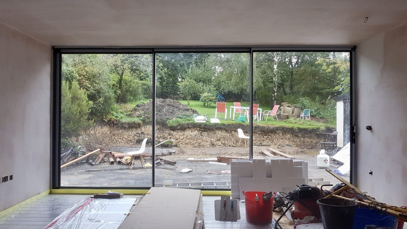
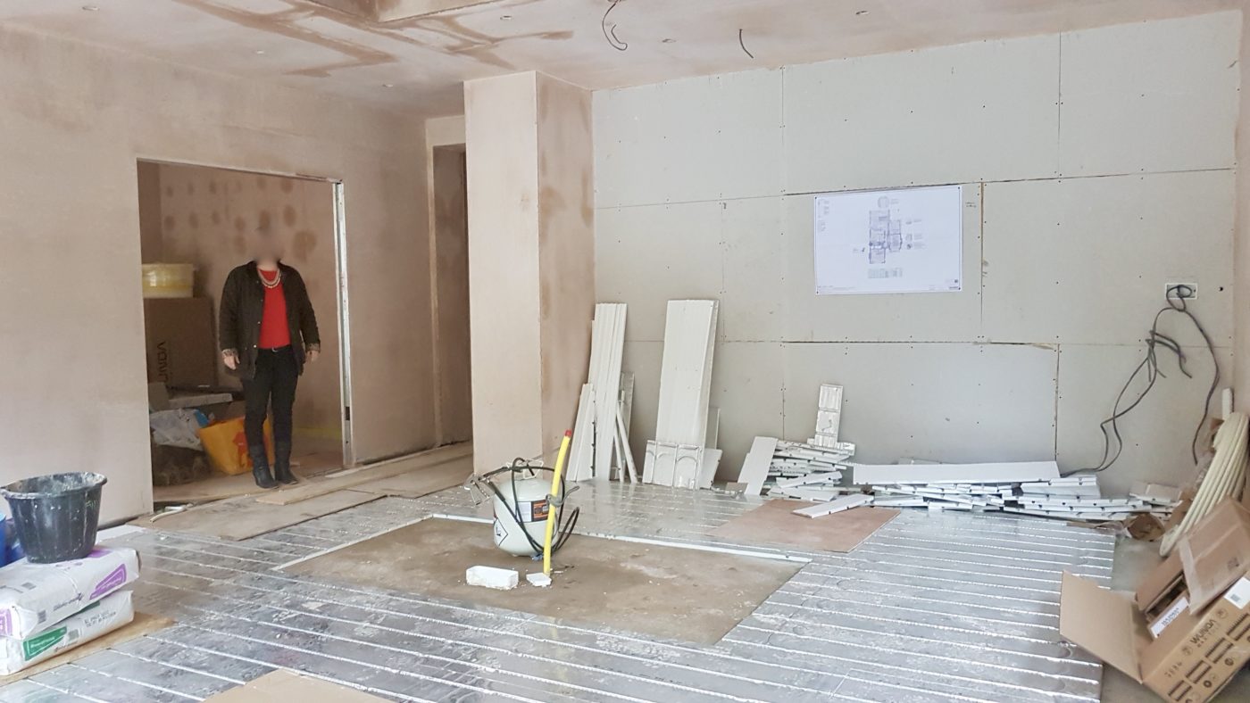
During – September 2019
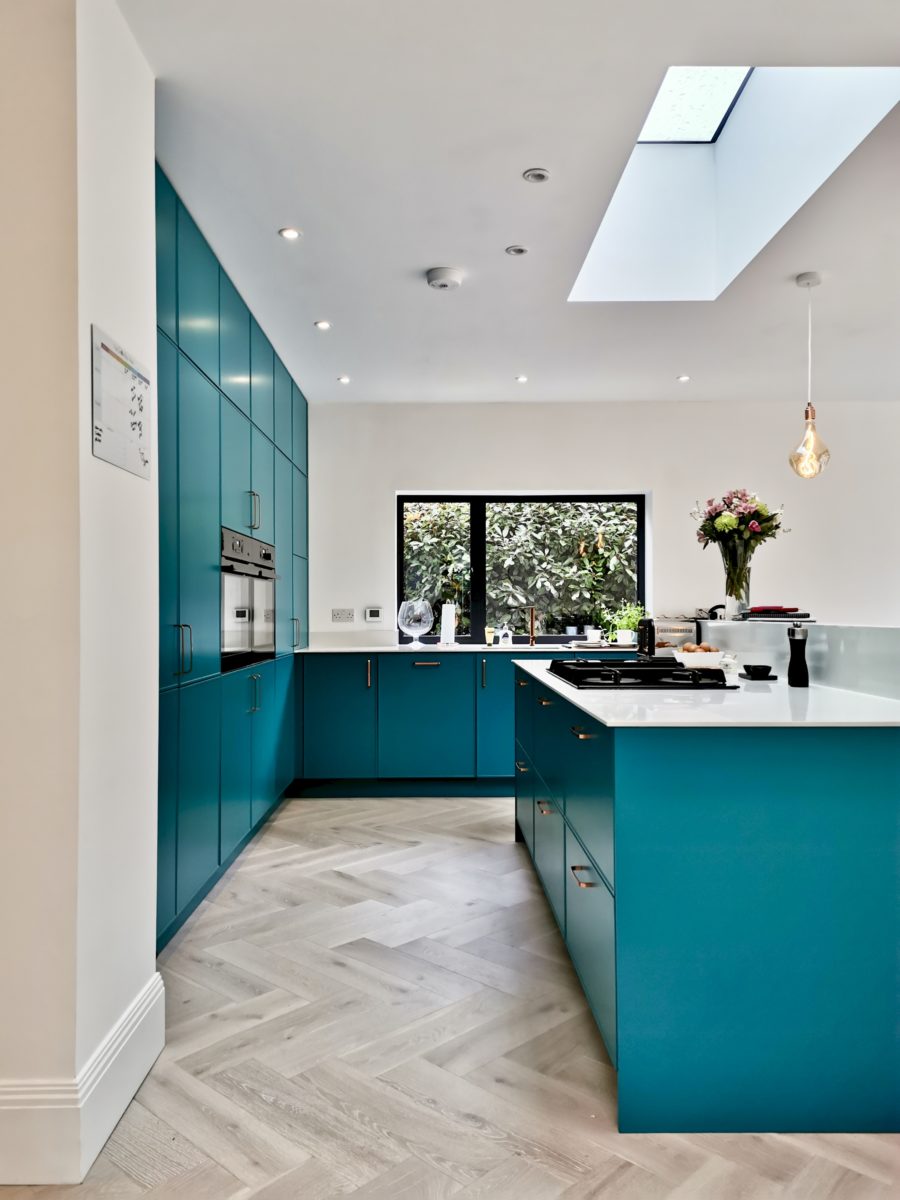
The homeowners were already pretty set on quite a few elements of this space. They knew they wanted a bright, but warm Scandi inspired space, including:
- a blonde wood parquet floor
- a full bank of kitchen units with large island
- white stone worktop
- copper details
- black aluminium windows
The headless woman
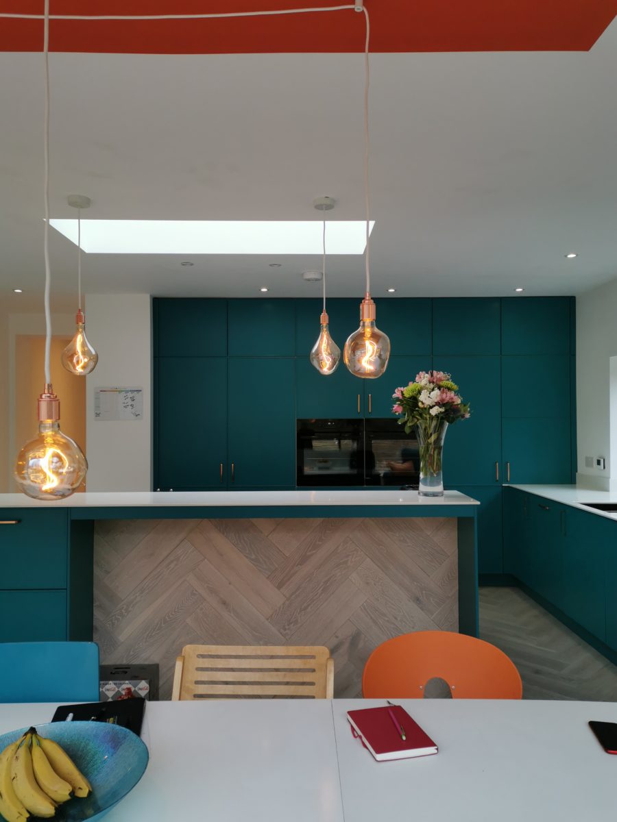
They worked with Arlington Interiors, a Leeds based kitchen company on the design of the kitchen, but found themselves torn between navy blue or teal for the cabinets. I felt that a dark blue really would have been the wrong colour for a north facing kitchen and far too sombre for this colour-loving family. I swayed them towards the teal as it was just so “them”.
A year later (quite literally a year after our initial consultation back in 2018), here’s how it looks:
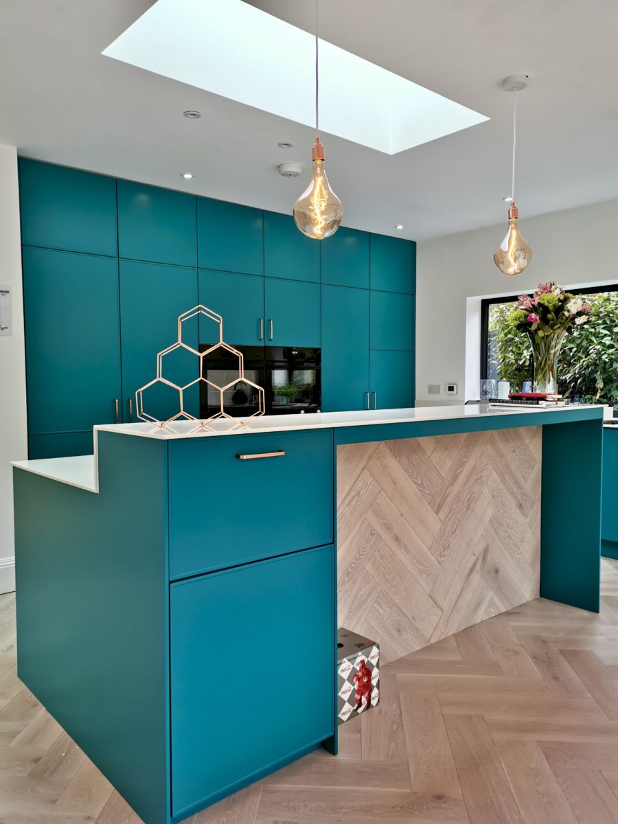
Isn’t is beautiful? (Yes – that’s a copper hexagon wine rack)
I’m so glad they went for the teal, it adds a real sense of fun and individuality don’t you think? My suggestion to run the parquet up the back of the island also looks pretty darn (yes, I just said darn) cool too. Counter stools to be added in due course – obvs.
Alongside helping with the cabinet colour, they also wanted some cost-effective ways of adding design details to the rest of the space – and what have I always said? The cheapest way of adding these details is with paint.
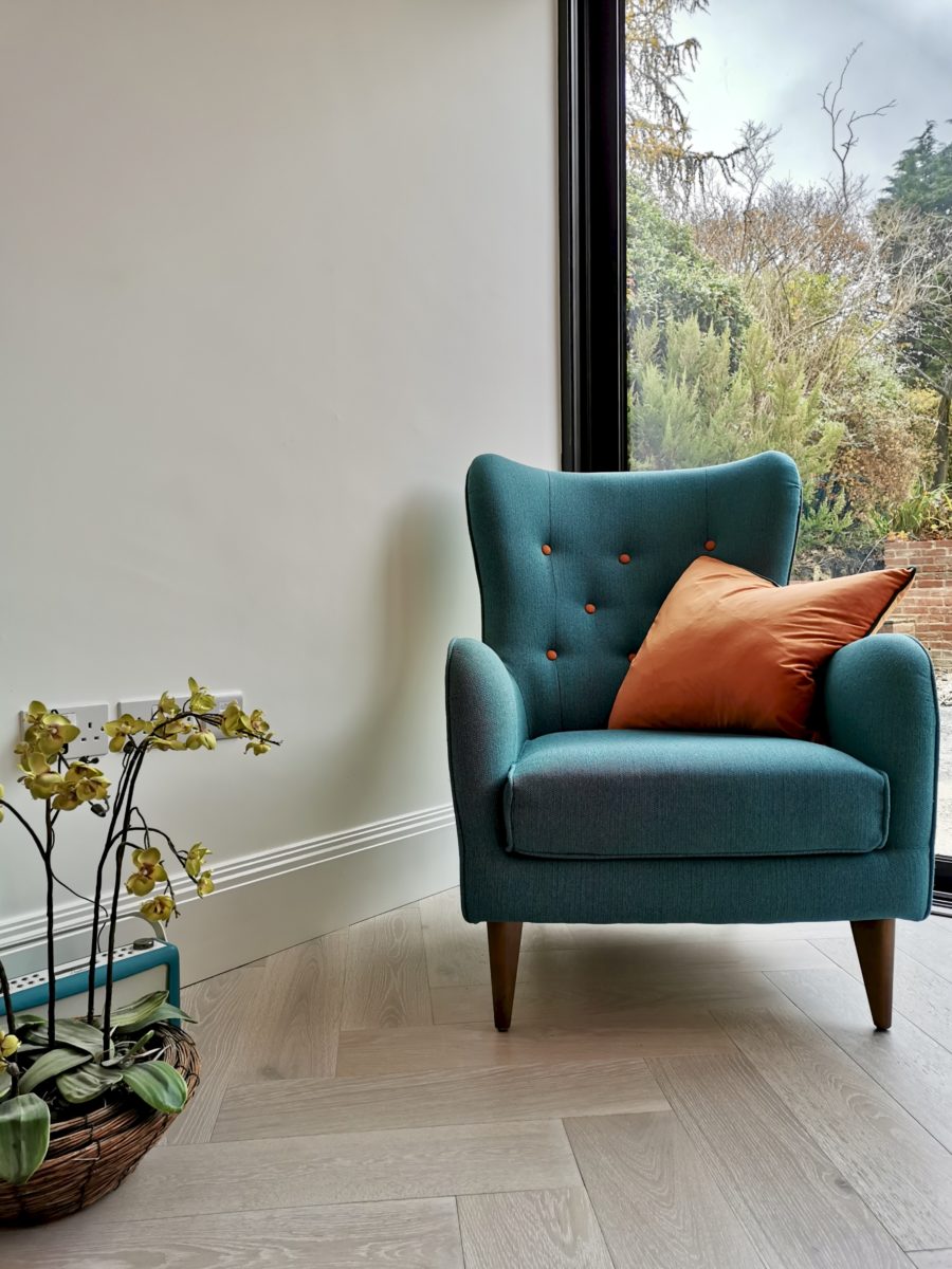
Based on the existing pieces of furniture dotted around the house on my very first visit, it was this armchair above that informed the kitchen colour scheme. This teal with its bright pops of orange was the cue for the next big kitchen design detail. Orange! Not too much so as not to overwhelm and not too little as to go unnoticed. But where and how?
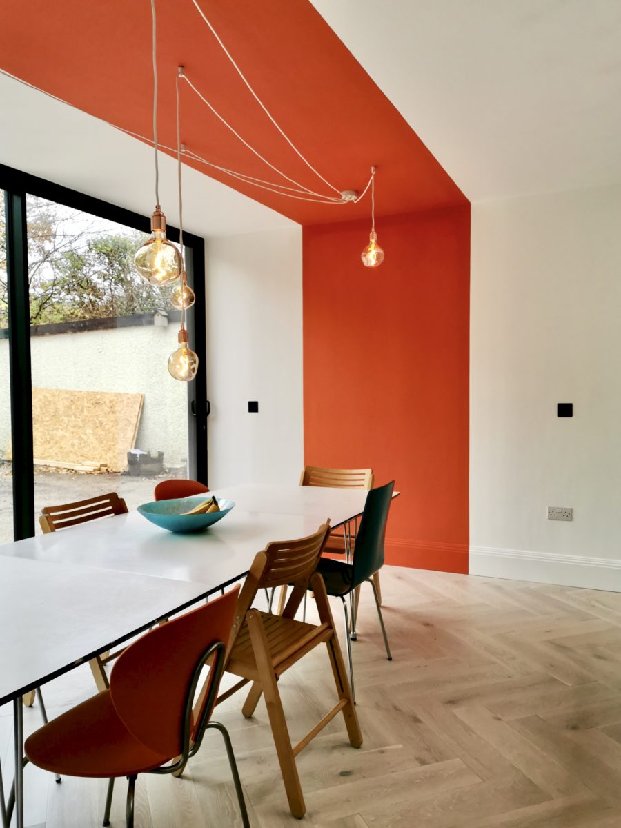
The ceiling of course!
As a rug wasn’t an option because of the underfloor heating (who’d want to cover that beautiful flooring anyway?), I suggested a clever bit of orange colour blocking. A painted section of wall and ceiling the width of their existing dining table to begin at the skirting, leading up and across to zone the seating area. I then suggested the main ceiling point be fitted off to one side of the ceiling so a simple white spider light could emanate from one side of the room to the other, hanging directly over the dining table.
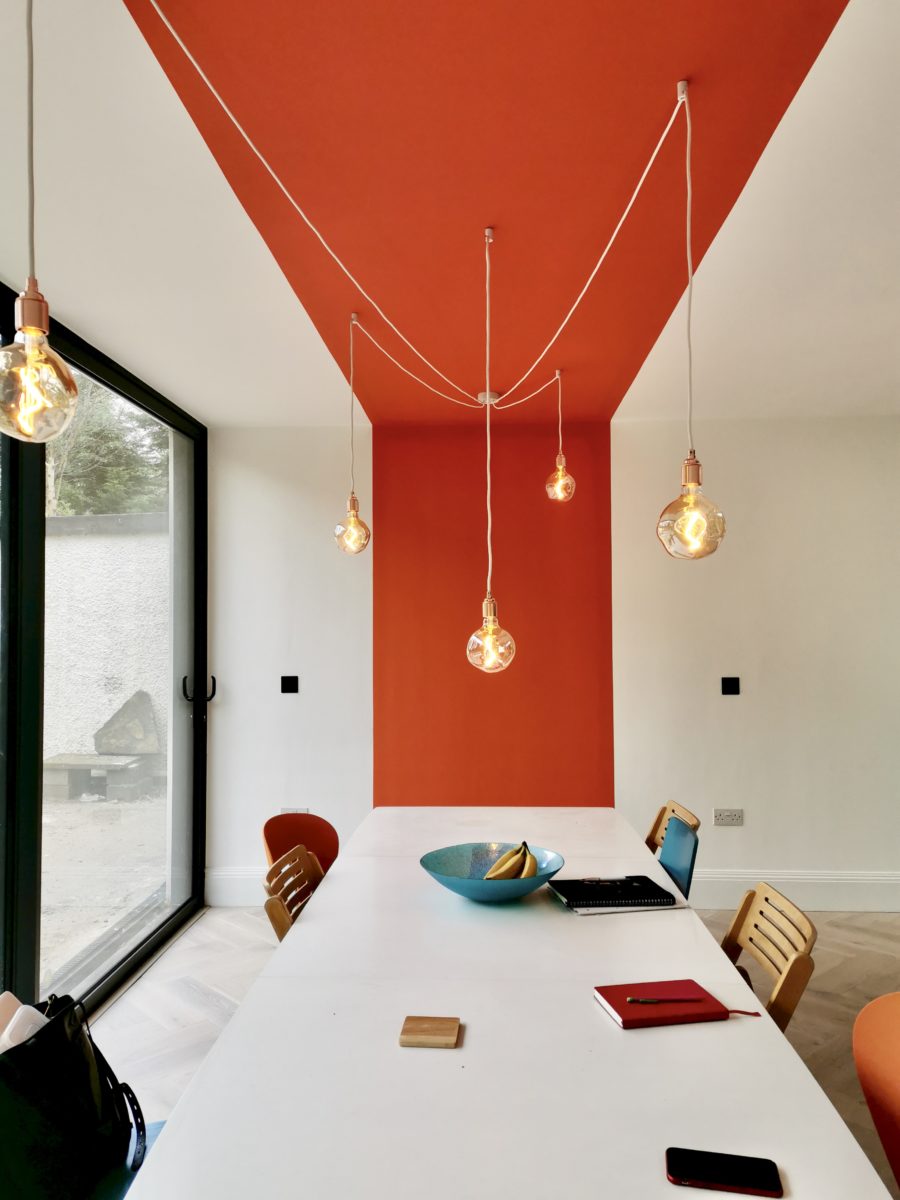
It’s not subtle, but it also doesn’t overpower. It’s like a piece of installation art, but also provides the feature dining light required for over the table, one that also doesn’t block the view out into the garden. The simplicity of the white fabric cables would have been lost on a white ceiling, but the orange strip only goes to frame the delicacy of the spider light. Love it. It’s turned out just as I imagined and given what would have been your typical white painted kitchen/diner extension into something a little more unique. All for the cost of a pot of paint.
See those orange and teal kitchen chairs peeking out from behind the table – they already had those before moving in
These guys were determined to have a home that represents their love of colour and quirk. Not always easy to do when all the walls have been freshly plastered and mist coated white. There’s something so tempting about “just leaving it white”. So as part of the design process for this project we chose colours for several areas of clever colour blocking across the whole house. We did this way in advance of the decorating, in fact some of it was decided before the build even begun, to avoid the all too common “fresh white wall” paralysis I see from a lot of ground floor extensions. Not that there’s anything wrong with white by any means, the colour blocking only works so well because of the neutral backdrop
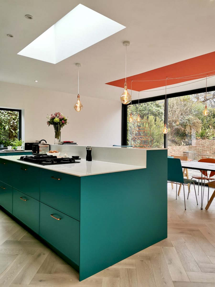
A few of the reasons the colour blocked ceiling works so well in this particular space is because there are no nibs, boxed in steels, or lines breaking the expanse of the fifth wall. The orange stripe echoes the shape of the skylight that sits above the island, and of course, orange and teal are best friends, sitting opposite on the colour wheel they bring out the best in one another.
There is still artwork to be hung in here and some fiddly bit of faffing, but i’m so happy for these guys for them to finally have the kitchen/diner of their dreams. They’ve worked really hard and been super open to lots of crazy design ideas which, in my opinion has totally paid off!
Moving onto the living room…
They needed a bit more help from me on this one with a room design putting together for what was to become the grown up, but family-friendly TV room.
This was the brief:
“We’d like to go dark but we love colour, we want this space to be in keeping with the rest of the house, but also have an identity of its own”
Things I also needed to consider were:
- Same flooring throughout the whole downstairs
- No rug due to underfloor heating
- Shelving for lots of books
- Seating for 4/5
- Somewhere for a large TV
- Keep the existing ottoman
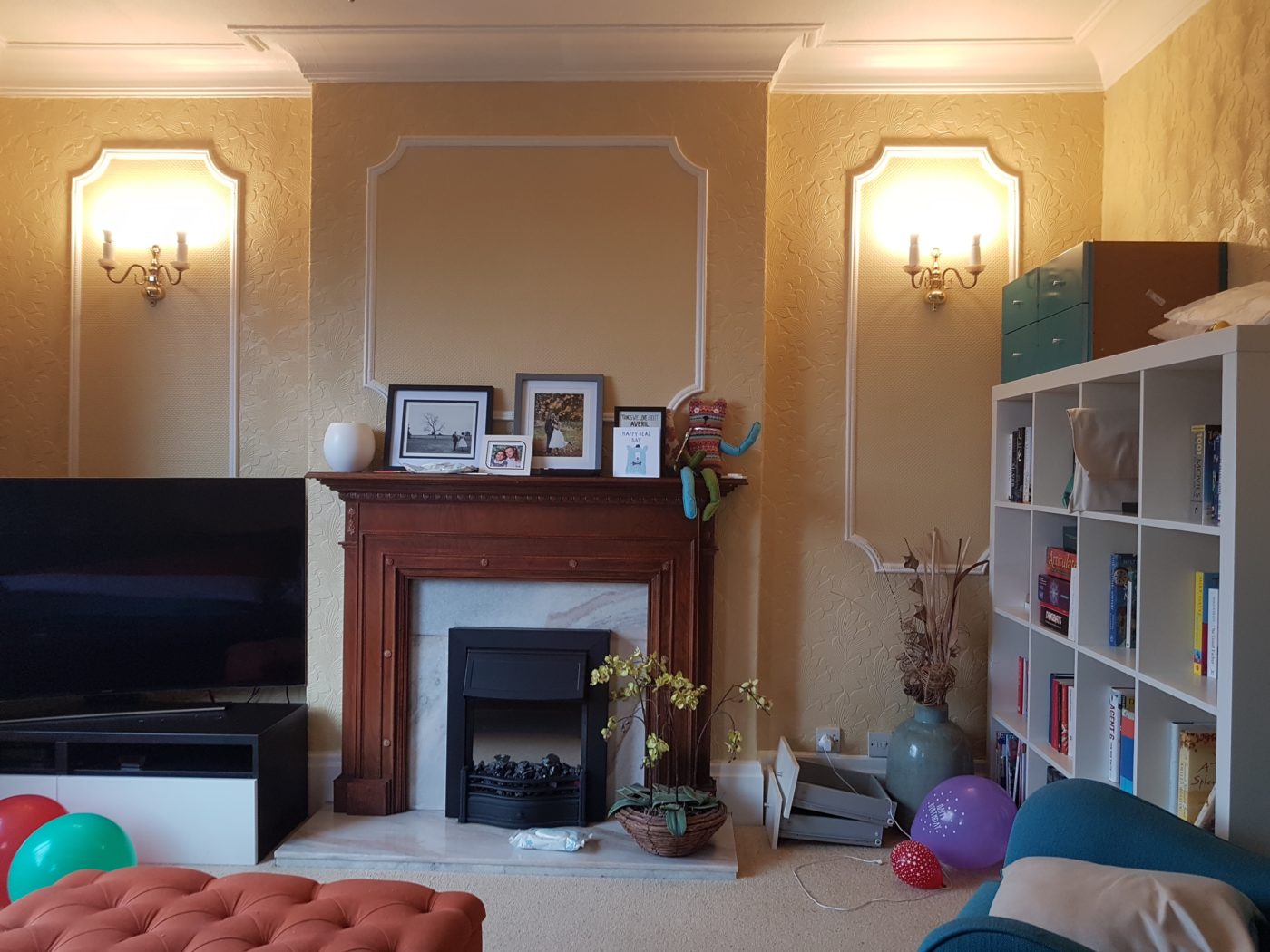
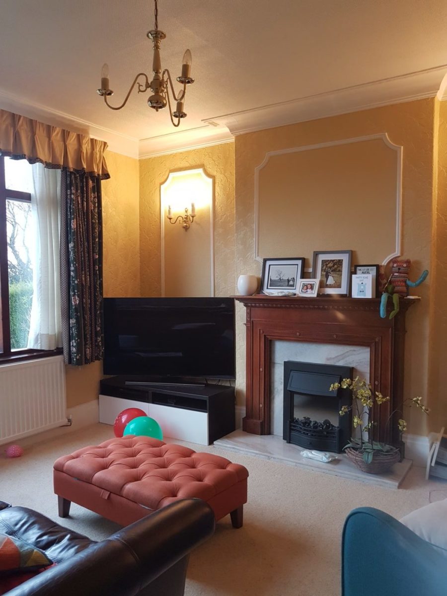
Before
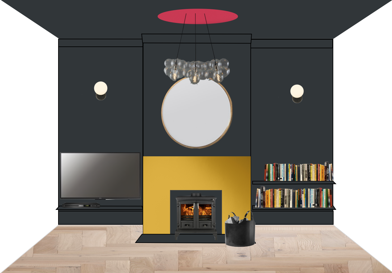
Concept – Bring on the more colour blocking!
They didn’t want a traditional mantle piece, not even really knowing if they even wanted another fire in here. They didn’t need one for heating as the underfloor heating was so efficient. So to give the illusion of a fireplace, we just used paint.
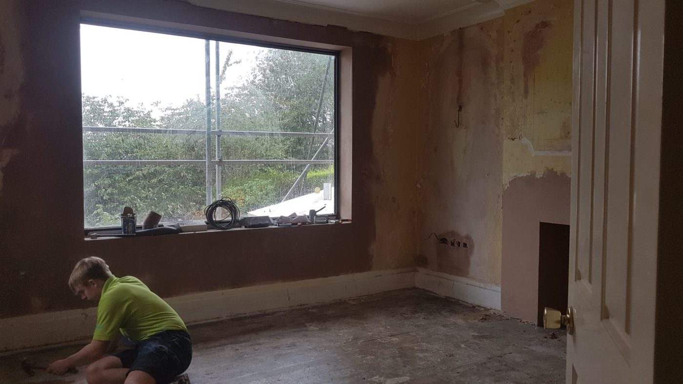
During – September 2019
Nearly after
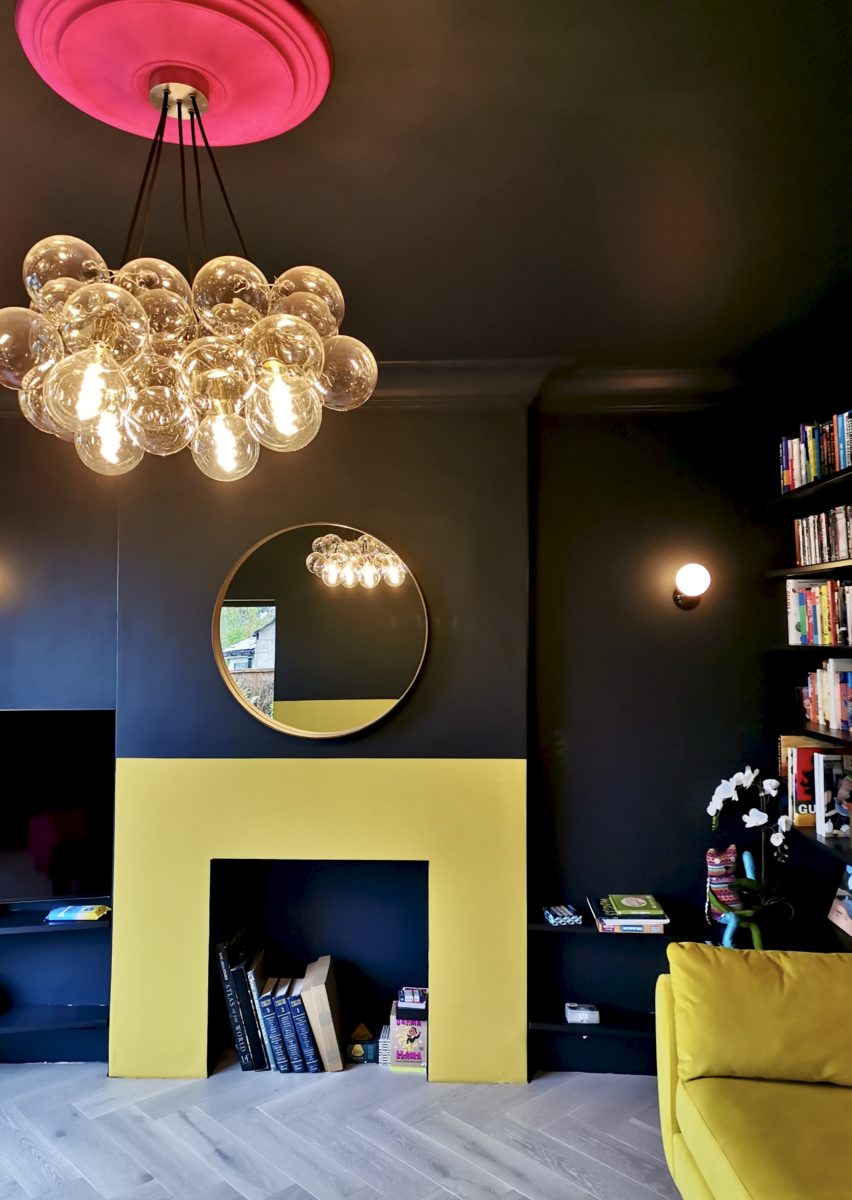
Originally, the ceiling rose was actually just going to be painted on to mimic the simplicity of the fire surround, but they went the whole hog and fitted a new one, which does look rather cool. I wonder how many people have a hot pink ceiling rose at home? Anyone…?
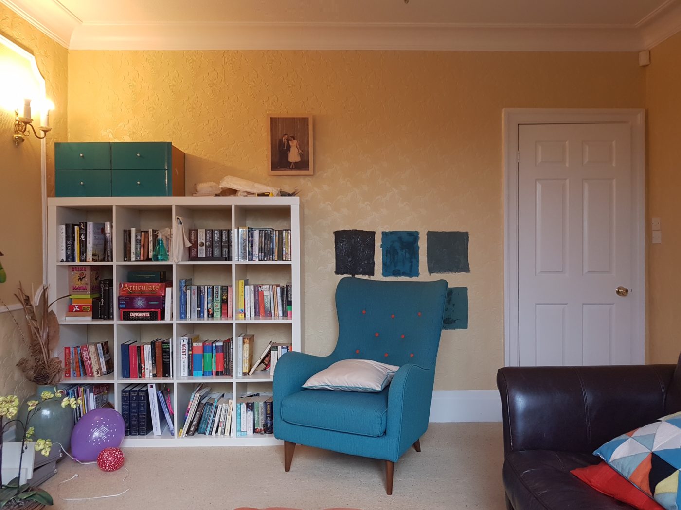
Before (notice the teal armchair that’s now in the kitchen)
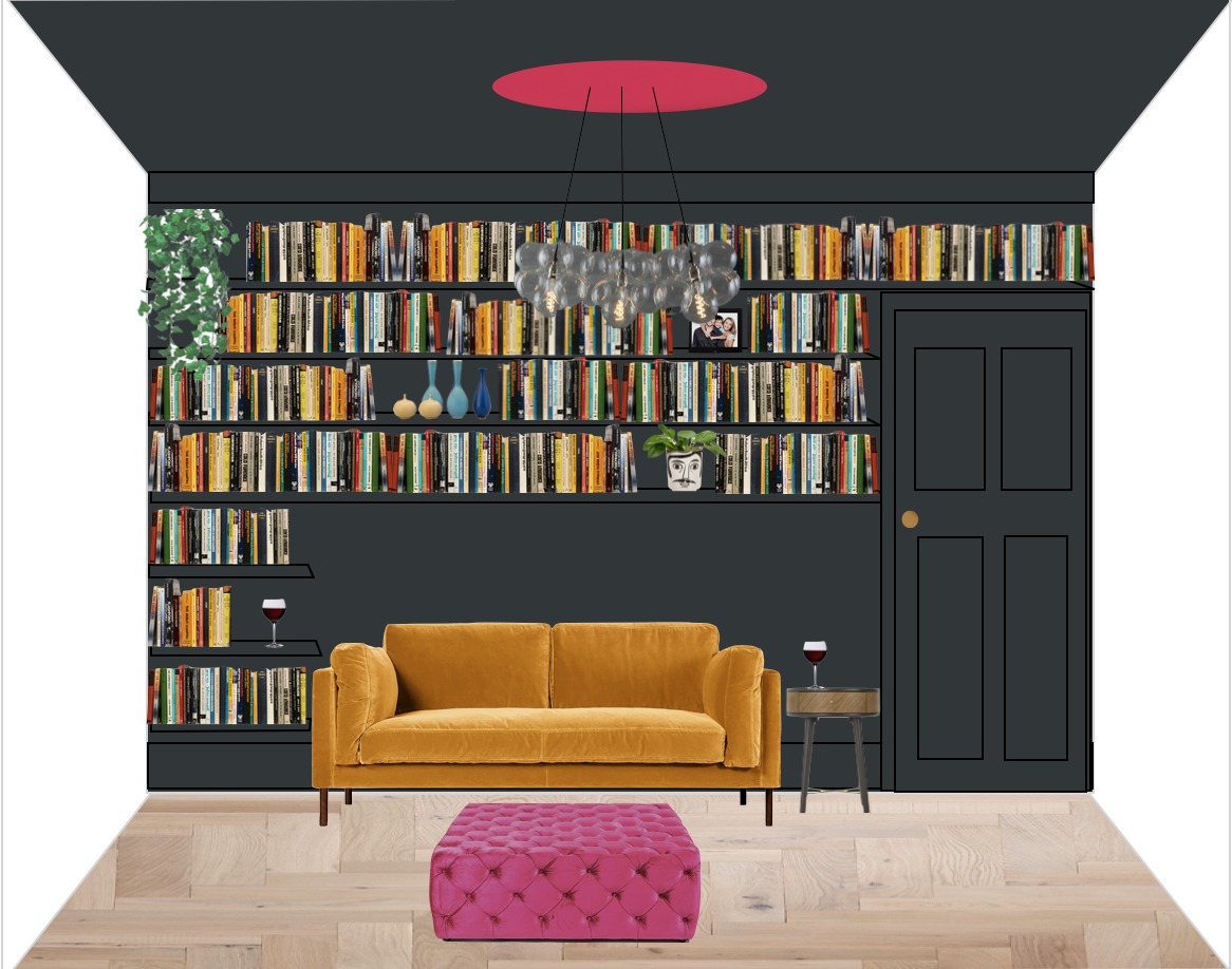
Concept
The good ole Ikea Kallax was going into the new playroom and this wall was to be turned into the home library with floor to ceiling shelving that wrapped around the seating. And here’s how it’s looking 90% finished…
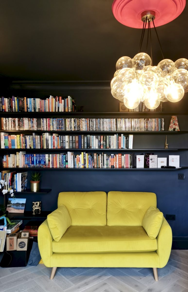
Nearly after – didn’t get a shot of the ottoman – GAH!
I know everyone always bandies on about how dark colours can make spaces feel smaller, but it actually feels bigger in here. Mainly because we’ve freed up the floorspace by using the walls for storage as opposed to pieces of floor standing furniture.
I didn’t get a shot of the next wall as there’s still artwork to hang and other bits to sort, so I’ll save that for the proper final reveal post in a few months time. But for today, here’s how it looked before…
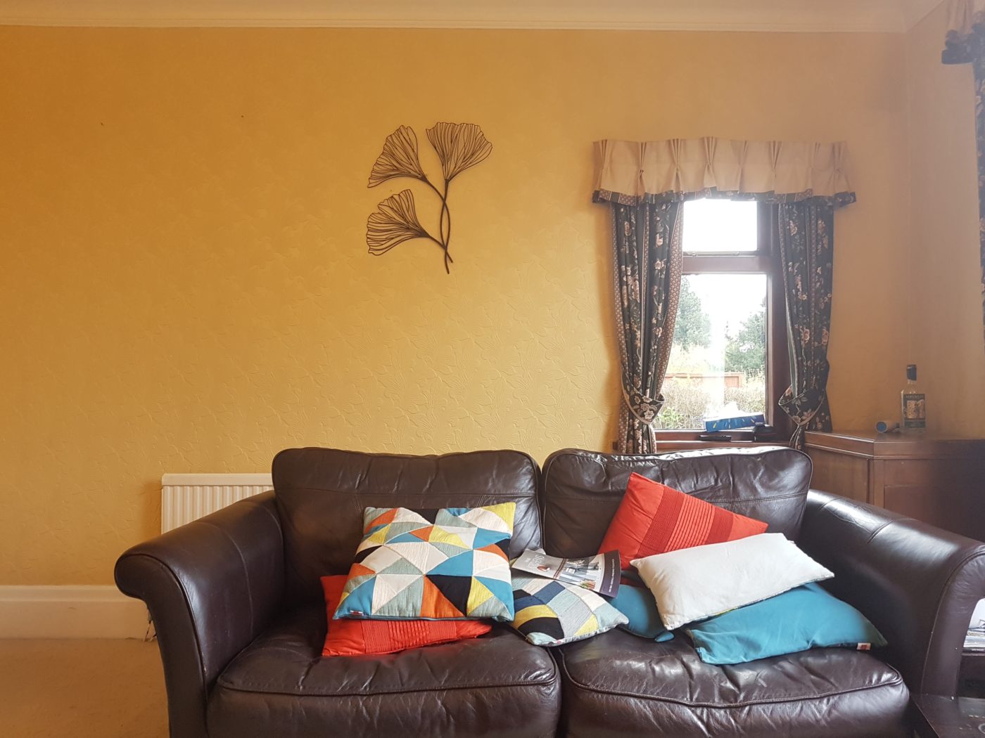
And here’s how it should look once it’s all finished…
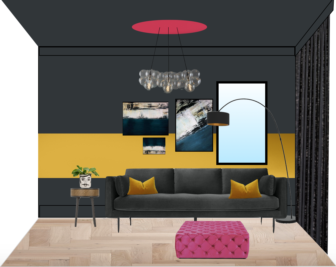
Concept
The yellow colour blocking here echoes the painted fire surround on the opposite side of the room (and the wide orange stripe across the ceiling in the kitchen). It’s also used here to draw your eye sideways away from the rather awkwardly placed window. By adding artwork along the width of the stripe, it brings the rectangular window into the gallery wall. It also means you can have a dark coloured, kid friendly sofa but still have it “pop” off the wall behind it. Hoorah!


Detail shots
So that’s about your lot for today. I’m hoping to return soon to get some final reveal photos, which I will be sure to share with you as and when. As ever I would love to hear your thoughts on this project so far. They’ve made some pretty bold choices here I think you’ll agree. Anything you’d think about doing at home yourselves?
Wow! So cool 😎
Thanks Kerry 🙂
WOW!!!! Absolutely love it. Esp Orange… simple but sooo effective and the Teal kitchen is amazing. I went inchyra blue ( thought that was brave- chickened out of Vardo even on my walls- Everone in life needs a Karen to push u and encourage U.
Haha. Not ‘everyone’ needs a Karen. I don’t need a Karen some days 🙂
Stunning!
The parquet on the island! 😍
Certainly bold! And should fulfil their love of colour.
We have underfloor heating and still have rugs down to soften the the look of the room, as well as for acoustics, in our large open-plan kitchen, dining, family room. The heat comes up through the rug and is super toasty. So in practice, it works for us.
Yes, we did look into it, but they decided against having them. For now anyway…
It looks truly fabulous.
Who supplied the Black Aluminium windows?
Thank you! It was the same company that I used at home; Clearview Doors & Windows based in South Yorkshire
The whole thing has blown me away! The colour blocking, the light fittings, the teal kitchen… Just wow!! 😍 xx
Thanks Cara – really glad you like it!!
Wow!!! That kitchen is stunning!!
I know – can’t take credit for the kitchen design i’m afraid. That was all them. I just bossed them about a bit with the colour 🙂
Gorgeous Karen… I love reading your posts as always! 🙂 Does the orange colour block line up with the skylight on the left?
Thank you! It lines up with the other end of the dining table 🙂
Oh my god, that teal just precision hit the pleasure centre of my brain (I’m sneakily reading this at work, and had to cover an audible coo with a rather unconvincing fake cough).
The rest is beautiful too, especially the ceiling rose, and the orange stripe, and the dark paint, and the BOOKSHELVES, and…. okay, I guess I just like everything!
Haha. That made me laugh. Thanks Caroline!
I love dark blue but the photos show it would have been so wrong for that kitchen, life sucking even. Your use of paint is brilliant. I still remember that bright yellow stripe in a bedroom in another project.
It’s weird isn’t it? Some colours are just a no – and you’re right navy blue would have been so wrong. And thank you – I do love a painted stripe 🙂
That ceiling rose is everything that is good about life.
I loooove it and I love your blog posts as always ! It makes me think about my own living room… I think I need wall storage to put all of my.. plants on it ! Could be cool especially if we think about a fun color for the wall behind. As always great ideas. Am looking forward to see the “final reveal” !
Thanks Marie 🙂 We all need plant shelves!
I do love before and after pictures and what a transformation for the owners.
This is fab – and a bit of an eye-opener for me. I’ve really never enjoyed colour blocking as a concept, whether on clothes or walls. But the way you’ve managed to get that off-centre window to incorporate into the gallery wall via the wide painted stripe is just genius. I love it. And teal/orange is one of my favourite colour combos, so the kitchen is just ace.
You, madam, have a very clever eye for design problem-solving!
Ran across your post on Pinterest. Trying some color blocking at my home. So inspired by your post. Thanks for the inspiration. Stunning!
Thank you Isabel! Great surname! 😉
This is stunning!! May I ask what colour the dark walls are? And the hot pink colour? Thanks so much!
Thanks Anna, the dark walls were in F&B Railings. I have no recollection what the pink was colour matched to though I’m afraid.
This is wonderful!!
Hi, would you possibly remember the colour used on the kitchen cabinets??
We are going for teal units as well and this looks like a great colour!