All posts filed under: Colour

Georgian Apartment Guest Bedroom

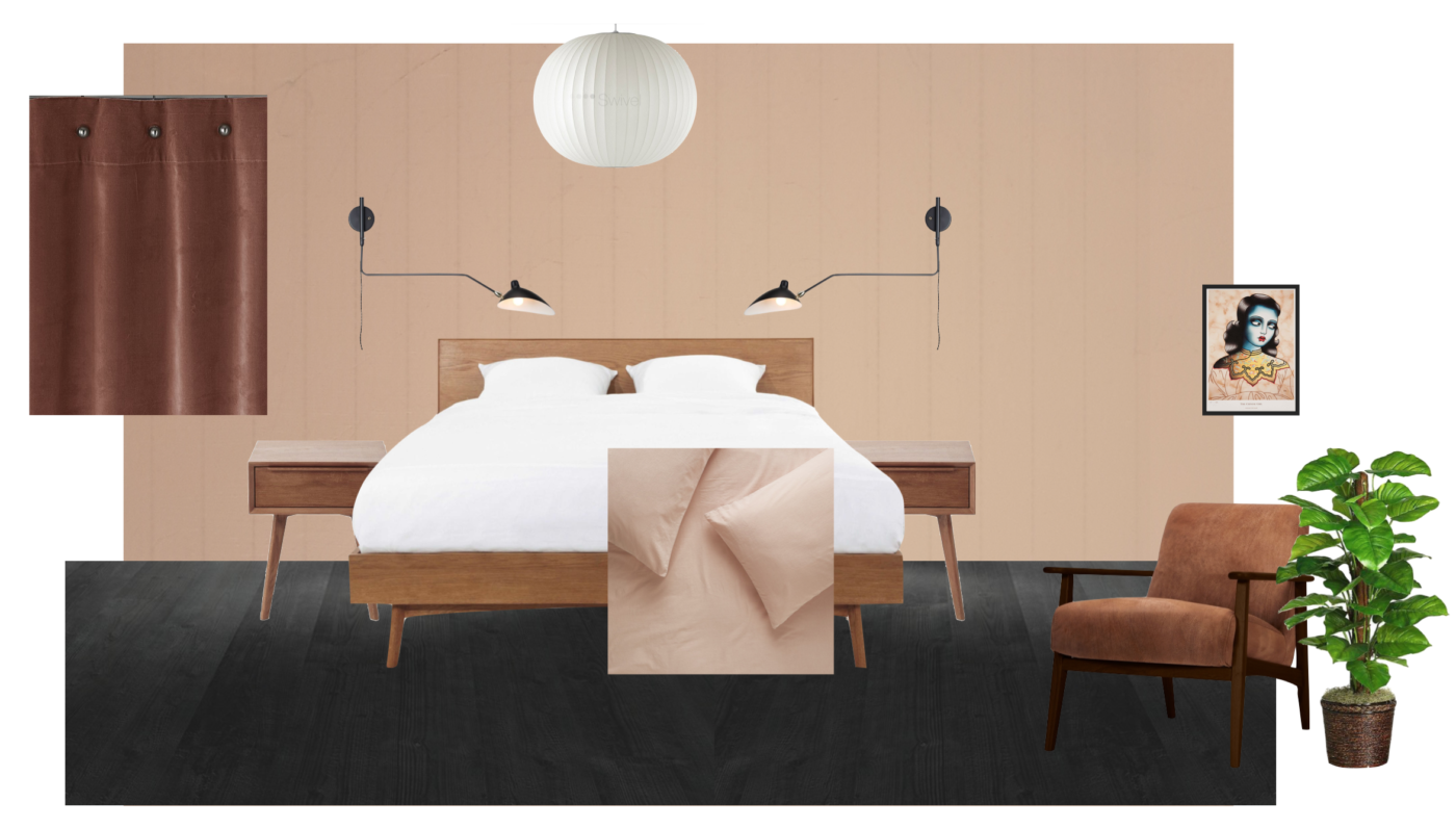
The Georgian Apartment – Guest Bedroom and Hallway

Hello all, another look at how the Georgian Apartment is coming on this week, with the focus being on the hallway and guest bedroom today. But before we start looking at the other spaces, a quick update on the open plan kitchen/dining/ living space: Here’s a pic from a visit a couple of weeks ago of the Quick Step Old Oak Grey flooring going down. This has now been fitted throughout the whole room leading in from the hallway. Having no thresholds or breaks in floor coverings is a great way of achieving a sense of continuity and flows between spaces. On my last visit the kitchen was very nearly fitted and the new radiators were in! I had just over a day to design the entire open plan living space so didn’t really have the luxury of  time for kitchen research. The timescales of the project are very tight due to the homeowners’ urgency to get moved in (which I think he is doing this BH weekend). For the kitchen I was given the …

Bedroom Moodboard The Nude Room

Our Bedroom Plans – The Nude Room

I’ve finally decided on plans for our bedroom. If you remember, I mentioned the bedroom was the next room i’d be switching up, here in this post where I showed you before and after pictures of our whole house. Our bedroom has always gotten lovely feedback, being featured in Real Homes magazine, by Abigail Ahern on MADE.COM and Apartment Therapy. So you know, this little room has certainly earned its keep. View this post on Instagram A post shared by Karen Knox – Making Spaces (@makingspacesnet) It’s been like this for over three years now, which is a long time for me to not fiddle with a room. But the one thing i’ve always found about this space is that it was a bit of a black sheep alongside  the rest of the house. Or teal sheep. Our home is “Monochrome and Materials”. It’s Scandinavian design inspired with a large helping of mid-century (because it’s a mid-century house). Whilst being neutral there is plenty of colour added with artwork, plants and accessories but for the fundamental scheme …

Pantone Living Coral

How to live with Living Coral – Pantone’s choice for 2019

Living Coral!? Well that was a nice turn up for the books wasn’t it? After the disastrous announcement of Ultra Violet for 2018, (so bad I didn’t even write about it) and Greenery back in 2017 (which I did write about, mainly because it meant I could add a picture of Kermit to my blog), Pantone have finally relented and given us something we can get our teeth in to for 2019. It’s a real pop. And not one for the faint of heart. But actually, Coral is one of the easiest colours to add into your interiors. Don’t believe me? Well, come and see how some of my brilliant colleagues from the Interior Design Collective have worked their magic with Pantone’s chosen hue for 2019. GREAT WITH BLUE Given the UK’s love of blue, partly because of the ease it fits our UK rooms (we have very blue, light here), coral is the perfect accent colour with blue as they sit opposite one another on the colour wheel, otherwise known as complementary colours. Now, …

Munich Project After Farrow & Ball Downpipe

When remote design works… And why…

I wrote a post last year about the pros and cons of E-Design; what remote interior design actually was, how it works, who it’s right for, because it’s certainly not for everyone. Today I wanted to show you some images from three remote projects i’ve worked on over the past year… and talk about why they turned out as well as they did. The London Flat The is the newly acquired apartment of a young, recently married couple. A couple who couldn’t quite decide on how to put their stamp on their new home. Having differing tastes and a limited budget to completely re-do a living space, dining area and kitchen, this blank canvas left them feeling a little stuck. So we started with a two hour remote consultation, which is how all of my projects, either remote or physical begin. A two hour remote consultation works like this: First hour – I go through photos, floorplans, and Pinterest boards you’ve collated, and of course your brief. You have to gather and supply all of this …

PeachBaby_Earthborn

Would you go nude? – The interior trend that’s barely there – Nude Walls

So yeah, a bit of a click-baity title I admit. No bums, boobs or body parts to see here people. It’s all about the nude walls today. Monument, New Black, and Temple Maybe it’s all this gorgeous weather we’re having that’s got me focussing on just how pale my pins are (like, really!) but since writing the Paint and Paper Library post where this picture above featured, i’ve been busy researching the best fleshy toned, nude paint colours out there. Because if you don’t already know, pink or “blush” aint going anywhere for a while… it is however, getting a little darker than those candy sweet pinks we’ve seen over the past four years or so. Think flesh tones, American tan tights, foundation samples, a touch more terracotta, peach… or dare I say it, “beige”. Yes, neutrals are on their way baby, but not in a boring way. Oh bloody hell no siree. Check out some of the best nude shades i’ve found and note how these barely there, neutrals can really pack a punch. …