
Hello hello, how are you all? Thanks to everyone who read Part 1 of final reveal for The Old Forge. I’ve heard from Karen (the owner) that bookings at the newly renovated holiday cottage have been going swimmingly since its launch with Next Door @ The Old Forge now being fully booked until the end of September, so get your skates on if you’re looking to book a break in North Yorkshire over the October half term or fancy an autumn/winter break.
So, where was I on the final reveal tour? I think I was about here…
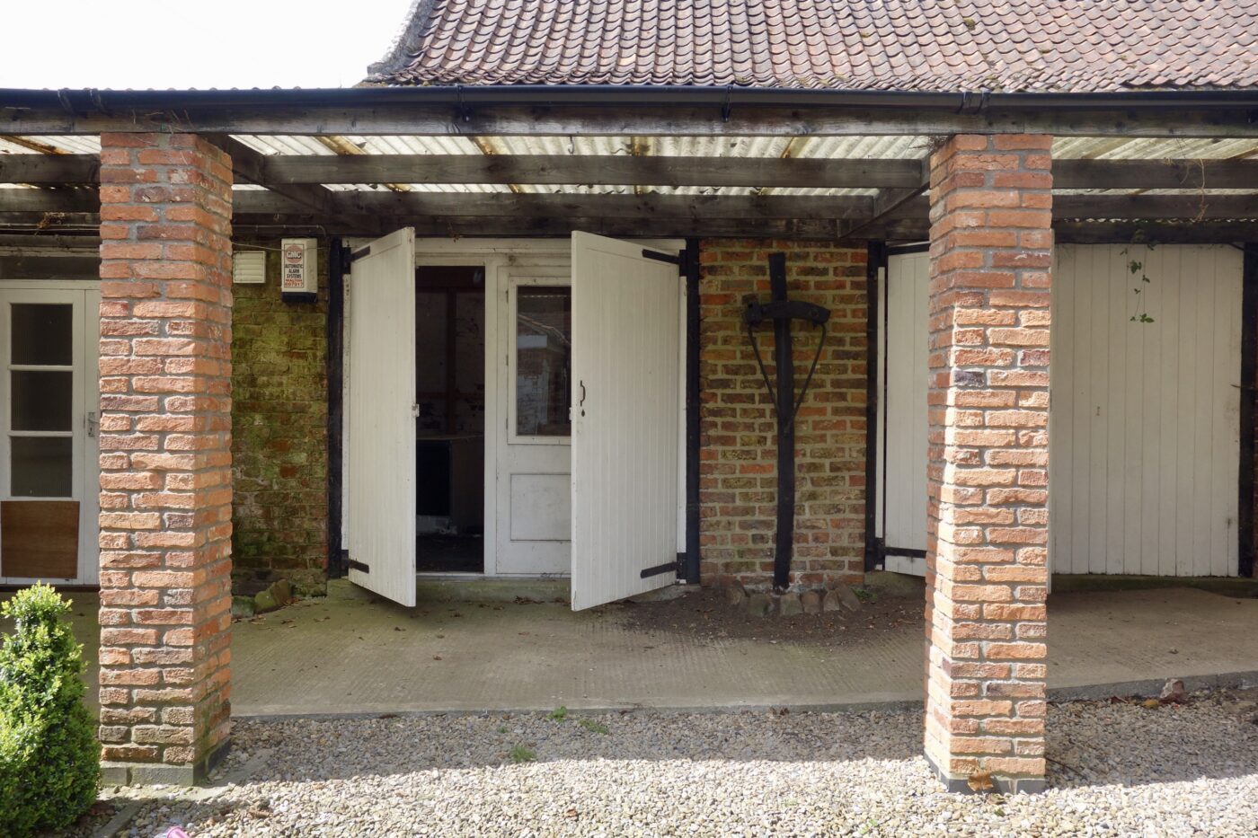
Corten steel cladding with a slither of hallway peeking through
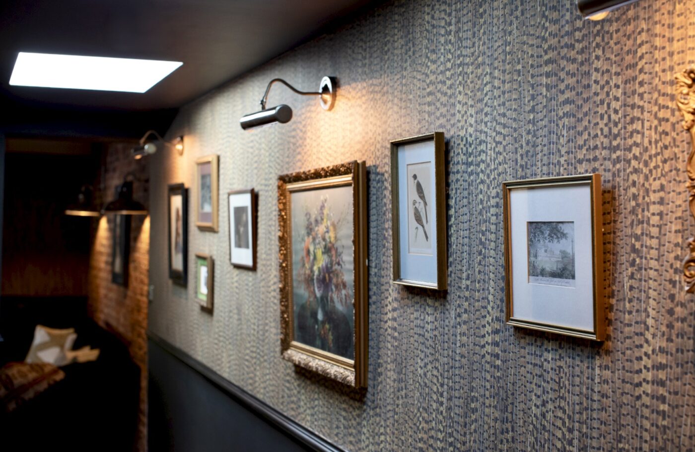
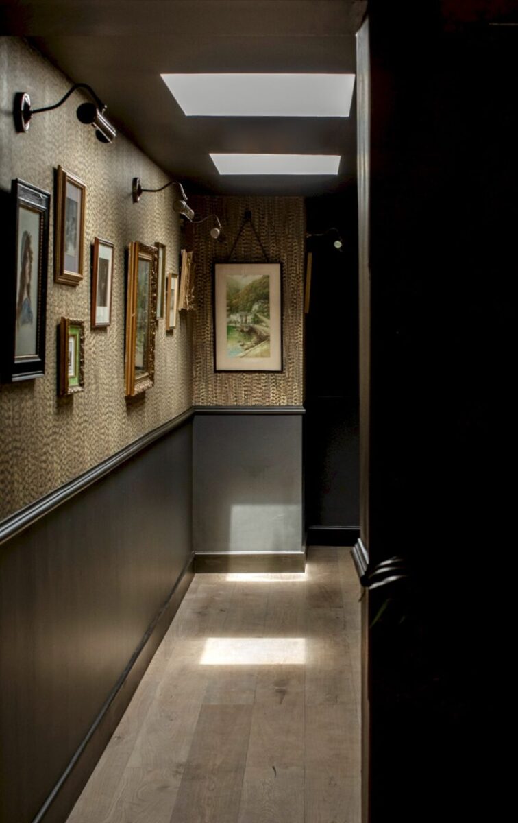
By their very nature of generally being long and narrow, hallways are spaces where people don’t tend to push the boat out design wise. However, a hallway is a place (much like a downstairs loo) is a place you can have plenty of fun. It’s somewhere you pass through fleetingly on the way from one place to another, not often somewhere you hang about for shits and giggles. But here, I wanted the hallway to be very much somewhere you actually spent a smidge of time in. After all, when you’ve got 6m square floor space, it’d be a shame for it be a bit meh.
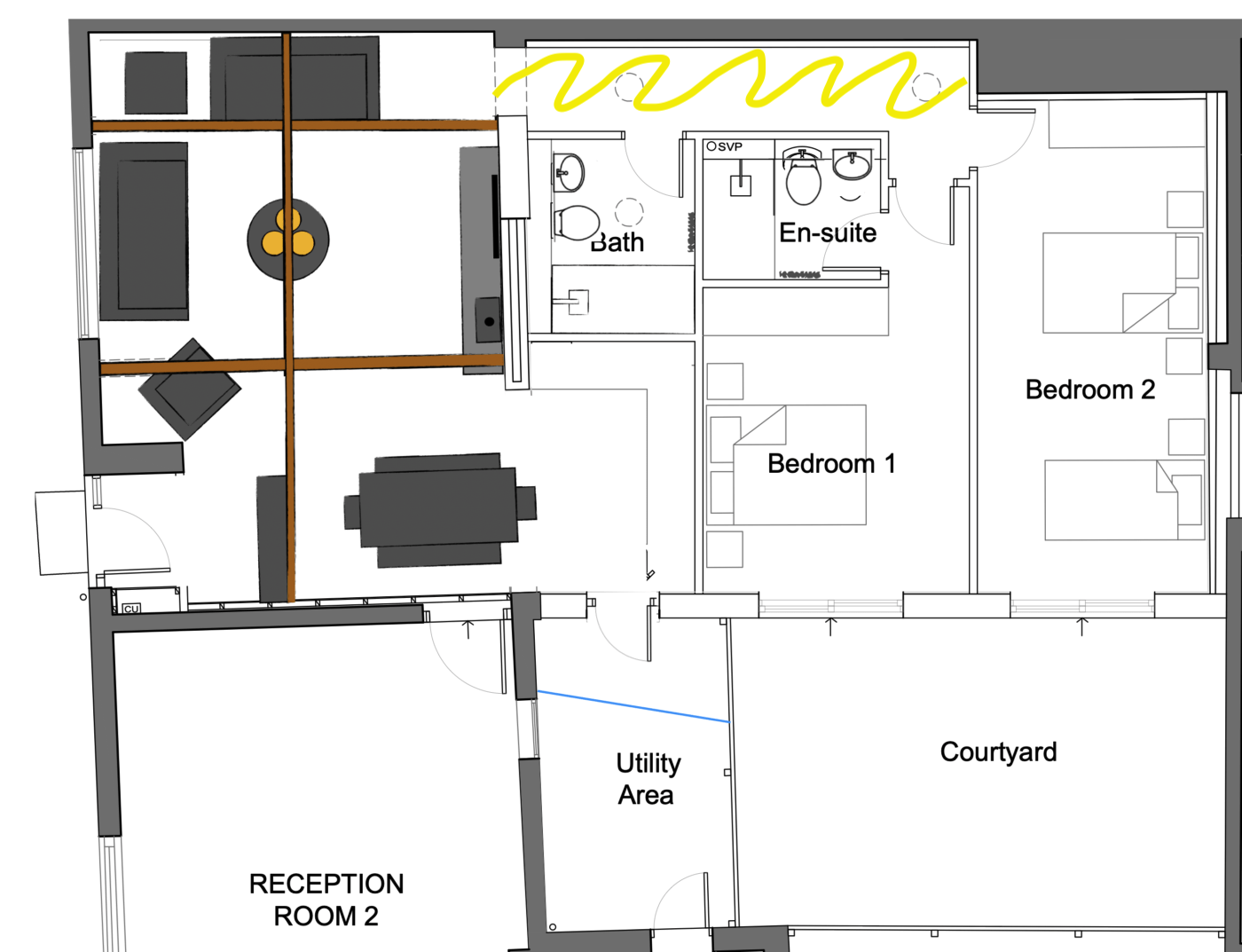
Floor plan with long hallway highlighted with professional looking yellow squiggle
I felt that this particular hallway needed a signature wallpaper, something that picked up on the scenic, village setting of The Old Forge. And so, I opted for Woodchip and Magnolia’s Pheasant wallpaper.
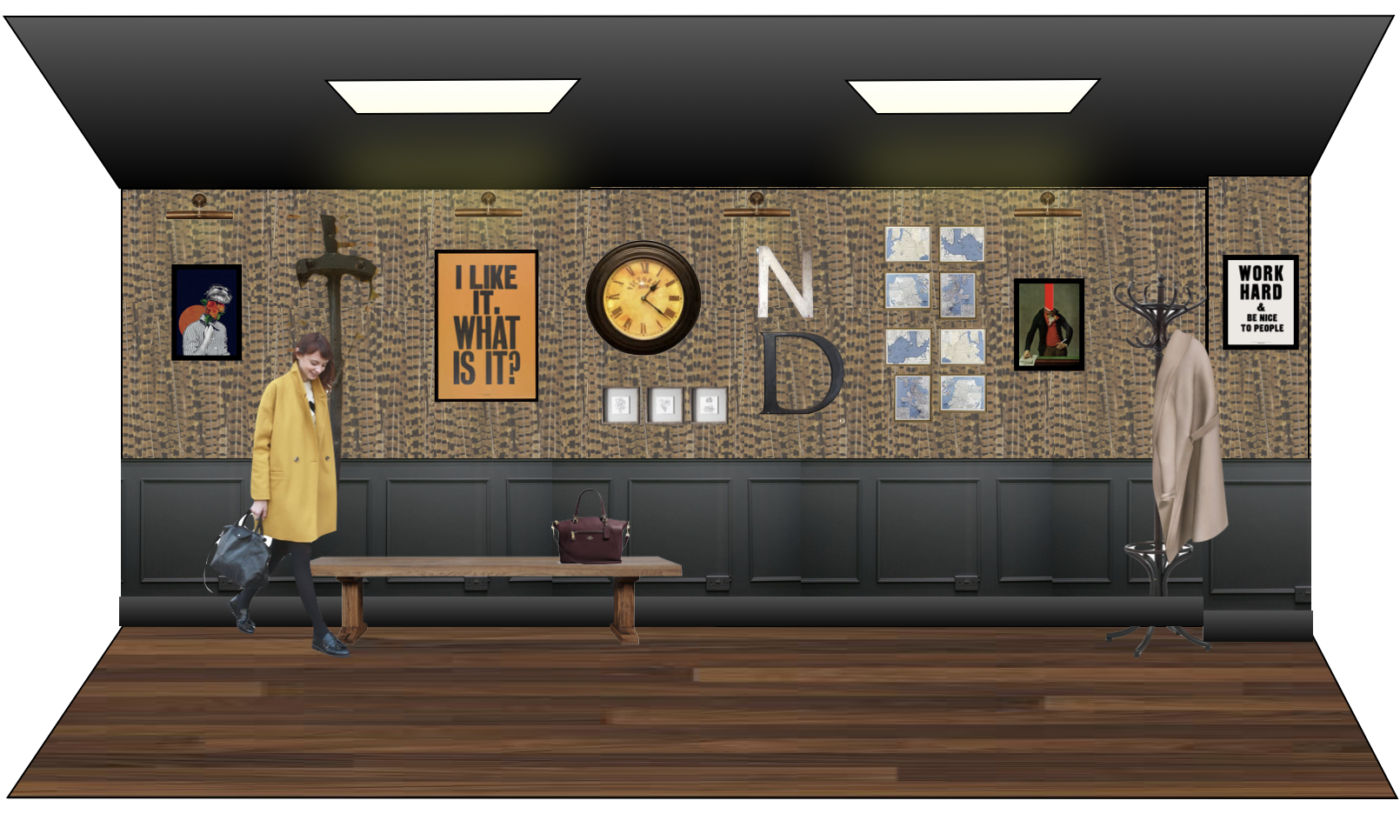
Hallway Concept
My brain chose the Pheasant feather design on the drive home from my visit first. My best ideas often come on the drive home, in the shower or whilst i’m asleep – basically any time i’m unable to make any notes, which is helpful. It’s been a long wait to see this particular lightbulb moment up on the walls for sure!
After
The original architects plans didn’t originally have roof lights here, but I suggested we add two large ones to allow the natural light to stream in from above. Sadly, the budget had ran out by the time we’d got to panelling the bottom section of this wall, but i’m keeping my fingers crossed that perhaps this can be added in time.
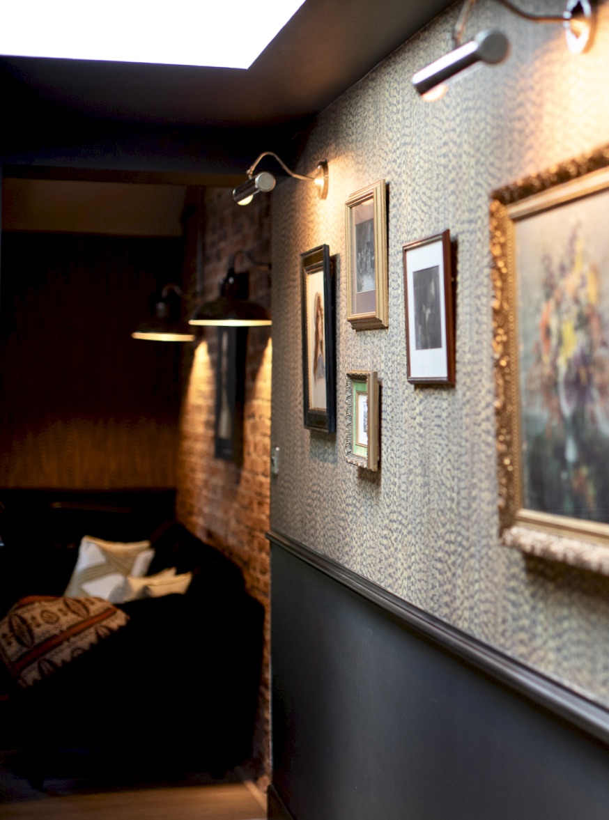
Many thanks to Julie from Oakwood Vintage for coming to Karen’s rescue during lockdown to provide the artwork for this space. All lit up by the traditional picture lights from the very original design concept.
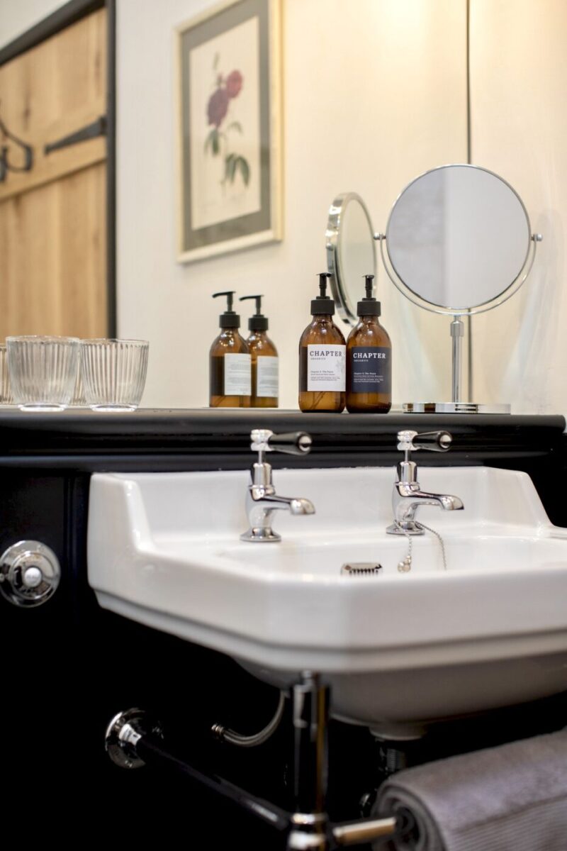
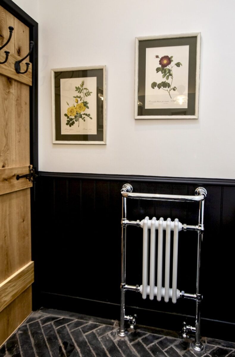
As you walk down the hallway you’re first greeted with the main bathroom. The concept for this space was traditional (slightly aged) monochrome. Classic bathroom fodder.
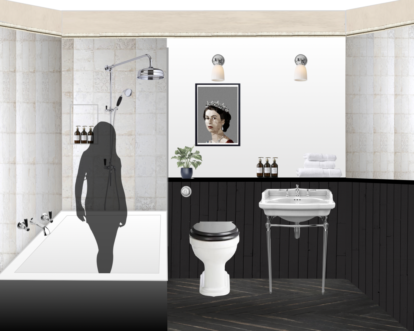
Bathroom concept (with sexy lady ghost in the bath)
Some of the elements I chose for this small but perfectly formed bathroom:
- Demelza Tin Talc Decor Ceramic Tiles – Mandarin Stone
- Traditional sanitaryware with washstand and back to wall toilet with hidden cistern with black seat
- Chrome brassware with black detail
- Dartrey “burnt wood effect” porcelain floor tiles
- Black shiplap panelling
- Full width mirror with porcelain wall lights
I do have a thing for seeing the Queen above the throne – a private joke between me and me. I think bathrooms need one or two pieces of art.
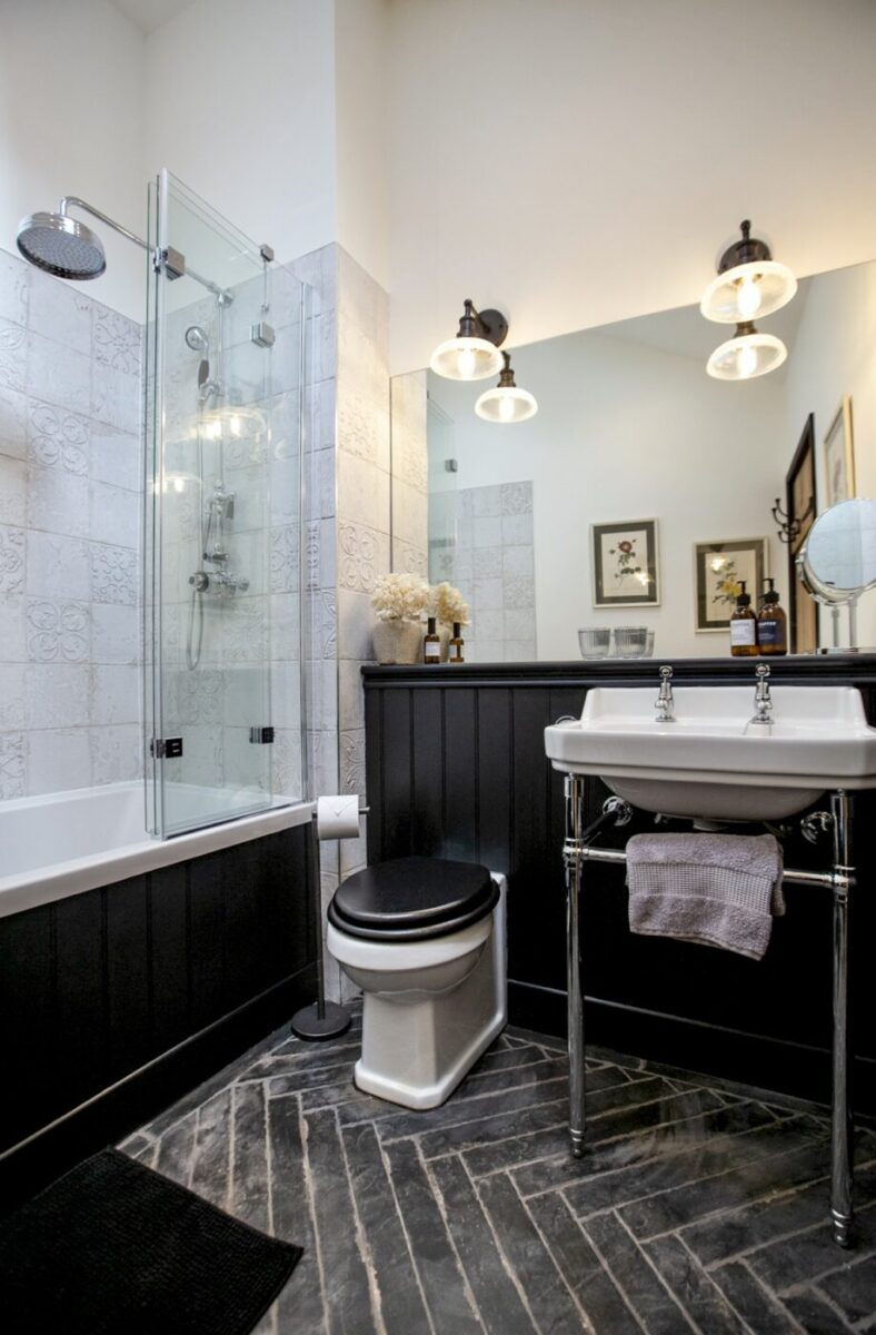
Unfortunately, Liz didn’t make it into the final cut for this space and certain elements were paired back in order to fall within the ever shrinking budget, but i’d say the bathroom concept stayed pretty true to the original. Hopefully it will provide this holiday cottage with a robust, easy to clean and timeless design.
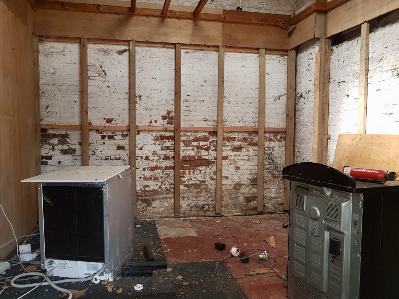
Whilst I don’t have any exact before photos for the bathroom, it it pretty much situated inside this store cupboard which all got knocked down and rebuilt in order to provide the new footprint.
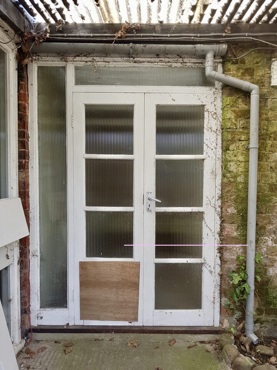
March 2018
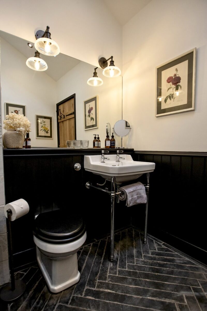
And now
Sticking with some more before photos, let me show you where the two bedrooms now are:
The master suite concept changed too much for me to bag that space as a Making Spaces design, but you can take a look at how that turned out on The Old Forge’s gallery. The second bedroom however, stayed truer to my original concept, so I’ll show you how that one turned out instead:
Before
This bedroom needed to provide multiple sleeping arrangements. A king size or two singles plus a pull out or additional single for kiddos. It needed to be in keeping with the rest of the cottage, somewhere that ticked the boxes for a grown up bedroom, but also be kid friendly and somewhere that children would like to sleep too.
During
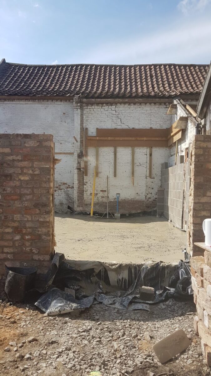
I will never forget this day. I turned up to laser measure the site again to check the measurements tied in with original plans (they didn’t) and the builders had just poured gallons of concrete to lay the foundations. Had to borrow some wellies for that one. Two sizes too big didn’t make it easy to keep them on!
The concept for the second bedroom changed quite a bit as this project went on. Here was the original plan:
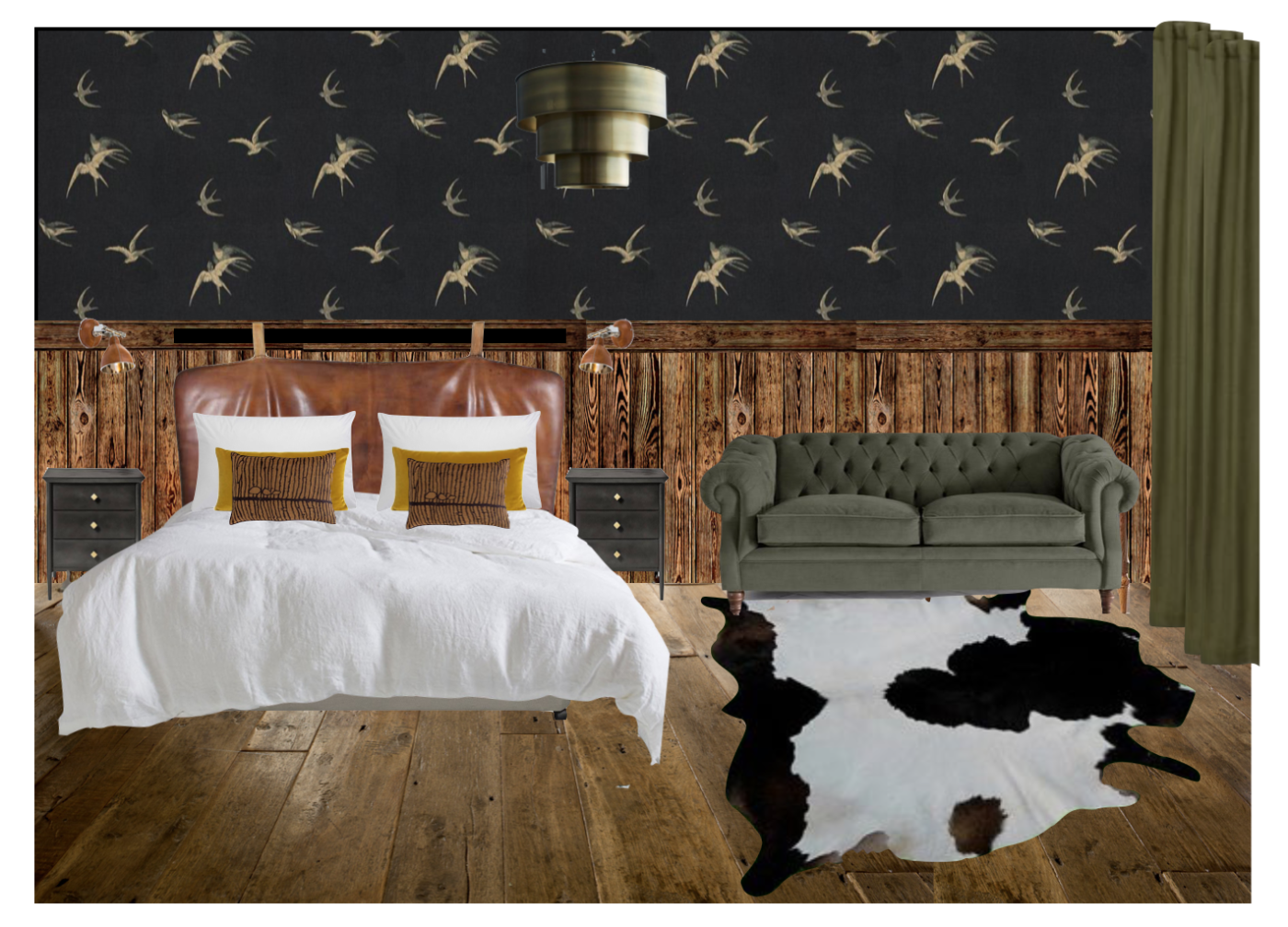
Second Bedroom Original Concept
- Wooden panelling
- Sanderson Swallows wallpaper along the top section of wall and across the ceiling
- Brass pendant light
- Leather bedside lights
- Tufted sofa bed for an additional sleeper
- Green fabrics to tie in with the courtyard space accessible through the room’s double doors
- Hanging leather headboard so the bed bases could be set up as either a super king or 2 x singles
- Black metal bedside drawers to tie in with the blacksmith’s cottage and to provide additional storage
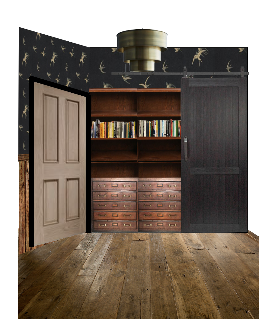 There was also to be a built in wardrobe and library with sliding barn door at the other end of the room.
I felt this was a really strong look and tied in with the other details from the hallway and living space. I also highly recommend a dark ceiling for a kid’s room, it tricks them into thinking the sun has’t come up yet and gives you an extra few minutes in bed. Isn’t that the best your kids can ever give you?
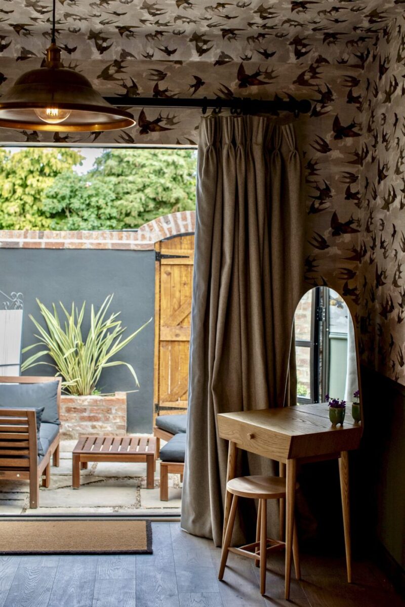
As an alternative however, I also offered Designer’s Guild Chimney Swallows wallpaper for a slightly softer, more “countryfied” look.
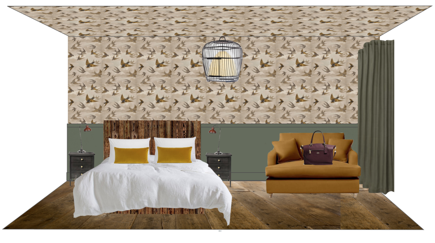
Second Bedroom Concept Two
- Designers Guild Chimney Swallows in Sepia
- Paint & Paper Library Horneblend
- Bird cage ceiling light
Unfortunately, as with the hallway, the wood panelling from the original concept had to be cut due to budget constraints, so the bottom section of this room was to be painted instead with a dado rail used to section off the wall. Alas, we also had to say goodbye to the hanging leather headboard too (I am bloody determined to get a hanging leather headboard into a Making Spaces design one day – I will I will!)
When it came to the crunch of deciding which wallpaper to run with, Karen opted for the Designers Guild design. I’ve always referred to my design process and way of working as being “client led”. I present what I think you really want, but also push you a little. From a personal perspective, I loved the simplicity of the Sanderson Swallows wallpaper (and it’s black – a classic me move) but for Karen she had to go with the design that felt right for her and her business.
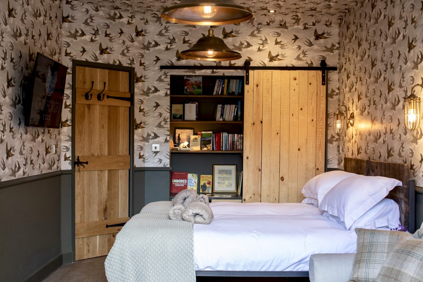
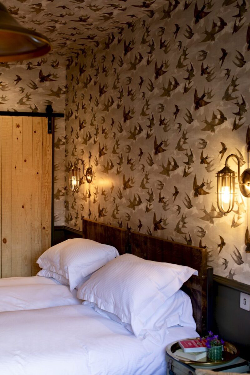
Second Bedroom
It feels fair to say the outcome of this bedroom is from a collaborative effort. Original concept, me, alternative concept, also me. This was then moulded by both Beth from Fresh Start Living who worked on the first fix with Karen Griggs the owner who chose the furniture and furnishings and did a fantastic job of styling the rooms which were all captured by photographer, Polly Baldwin.
I have still yet to see any of the finished spaces myself, so am looking forward to my visit later this year. It’ll be a bit weird to stay in the rooms I designed over two years ago, but what a lovely treat to look forward to.
And just a reminder, that until July 31st 2020, you guys can get 10% off your stay using the code MakingSpaces10. Just email Karen directly at info@oldforgeyork.com to book. And that completes the two-part final reveal tour of Next Door @ The Old Forge. Thank you again for your lovely feedback on Part 1 and for stopping by again for Part 2. Before I go, here’s a video posted by one of the recent guests, I think you might recognise the artwork 🙂
Until next time…
I LOVE that hallway – the wallpaper and the pictures and the lights are fabulous together.
Your original design looks like it called for darker/more modern doors in the second bedroom, but the finished room has more rustic doors. Was that a client preference?
Glad you like the hallway – it’s a cool space isn’t it?
And yes lots of changes were made throughout the whole process as unfortunately I wasn’t able to be involved in the implementation. Any original concept is just that, it’s just an idea. This idea then develops and changes throughout the process and becomes something slightly different, normally down to financial constraints or changes to the overall brief.
Love it! You are so talented:-)
Hi Karen. I’m re-doing my bedroom and would absolutely love a leather hanging head rest. Any tips on where to start?