
It’s final reveal time. At last! (previous post here).
I’m super excited to be able to share the photos from the Red Room project. For those of you that have been following this one, apologies, but i’m about to recap. Here is the storyline for this one:
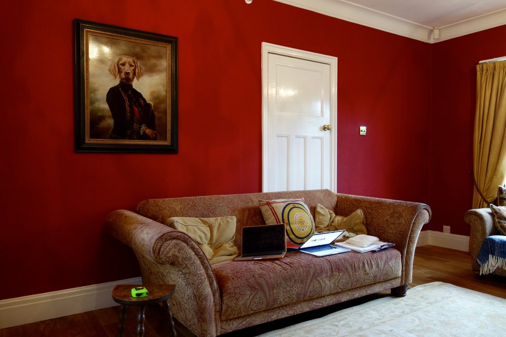
- Initial consultation – The brief was to make the room work in terms of function (family room with a TV and plenty of seating), keep the red walls (hence the project name) and pull it all together.
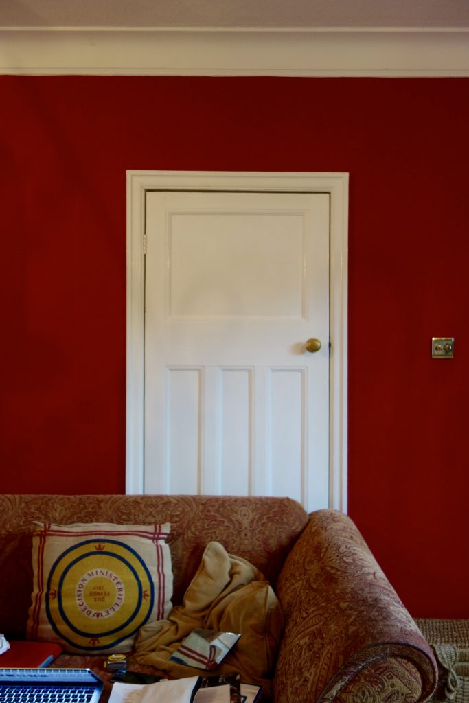
Before
- My plan was to block off the doorway into what was originally a room intended to be a dining room in order to give them a long run of wall to turn allow sofa seating a view to the soon to be TV. I’d already moved the sofa at this point btw and asked them to live with it like this for a few weeks to get used to the new flow around the house. Always something worth doing when you’re about to adjust layout that requires building work.
- The vintage sofa, as much as we all loved it, it took up a lot of room with those wide scrolled arms for not many bums on seats. So that had to go.
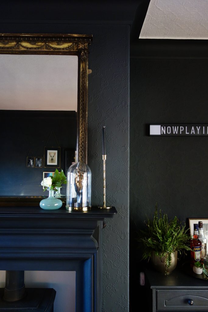
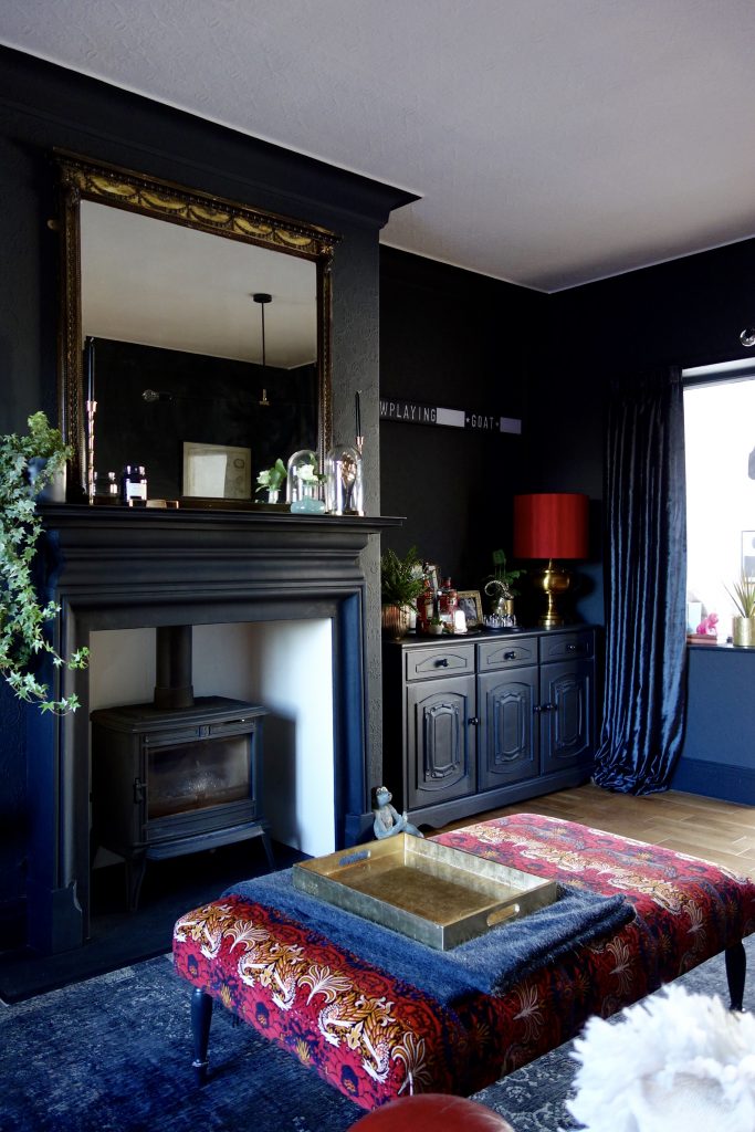
- The Welsh dresser was also a gonner as that’s where the new TV was going. But we did need a piece of furniture for the other alcove. So we lost the top section and kept the base cabinet which was to become the new home drinks cabinet.
- The fire surround was originally staying. Then the clients decided they actually hated it and a new log burner and fire surround was now on the cards.
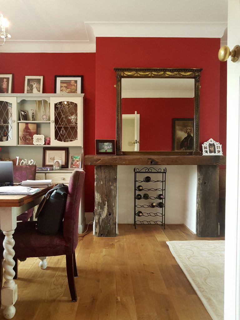
- The small vintage sofa was moved to the front sitting room as this was the spot for the new drinks cabinet. As you can see here, this side of the room links directly to the newly extended kitchen diner, so having the drinks cabinet in this corner was a great way of connecting the two spaces. One old and one new.
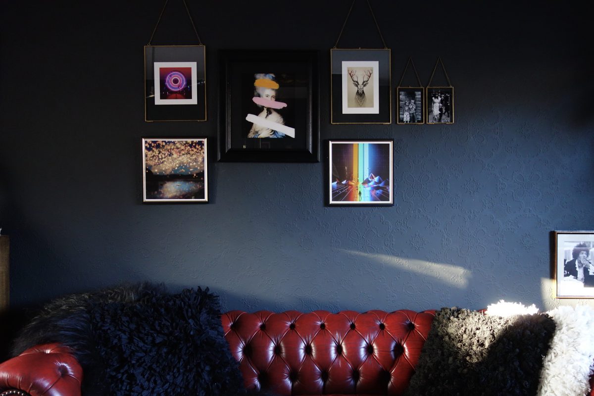
- Half way through, the clients made a U-turn on the red walls, deciding that they wanted a complete change. So it was time to strip those walls and start again. Cue Anaglypta’s Alfred and Little Greene’s Lamp Black.
Which gave us a strong backdrop to add the red in elsewhere. Which was purely so I didn’t have to change the project name. Obv.

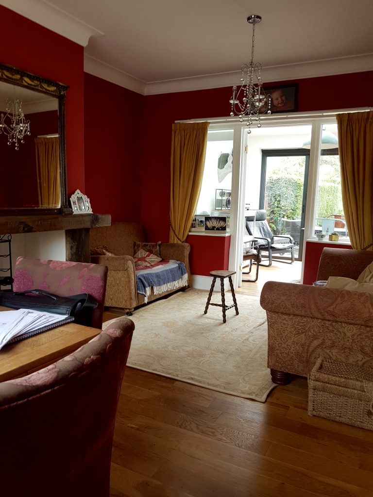
Before – Original layout
After – Door blocked off and sofa positioned centrally to the room
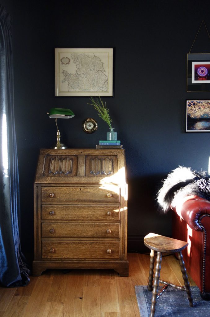
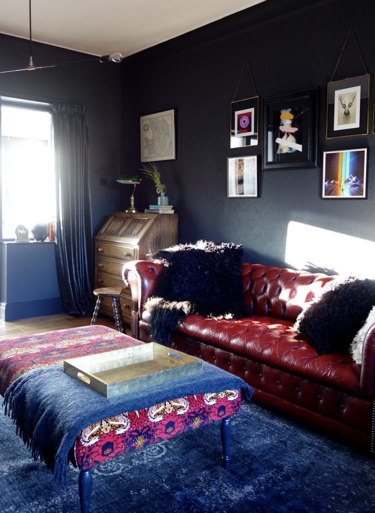
And with the sofa being placed centrally, we managed to squeeze in a small home office in the form of an antique oak bureau picked up from a local vintage dealer.
Old doorway – Now you see it….
Now you don’t!
Blocking off an old doorway really isn’t that much of a big deal. It’s done and dusted in two to three days but the difference it can make to a room is enormous. Way better to spend your pennies on nailing a room layout than on a super expensive sofa. Because if you’re sofa’s still in the wrong place… it’s still gona look naff. More pearls of wisdom like this over here in a post about where’s best to spend your money at home.
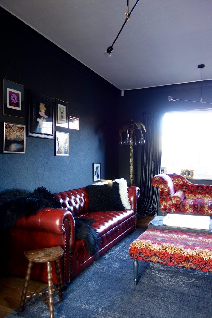
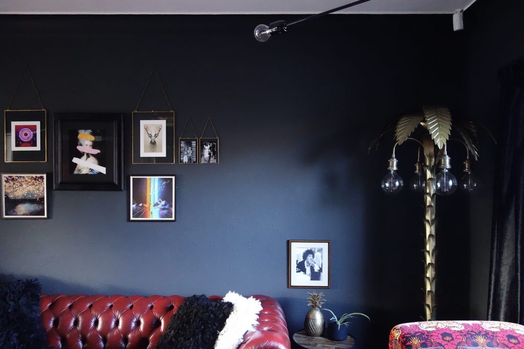
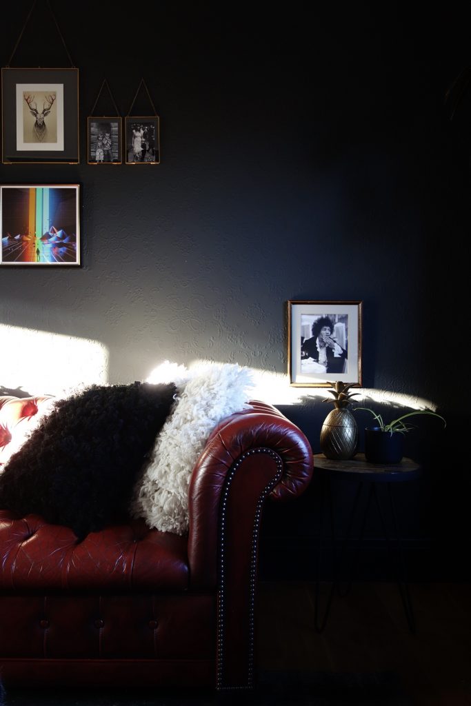
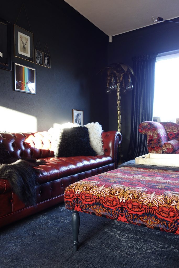
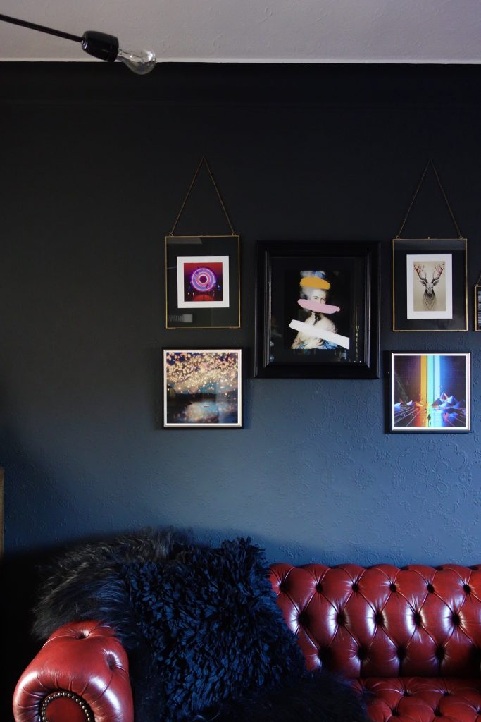
The new layout works perfectly for the family TV room. The vintage oxblood chesterfield sits three with ease and the right hand chaise longue provides an extra comfy spot for TV lounging, without a second arm blocking the view.
The red continues as an accent throughout the room, firstly in the House of Hackney Peacock and Dragon fabric which was used to upholster the second hand chaise longue and ottoman footstool bagged from eBay and Gumtree.


Many thanks to Eclectic Chair again for your expert hand. Hard to believe it’s the same piece of furniture.
The ottoman (which is enormous) triples up as a coffee table, footstool and additional seating as and when needed. Every room needs a piece of furniture that can be whizzed about to provide different functions. Especially when they look as pretty as this.
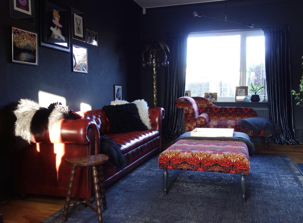
The Fading World rug by Louis de Poortere anchors the room. We didn’t want anything too plain, but we also didn’t want anything with bold with too much colour or pattern. Just like Goldilocks, we needed something in between, with just the right balance, something that complimented the walls and didn’t fight with the beautiful upholstered furniture.
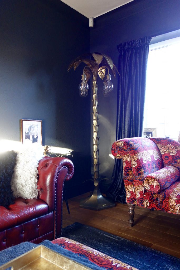
Unlike the Palm Tree floor lamp from Rockett St George, the bolder the better for this corner of the room. Whatever stood here had to dominate or at least be on par with the gorgeous HoH fabric. I’m quite certain we found something up to the job.
With the room having two ceiling light points we had to be careful not to choose something too much of a statement for the pendant lights. The room wasn’t big enough for two large statement fittings, but it still needed something grand enough to stand up to the rest of the pieces in the room. The Eagle Span lights, again from Rockett St George were perfect. Individually, their linear design meant they didn’t dominate, but when fitted at a diagonal to one another at opposite ends of the room, it gave the effect of a large matrix of light up above. It also meant that the light at each end of the metre long arm spread the light evenly across the room.
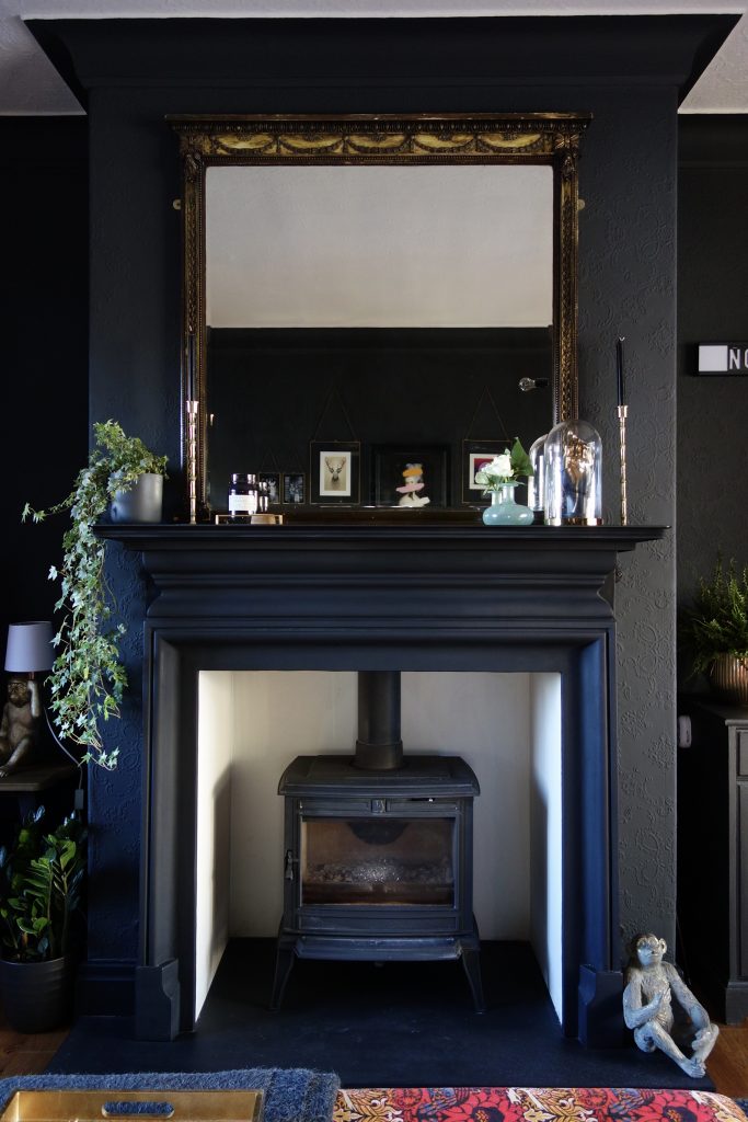
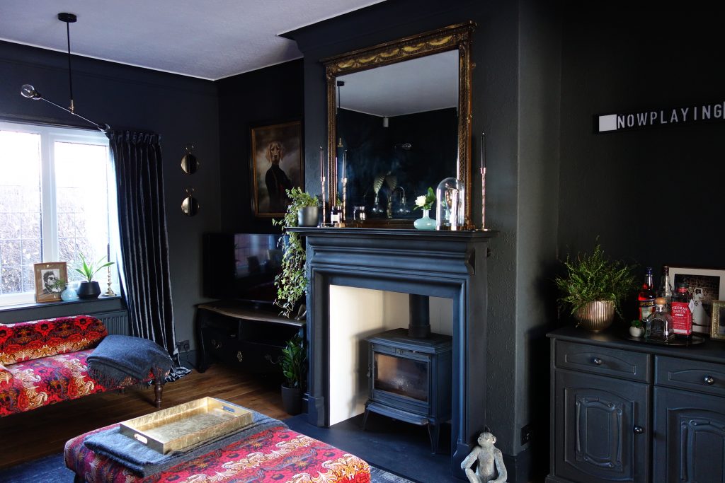
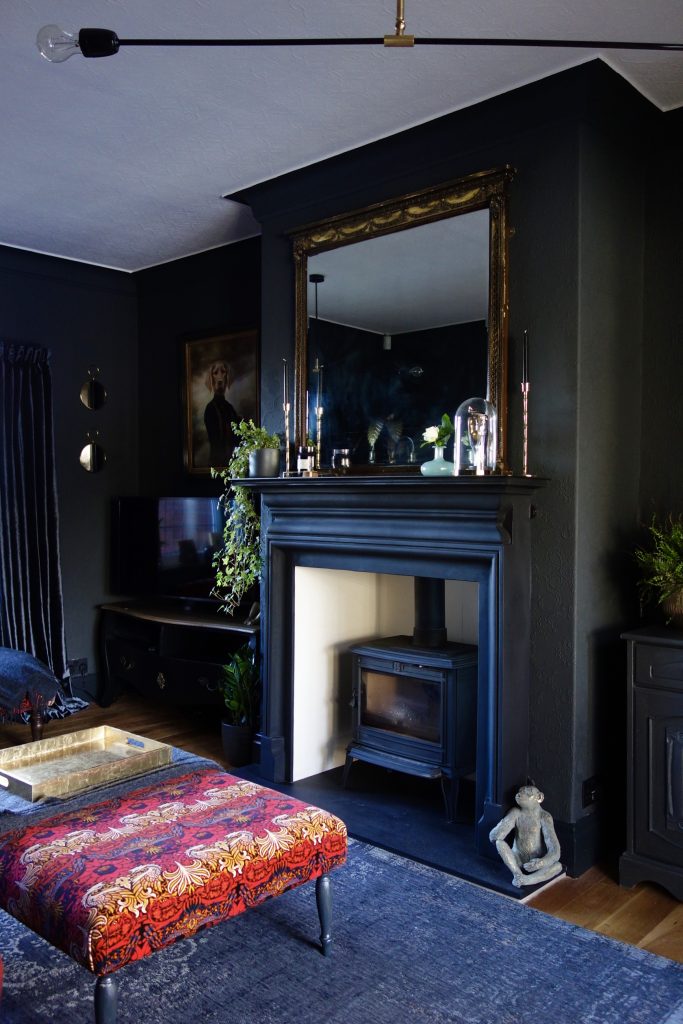
The chimney breast required some structural work in order to adjust the height and proportions of the new surround. The new Palmerston Gallery surround in matt black and Franco Belge Monoco stove gave the room a focal point more in keeping with the rest of the design.


Lots of brass and gold metallic detailing from H&M Home were added around the room to warm up the space and add some glamour.
The Alfred Anaglypta works wonderfully in adding texture and movement to the room. Despite it being dark in here, the subtle pattern softens the overall ‘edgy’ vibe. A plastered and painted wall would have appeared too cold and clinical for this 1930’s home.


Styling details – with pieces from Ikea, Homesense, Muck N Brass
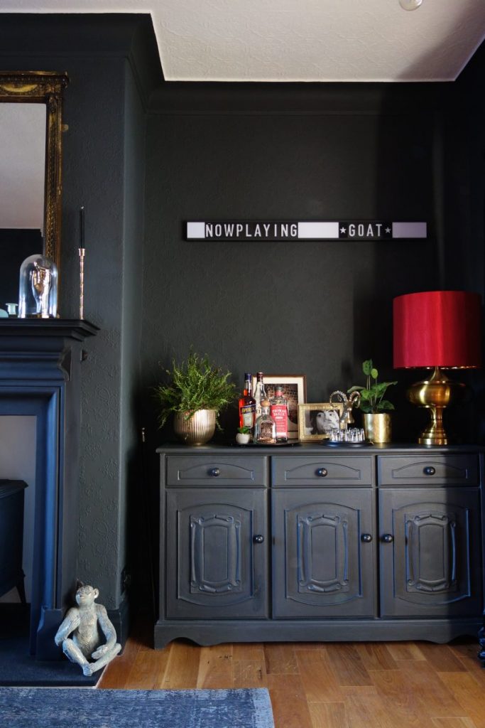
The repainted Welsh dresser, has now been given a new lease of life as the new drinks cabinet, providing additional storage for every day stuff. We’ve all got it, so best give yourself somewhere to shove it all.
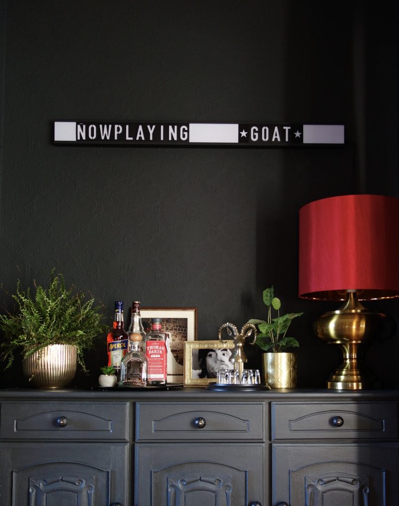
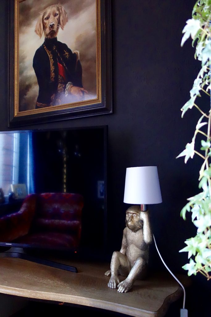
The large, gold and red table lamp was pilfered from their other sitting room. It was meant for this room don’t cha think? And the Cinema strip light from Rockett St George (now discontinued) adds another, more quirky, customisable lighting option.
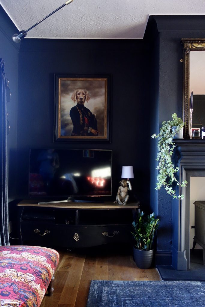
The TV corner is now graced with the Lipstick TV Media Unit from La Redoute, the monkey table lamp from Next and ‘The Marquis’ by Thierry Poncelet.
(And if you look closely, you can see muggins reflected in the TV)
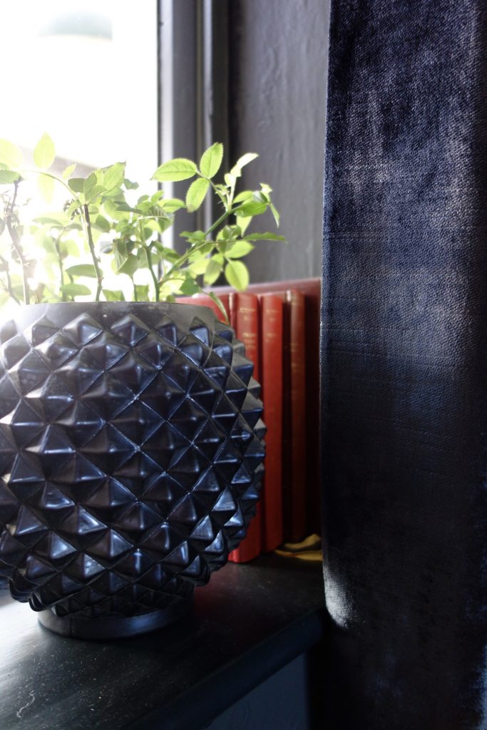
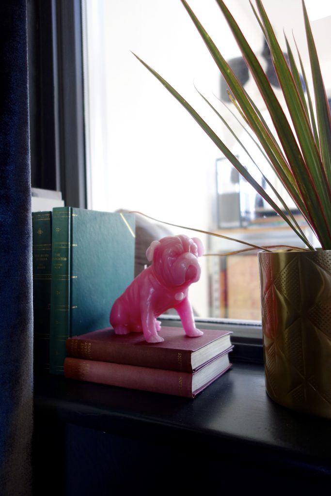
Styling details – Artwork from Society 6, vintage books from a charity shop rummage and H&M plant pots.
And so to end today’s final reveal post, here’s one last before and after. I really hope you like what we’ve done here. It’s certainly a bold move and not to everyone’s taste, but isn’t that exactly what makes our homes so unique. Us all embracing different aspects of design?!
Before
After
One thing i’m certain about is that this room now has a definite function. You can see exactly how it’s meant to be used. The layout works, the design is cohesive and reflects the homeowners perfectly. Such a cosy space to spend time in the evening in and ready just in time for Christmas.
As always, I’d love to hear your thoughts on this project. I always have lil butterflies when I put a project out there into tinterweb land…. the comment box below awaits!
Many thanks to my lovely clients for allowing me to share photos of your project, the process and photos of your beautiful room. All you’ve got to do now is keep those plants alive! 😉
Fabulous room, the owners are very very lucky
Ah, thank you Sara. So glad you like it!
It looks fabulous!! Complete and total transformation – the homeowners must be thrilled to bits! xxx
I hope so! 🙂
It’s quite different to what they wanted originally… but it really does suit them. And i’m so glad you like it, thank you very much indeed xx
Gorgeous! I was initially disappointed when they decided against keeping the red, but love the way you’ve put it together.. it’s dramatic and cosy.. fabulous.
Yes I know what you mean. I actually loved the red, but I think after these guys sat down and went through all the changes we were going to make, they wanted it to look completely different. Really pleased to hear you like it Debbie! Thank you v much x
It looks really good, I love dark walls and gold accents. In fact, it’s very similar to my living room!
Thanks Jenny. Really happy to hear you like it 🙂
Love this! So interesting to see how lots of clever small changes, not just the big ones, help to make this a beautiful room.
Thank you Kathryn, it’s so nice when people notice the smaller things. Appreciate you stopping by 🙂
I absolutely love the uniqueness of this room. It is both stunningly gorgeous and incredibly functional. Love, love, love it!
Thanks so much Catherine. So happy to hear you like it! Thank you 🙂
Love it! I’m a lover of dark moody rooms and even got a bit in there in my son’s new room. I totally agree about blocking up the door. It’s nit that hard and our living room really benefited from it. Well done Karen!
Thanks Donna. Very kind 🙂
This is now a very sexy room, great job Karen! I have to say, I’m very glad the red walls went. You may remember I freaked out when you showed your original plan with red walls, haha! The red furniture looks amazing with the dark walls now. Great choice with the HoH upholstery fabric! As always, the way you’ve accessorised the room is so gorgeous!
Oh yeah, you big red wall hater you! Glad you like it Meera, thank you for your lovely words 🙂 x