
Hello again you lovely lot, I’m back again with another final reveal post of a project I began work on last July. Do you remember the snug? You can read the introduction to this project here. For those that can’t be arsed clicking back, let me remind you…

The TV/Playroom is split on two levels, two thirds being down two small steps where the sofa and TV was. The top third being a walkway from the kitchen to the back door and another door into the integral garage.

Originally this space was used as a playroom but as the kiddos had since outgrown the need for dedicated play space, it was time to turn the room into the family friendly but grown-up snug. And when I say grown up, I mean it has direct access to alcoholic beverages.
It wasn’t a complete redesign by any means as I had to work around the items that were staying; a white, leather corner sofa, old trunk/coffee table, white UPVC French doors and the rich coloured, oak floor. Sometimes this is more difficult that starting from scratch, as having certain items already set in stone, it sets limitations.

The Snug – Mood Board
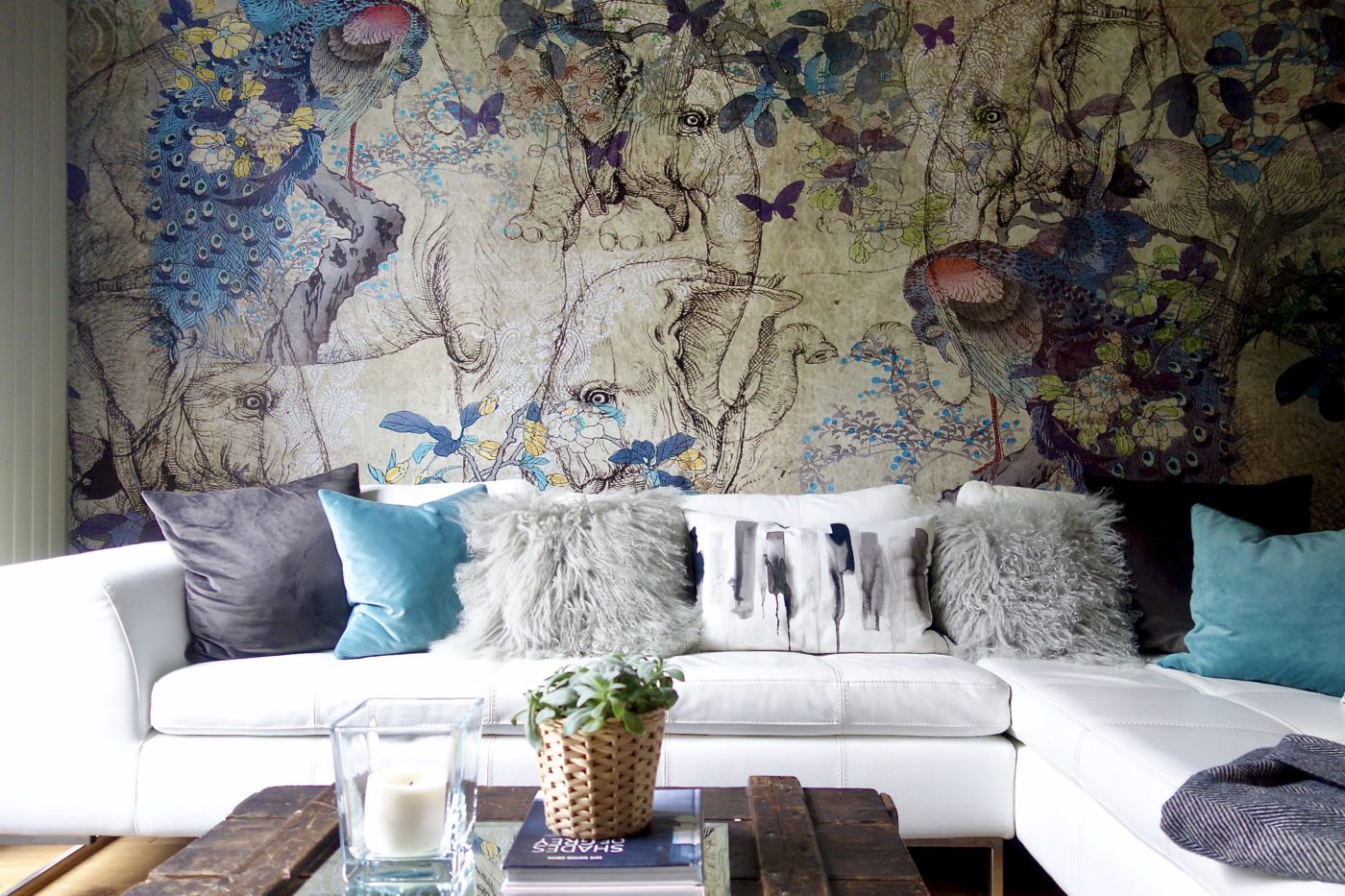
Finding colours that worked with both the oak floor and white leather narrowed things right down. Oak has strong yellow undertones, almost orange when it ages like it has done in this room. Whatever shade went on the walls, it needed to cool these warm tones down, but also had sit well with the white. The plan was a sage-y green. Little Greene’s Normandy Grey, as the name suggests is a grey based green providing a warm but neutral backdrop to the white, there’s enough of a contrast without it being overwhelming to be painted across the walls and ceiling. The lilac and violet details in the Rebel Walls Mural Cochin provide the third colour for this room – the accent colour.
Now for a bit more colour science…

Pocket Colour Wheel – showing a Triadic colour palette
You can see above how the Orange, the Green and Violet are equally spaced on the colour wheel above – this is known as Triadic colour palette. It’s the relationship and interplay between the three colour families that provide the balance and interest for this room. Orange tones from the oak floor, green from the walls and violets from the peacock feather accents in the mural design. Am I getting too technical now? Tell me if I am!
Anyhoo, here we were in July 2019 on my first visit…

Before

Concept

After – February ’20
I think it’s fair to say the Rebel Walls Mural Cochin has transformed this room. It’s really quite mesmerising. One of those where you the more you look at it, the more details you find. The abstract nature of the design and curving, merging lines of the elephants, birds and butterflies adds a softness to the square lines of the sofa and coffee table.

The “faded world” vibe mural with the elephants, touches of white, rattan and the old coffee table trunk all work to give this room a real colonial vibe.

The Dowsing & Reynolds Bubble Chandelier with the white frosted bulbs (definitely a client favourite at the moment) echoes the white sofa sat below. Both working together to frame the mural design that sits within.
White. Mural. White.
Like a mural sandwich.
Do you like my analogy there?

Before

After*
I would have loved to have painted these doors black to tie in with the woodwork detail and balance out the other end of the room (which you will see shortly). Alas the bars were sat inside the glazed units, purely decorative, so getting access to them with a paint brush wasn’t possible. The homeowners aren’t sure if they want curtains at the moment, so are leaving it like this for now. If curtains are added, I have suggested simple, black linen curtains to act as a frame and add some visual weight to this end of the room. Oh and there’s a floor lamp still to arrive too.
(* yes, I know this photo is a bit crap – I took it during those blooming storms last week and the light outside was baaaaddddd. I’ll try and get some better ones.)

Before
The glass media unit showcasing sheer cable mayhem had to go. So everything (I mean all the media boxes, beepers and TV gadgets) were all re-wired to the other side of the room. The TV set up is all totally wireless, so no need for IR remoting. Very clever.

So the corner that was originally a bit of a disaster, is now a lovely quiet spot to sit and look out over the garden and of course sit and admire the new mural.

The pretty armchair was bought by my client from Homesense. Originally destined for the master bedroom, it now sits here and I think it works beautifully within the new room design.

Before

After

Before
The quite frankly pointless balustrade is now gone – and what a difference taking that down has made, the room feels twice the size…

After
There are literally two steps down, a drop of about 35-40cm, so I had no issues with suggesting they take this out in order to open up the whole room. The top section now houses the drinks cabinet with the fabulous mural wrapping around so you get to see it when sat on the sofa too.
The mirror? Oh yes, it’s massive at 120cm diameter and was a total bargain from Melody Maison at £123!! Seriously, that’s an insanely good price for a mirror that big! And the best thing is that you now get to see two Bubble Chandeliers via the enormous reflection. Hoorah!

Oh and remember the rewiring of all the media and gadgetry? Well it’s all in this cabinet working wirelessly. Clever eh? I had nothing to do with that at all, I just asked if is was possible to move all of the wires and cables and have them set up somewhere not right by the TV. And it was. And now it is. Hoorah hoorah!

Pulling back a little, you can now see the door to the kitchen over to the right. See how their kitchen units are black and white? It was important that we connected that room to this one. The dark kitchen cabinets are painted in Little Greene Lamp Black, so this was the colour used to paint the woodwork and trim in this room. This gives a direct link from one room to another. It’s all about the flow and how to make your individual rooms feel like they connect. A lack of cohesion between spaces can really affect how you feel at home. Which is why when I do a consultation, I always do a full house walk around to have a proper nosey try and absorb as much as possible about your style, tastes and to make those links where possible, whether that’s with colour, shapes, use of materials, design styles and eras…

So that’s the full room tour. Apologies once again for the quality of some of the photos, the light really was awful. But I hope you’ve got a good feel for the room and a greater insight into the design and decision making process (that my brain decides to kick in with at 3am).
Original Concept

As ever, I’d love to hear your thoughts on this project. I know a large scale elephant, bird and butterfly mural isn’t everyone’s cup of tea, but it’s hard not to smile when you see it. I know I certainly did!
Huge thanks to Rebel Walls for gifting the mural for this project. It’s been a pleasure working with those guys. And as always, all opinions, words and images are my own. I only ever work with brands I love and think you guys will love too.
Wow this is an amazing transformation! When I saw the process photos on Instagram I wasn’t sure if the mural was my cup of tea but seeing all the elements working together, the room looks really fabulous. Nailed it!
Thanks so much Kathryn. It’s always so hard to judge something out of context. I’m really happy to hear the mural makes more sense now it’s in all together with the rest of the room 🙂
As soon as I saw that mural, I knew I’d love this room but wow, nothing prepared me for the incredible transformation! Your magic touch once again has delivered a masterpiece. What a beautiful space! Love the colour combination and how you worked in the seemingly disparate pieces (and your methodology behind how) to create such a stunning whole. Amazing work missus xxx
You’ve worked your magic here yet again Karen! I absolutely love it. The mural is fabulous, it’s like a big piece of art. Love the details such as the light, mirror and black door. What a lovely grown up space for your clients to enjoy now!
Thanks misses. I’m so glad you like it. And yes, the mural is totally like a room sized piece of art!!x
Thank you thank you! I’ll take masterpiece 😉
Am trying to dig deeper on the rationale for the choices I make. It’s as interesting to me as it is to you. Like i’m trying to unpick what is instinctive!
Thank you again xx
I love this room. The mural is insane.
I love this room. The mural is insane.
Ha. It is a bit isn’t it!?
It’s a lovely room and looks so much bigger without the rails! The sofa and flooring combination that you had to start with just blend in with the scheme, so clever
Thank you Jill!
Wow! Amazing transformation! Love everything you’ve done, but I think the wallpaper is my favorite part.
It’s cool isn’t it!? Thanks Lisa 🙂
This room looks like a proper grown-up room now! Amazing. I love the colours in the mural, and balancing it with the floor and that gorgeous sage green-grey is beautiful. You have a real bravery with your designs that I love – that mural is not for the timid, but it looks so right in that room. Congratulations!
Thank you. I’m so glad you like it Elaine. Certainly not for the timid – for sure!
[…] mural wall by makingspaces.net […]
Normally I’m not a fan of moody modern, but I flipping love this room – and that wallpaper! The black door really finishes the wall and selection of throw pillows is perfect. So elegant! You made a modest space look incredibly rich. I may have to wallpaper one wall of my living room now just to give it a taste of this vibe. My husband will hate you.
This mural is beautiful with colours that soothe, but the picture has so much movement in, its exciting. This post has given me a lot of inspiration (“too much inspiration” according to my boyfriend😂)! Thank you!
I ADORE this space. It’s so beautifully unique and balanced and STYLISH. I’ve been binge-reading all your blog posts for inspiration for my master bedroom! I’m struggling so much with wanting a feature wall that isn’t tacky! This is really beautiful!
Hi,
Wow, this is an amazing change!
I’m a fan as of today 🙂