All posts tagged: pantone

Pantone Living Coral

How to live with Living Coral – Pantone’s choice for 2019

Living Coral!? Well that was a nice turn up for the books wasn’t it? After the disastrous announcement of Ultra Violet for 2018, (so bad I didn’t even write about it) and Greenery back in 2017 (which I did write about, mainly because it meant I could add a picture of Kermit to my blog), Pantone have finally relented and given us something we can get our teeth in to for 2019. It’s a real pop. And not one for the faint of heart. But actually, Coral is one of the easiest colours to add into your interiors. Don’t believe me? Well, come and see how some of my brilliant colleagues from the Interior Design Collective have worked their magic with Pantone’s chosen hue for 2019. GREAT WITH BLUE Given the UK’s love of blue, partly because of the ease it fits our UK rooms (we have very blue, light here), coral is the perfect accent colour with blue as they sit opposite one another on the colour wheel, otherwise known as complementary colours. Now, …

Pantone 2017

Let’s talk about “Colour of the Year”

This post isn’t going to tell you anything you don’t already know. If you follow anything remotely interiors/fashion/media related, then you’ll already know what this year’s official “Colour of the Year” is. Ya know, by Pantone. Today’s post is to question what “Colour of the Year” actually means (and for me to have a little moan about it) because, although my husband is the most wonderful person I know, even he would struggle listening to me grumble on about this kind of stuff. But I know you guys will get it… Last September, Dulux UK released their chosen hue for 2017, “Denim Drift”. “Denim Drift is the must-have color of 2017. It is truly adaptable, fitting into all life and interior styles, making it the perfect choice for reflecting our new perspective for 2017.”   Blue and grey are hardly new but I do like “Denim Drift”, a grey-er, more versatile shade similar to Pantone’s release last year, “Serenity”. Remember that one? At the same time as Denim Drift’s release came “Starry Sky” from Dulux Canada. A …

The Office Refit – Final Reveal

Remember the office refit I was working on? Here’s a lil recap: “I’m working with Visibilis, an Integrated Digital Marketing Agency. It’s my first dip into working in a commercial premises, but it’s good and am enjoying the experience of scaling up! The team of staff has reached capacity at their current office space prompting the move to a new, larger purpose-built office space in a swanky part of Leeds City Centre.” Before And here it was in March. A huge empty space, ready and waiting for its lovely, new residents. A month later, the layout had been solved, colour scheme decided upon, furniture had been ordered… You can read more about the project brief, colour scheme, layout and shopping list here if you’d like to check out the finer details. But to catch you up quickly i’ll post a few pics to give you the low down. Lots of paint + A load of brushes…. …. + Frogtape…  + A design from inside my busy mind = Turned out pretty good. If I do say so myself. **performs frilly bow** At …

Pantone Spring Colours

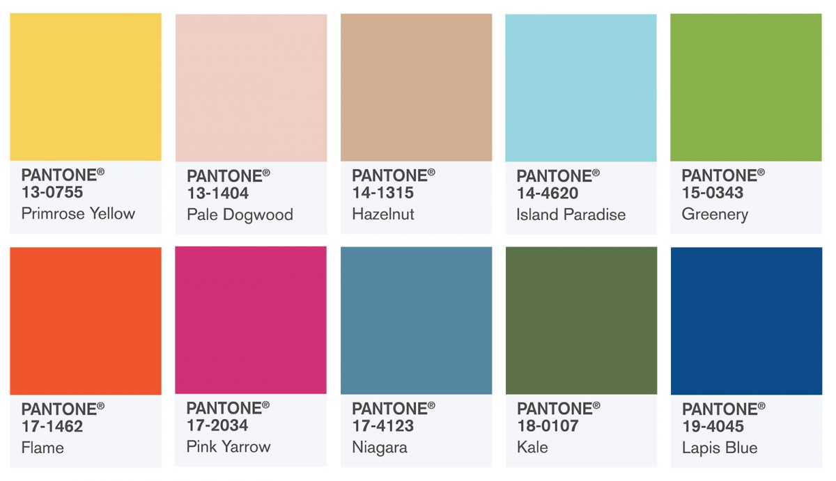
Remember I introduced you to Pantone’s Colours of the Year in January ? Since then i’ve seen Rose Quartz and Serenity popping up everywhere. From artwork to marketing, interiors and fashion, even influencing a current Making Spaces project. Pantone have since released their “colour report” for Spring 2016. A palette chosen by top industry experts to compliment and contrast both the blush pink and iris-y blue. “Like a serene sunset, flushed cheek or budding flower, Rose Quartz reminds us to reflect on our surroundings during the busy but lighthearted spring and summer months.”  “Weightless and airy, like the expanse of the blue sky above us, Serenity comforts with a calming effect, bringing a feeling of respite even in turbulent times. A transcendent blue, Serenity provides us with a naturally connected sense of space.” The “Transporting and Transformative”optimistic palette is no shrinking violet. This ten strong colour canvas is rocking some real stand out colours, ready to add a spring to your step this Spring 2016. As you probably know, I’m not the biggest “brights” fan for interiors. I love colour, but …

Pantone COTY – Styling with Wayfair

I’m sure you’ve already heard the news? Last December? Pantone’s Color of the Year (COTY)? Industry experts announced the colour for 2016 to influence all things fashion, interiors, art, culture etc. And for the first time ever, Pantone announced not one, but two colours. Twins. Surprise! A pastel blue with a hint of ice-y lilac. A feminine dusky pink. “Joined together Rose Quartz and Serenity demonstrate an inherent balance between a warmer embracing rose tone and the cooler tranquil blue, reflecting connection and wellness as well as a soothing sense of order and peace.” Leatrice Eiseman, Executive Director, Pantone Colour Institute Hmmm… My first thoughts weren’t great if i’m honest. You know i’m always honest. I’m sure you’ve cottoned on by now, I do like my bold colours and inky, jewel based tones. I don’t tend to play with pastels, making this year’s COTY’s tricky ones for me to get my head around. Always keen to find a solution to design quandaries, my next thought was, “Scandi”. Yes, that could work nicely. Adding a subtle hint of colour …