All posts tagged: Lesson

Monochrome Bedroom with pops of yellow

How to Connect your Rooms – Choosing a Colour Palette

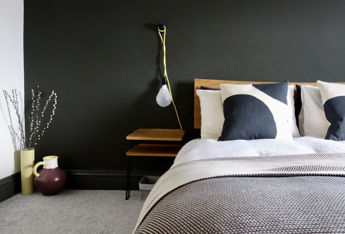
Hello everyone, I’m back this week with a little look at how to connect your rooms at home. What does that mean exactly? One of the keys to a successful home interior is having a sense of cohesion and “flow”. The rooms and spaces between should connect with the surrounding ones. For example, let’s say you’ve got three bedrooms on a floor, like most people and you want them all to have their own identity but also not look like a patchwork quilt from the landing, it’s good to consider how these spaces connect as a whole. Often, people run the flooring throughout to make the overall space feel larger. We all know that the less breaks in a colour or pattern, the better, as the eye continues further along the space. Flooring continues on from our loft bedroom to landing with no threshold to break the line’s eye. Another way to do is is choose a colour palette, and stick to that for a floor, even better, a whole house if you’re being really clever. …

Aula Coffee Table Made.com

What is negative space? Lesson 1.

I’ve mentioned this a few times over on Instagram of late, and I thought it was about time I explained what i’m actually going on about. Negative space isn’t a space that’s got “bad vibes, man”. Negative space is a good thing and every room needs it in order to function, to offer visual balance and to zone spaces. Eclectic Living Room Project The chimney breast was left clear, offering the room some negative space to balance out the alcoves, both of which were filled with furniture, mirrors, books and accessories. Positive space = the space that’s taken up with actual “stuff”; furniture, lighting, artwork, accessories…. Negative space = the “empty” space around and in between everything else, more often than not highlighting and showcasing everything next to it. Larry Eeles “The use of equal negative space, as a balance to positive space, in a composition is considered by many as good design. This basic, but often overlooked, principle of design gives the eye a “place to rest,” increasing the appeal of a composition through subtle means.” …