All posts tagged: colour scheme

Paint Paper Library Perse Grey

The Georgian Apartment – Progress Update

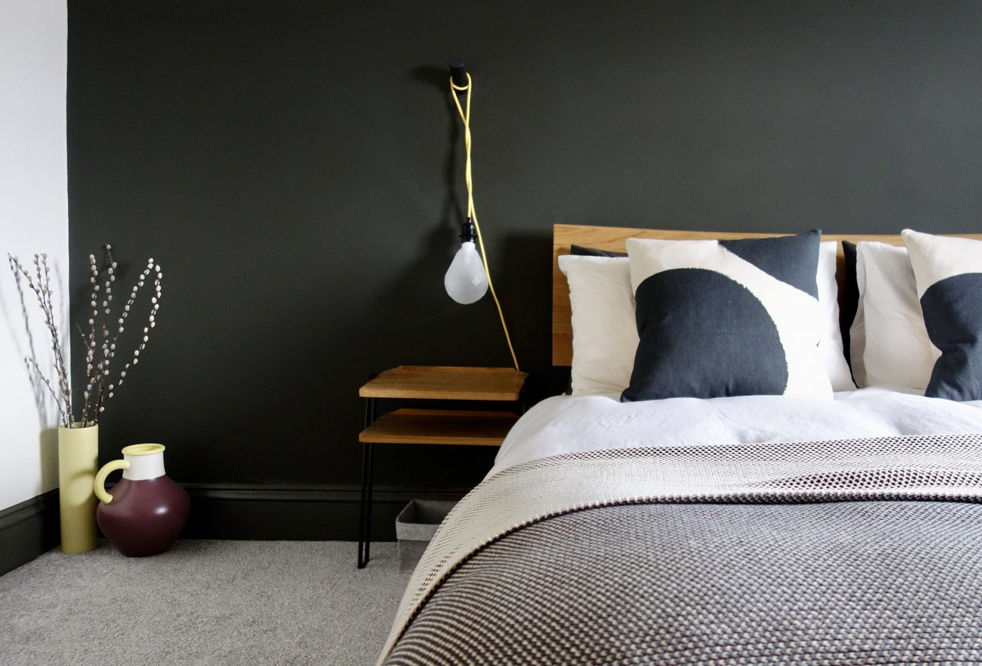
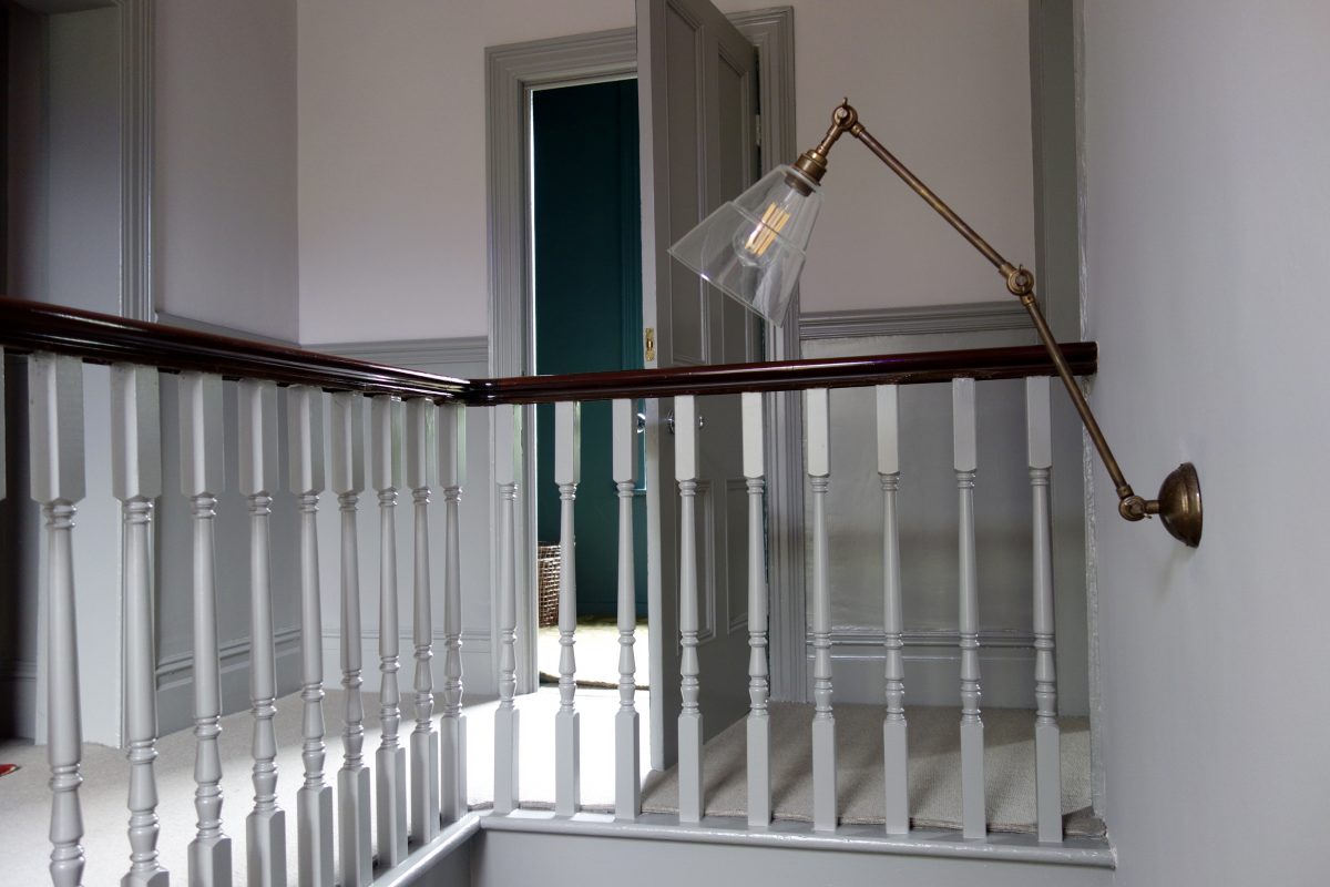
Hello hello! I’ve been away for a wee while after struggling to find the time to wash my own hair, never mind time to sit down and studiously write a blog post. I think three weeks has been the longest hiatus I’ve had since starting this blog back in 2015. And I suspect my posts from now on will become a little more sporadic than usual (especially over the school holidays – 7 weeks!!). Anyhooo, I’m back today with an update on one of my projects after a site visit on Friday morn. Remember the Georgian Apartment I was working on…? This be the one – read part 1 here if you like With the f’ugly blue kitchen My previous visit Well progress has been going swimmingly since my last visit, so much so that I wanted to show you some photos, because now one room in particular has been painted, it is looking rather special. And now The walls and woodwork are all in Paint and Paper Library’s Masque, the palest of greys. In …

Monochrome Bedroom with pops of yellow

How to Connect your Rooms – Choosing a Colour Palette

Hello everyone, I’m back this week with a little look at how to connect your rooms at home. What does that mean exactly? One of the keys to a successful home interior is having a sense of cohesion and “flow”. The rooms and spaces between should connect with the surrounding ones. For example, let’s say you’ve got three bedrooms on a floor, like most people and you want them all to have their own identity but also not look like a patchwork quilt from the landing, it’s good to consider how these spaces connect as a whole. Often, people run the flooring throughout to make the overall space feel larger. We all know that the less breaks in a colour or pattern, the better, as the eye continues further along the space. Flooring continues on from our loft bedroom to landing with no threshold to break the line’s eye. Another way to do is is choose a colour palette, and stick to that for a floor, even better, a whole house if you’re being really clever. …

Farrow & Ball Peignoir Worsted

Peignoir & Worsted

I could barely contain my excitement yesterday. I was off to visit the Masonic Villas project for the first time since the hallway, stairs and landing were given its new Farrow & Ball colour palette. I won’t lie. I did a little cry when I arrived to finally see it, worse still I found it impossible to leave… I just kept gawping. Truly beautiful. Please bear in mind, we’ve still got artwork and mirrors to hang, brass stair rods to fit and the final finishing touches to sort, but I thought it was only fair you got to see it. I mean, we’ve all been waiting so long to see F&B’s Peignoir and Worsted up on these walls haven’t we? **Major pic heavy post** Before After – Farrow & Ball’s Peignoir and Worsted Everything from the dado rail and below was painted in Worsted Estate Eggshell, including all the door frames, staircase and spindles. Everything above the dado was painted Peignoir Estate Emulsion. I didn’t want lots of fussy colour changes around all the detail like the picture rail, …