All posts tagged: colour palette

Bedroom Moodboard The Nude Room

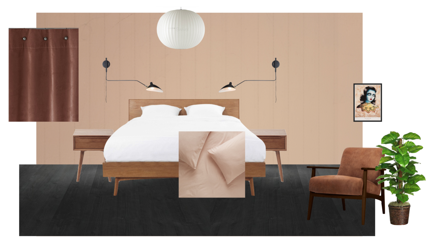
Our Bedroom Plans – The Nude Room

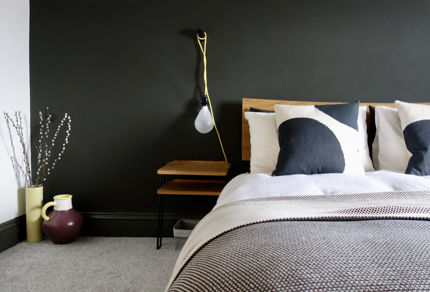
I’ve finally decided on plans for our bedroom. If you remember, I mentioned the bedroom was the next room i’d be switching up, here in this post where I showed you before and after pictures of our whole house. Our bedroom has always gotten lovely feedback, being featured in Real Homes magazine, by Abigail Ahern on MADE.COM and Apartment Therapy. So you know, this little room has certainly earned its keep. View this post on Instagram A post shared by Karen Knox – Making Spaces (@makingspacesnet) It’s been like this for over three years now, which is a long time for me to not fiddle with a room. But the one thing i’ve always found about this space is that it was a bit of a black sheep alongside  the rest of the house. Or teal sheep. Our home is “Monochrome and Materials”. It’s Scandinavian design inspired with a large helping of mid-century (because it’s a mid-century house). Whilst being neutral there is plenty of colour added with artwork, plants and accessories but for the fundamental scheme …

Colour Consult – Inspiration for your walls with Paint & Paper Library

I did a colour consult yesterday for someone that’s recently bought their own home. They’d always rented previously, so painting walls wasn’t an option and therefore not a concern. Now he’s got a four bedroom, three storey house to decorate and furnish, it’s not surprising he’s overwhelmed. We’ve already worked on his living room and it’s been completely transformed by choosing the right paint colour. I’m not exaggerating either. Will share some photos with you guys when the rest of the work is done. The Brits’ fear of colour Most people’s homes are off white, cream, ivory, dare I say, magnolia… there might be a feature wall somewhere or a splash of jazzy wallpaper in the downstairs loo, but generally us Brits are pretty scared of living with colour. I don’t just mean dark colours, but richer colours and pigments. Dulux nailed the Brit’s fear of colour with their infamous, still going strong, Natural Hints collection. Apple White, Apricot White, Jade White… see where i’m going with this…? We like colour, but only a little bit, …

Monochrome Bedroom with pops of yellow

How to Connect your Rooms – Choosing a Colour Palette

Hello everyone, I’m back this week with a little look at how to connect your rooms at home. What does that mean exactly? One of the keys to a successful home interior is having a sense of cohesion and “flow”. The rooms and spaces between should connect with the surrounding ones. For example, let’s say you’ve got three bedrooms on a floor, like most people and you want them all to have their own identity but also not look like a patchwork quilt from the landing, it’s good to consider how these spaces connect as a whole. Often, people run the flooring throughout to make the overall space feel larger. We all know that the less breaks in a colour or pattern, the better, as the eye continues further along the space. Flooring continues on from our loft bedroom to landing with no threshold to break the line’s eye. Another way to do is is choose a colour palette, and stick to that for a floor, even better, a whole house if you’re being really clever. …

Farrow & Ball Peignoir Worsted

Peignoir & Worsted

I could barely contain my excitement yesterday. I was off to visit the Masonic Villas project for the first time since the hallway, stairs and landing were given its new Farrow & Ball colour palette. I won’t lie. I did a little cry when I arrived to finally see it, worse still I found it impossible to leave… I just kept gawping. Truly beautiful. Please bear in mind, we’ve still got artwork and mirrors to hang, brass stair rods to fit and the final finishing touches to sort, but I thought it was only fair you got to see it. I mean, we’ve all been waiting so long to see F&B’s Peignoir and Worsted up on these walls haven’t we? **Major pic heavy post** Before After – Farrow & Ball’s Peignoir and Worsted Everything from the dado rail and below was painted in Worsted Estate Eggshell, including all the door frames, staircase and spindles. Everything above the dado was painted Peignoir Estate Emulsion. I didn’t want lots of fussy colour changes around all the detail like the picture rail, …