All posts filed under: Decorating

The Mulberry Red Room (and other rooms) – Final Reveal

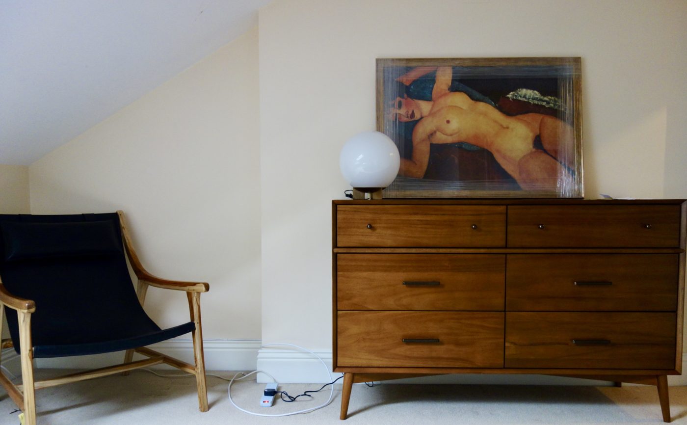
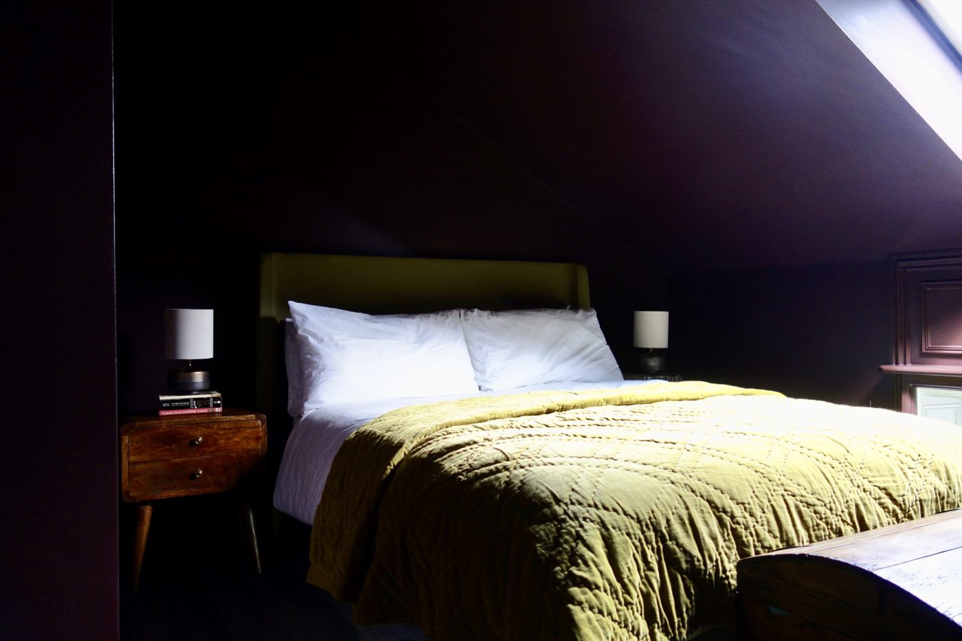
Not one, but three spaces to reveal to you today, the first one being the Mulberry Red Room. Let’s go! If you remember the last time I shared the Mulberry Red Room, back in Feb, it was very nearly done. We were awaiting the arrival of the bed and some smaller, finer details to be completed. The whole concept for the room was based around the large framed Modigliani poster which the homeowner had bought especially to hang in this room. The burgundy red backdrop for this rather provocative piece was the starting point for the room with the rest of the details following suit quickly after. Let me show you the completed room: Walls, woodwork and ceiling in Abigail Ahern’s Mulberry Red Lampex Opal 3 Drum Pendant – Wayfair One thing I should tell you about this client, is that he doesn’t like faff. I wasn’t allowed to do nic nacks, no superfluous items, no unnecessary decoration or styling. I was allowed to bring a plant or two. And that was that. He likes …

Paint Paper Library Perse Grey

The Georgian Apartment – Progress Update

Hello hello! I’ve been away for a wee while after struggling to find the time to wash my own hair, never mind time to sit down and studiously write a blog post. I think three weeks has been the longest hiatus I’ve had since starting this blog back in 2015. And I suspect my posts from now on will become a little more sporadic than usual (especially over the school holidays – 7 weeks!!). Anyhooo, I’m back today with an update on one of my projects after a site visit on Friday morn. Remember the Georgian Apartment I was working on…? This be the one – read part 1 here if you like With the f’ugly blue kitchen My previous visit Well progress has been going swimmingly since my last visit, so much so that I wanted to show you some photos, because now one room in particular has been painted, it is looking rather special. And now The walls and woodwork are all in Paint and Paper Library’s Masque, the palest of greys. In …

Benjamin Moore

Benjamin Moore #paintlikenoother

Sorry for not posting last week. I’m sure you were all refreshing your inboxes every 30 minutes wondering where my weekly post was? Call off the search party everyone, i’m fine, if a little stiff around the ole joints. I’ve done the equivalent of 39 step classes this weekend, working hard on the decorating of our bedroom makeover. Remember our proposed new bedroom colour that divided opinion? Nude Bedroom – Moodboard Now let me make it clear from the off so the ASA don’t come and arrest me, I was gifted the paint for this project. BUT I chose the paint and colour, Benjamin Moore‘s ‘Fox Hedge Tan’, before i’d secured a collaboration. I’ve been wanting to try Benjamin Moore’s paints for ages and always prefer to try new products in my own home before recommending them to others to try in theirs. After i’d bought a tester and settled on the colour, I emailed Benjamin Moore to see if they’d let me review their paints on the blog in exchange for a few litres of …

Project in progress

Project in progress… The Mulberry Red Room

Hello there, wasn’t sure if i’d make it onto the blog this week, but i’ve managed to squeeze a little one in.  I’m catching you up on another project. It’s the master bedroom of a house i’ve been working in for about 10 months now. The homeowner moved from a flat into a four bedroom Georgian property. The plot this beautiful stone built house sits in had been bought by developers, the property then chopped to make three individual houses. From the outside it’s beautiful and full of character, but internally, it was somewhat lacking so we’ve been working hard to bring it back to life. Living Room in Little Greene Grey Stone We’ve just about completed the living room (still got to take proper photos of that) and made progress on the stairs, landing and guest bedrooms but now we’re onto the top floor. This is (was) the master suite, on the second floor set in the eaves of the house. Can you see what would have originally been the real height of the ceiling …

Pantone Living Coral

How to live with Living Coral – Pantone’s choice for 2019

Living Coral!? Well that was a nice turn up for the books wasn’t it? After the disastrous announcement of Ultra Violet for 2018, (so bad I didn’t even write about it) and Greenery back in 2017 (which I did write about, mainly because it meant I could add a picture of Kermit to my blog), Pantone have finally relented and given us something we can get our teeth in to for 2019. It’s a real pop. And not one for the faint of heart. But actually, Coral is one of the easiest colours to add into your interiors. Don’t believe me? Well, come and see how some of my brilliant colleagues from the Interior Design Collective have worked their magic with Pantone’s chosen hue for 2019. GREAT WITH BLUE Given the UK’s love of blue, partly because of the ease it fits our UK rooms (we have very blue, light here), coral is the perfect accent colour with blue as they sit opposite one another on the colour wheel, otherwise known as complementary colours. Now, …

Munich Project After Farrow & Ball Downpipe

When remote design works… And why…

I wrote a post last year about the pros and cons of E-Design; what remote interior design actually was, how it works, who it’s right for, because it’s certainly not for everyone. Today I wanted to show you some images from three remote projects i’ve worked on over the past year… and talk about why they turned out as well as they did. The London Flat The is the newly acquired apartment of a young, recently married couple. A couple who couldn’t quite decide on how to put their stamp on their new home. Having differing tastes and a limited budget to completely re-do a living space, dining area and kitchen, this blank canvas left them feeling a little stuck. So we started with a two hour remote consultation, which is how all of my projects, either remote or physical begin. A two hour remote consultation works like this: First hour – I go through photos, floorplans, and Pinterest boards you’ve collated, and of course your brief. You have to gather and supply all of this …

The Loo. Toilet. Whatever you call it, our WC gets a makeover

It’s often the most overlooked room of the house. Not even big enough to warrant its own basin, mirror or any extraneous faffing. The separate bathroom and loo combo leaves a lot of people with a space that’s not big enough to swing a small hamster, never mind a cat. This is our first floor layout… since we had the loft converted and sacked off the second smallest room in the house for our dream staircase. You can see on the floorplan, our bathroom and WC are two separate spaces. And despite most people’s preference to knock these spaces into one to make a larger family bathroom, we didn’t want to do that with the house only having one loo when we moved in. And actually, I still prefer the layout like this. I like not having the loo in the bathroom. Especially with a five year old in the house whose aim isn’t always 100% accurate. Sure, our bathroom isn’t large, but for a family of three it’s more than adequate. More so now …

Black Parrots Studio Painted Wallpaper

‘Painted’ Wallpaper from Black Parrots Studio

About 2.5 years ago I wrote a post about how I was looking for just the right wallpaper to hang in our living room. It’s not a big space, so didn’t want a pattern on all four walls, but something to sit behind the sofa. The gallery was ok for a bit, but I knew deep down that there was way too much art in this room. It was time to downsize. Our house is late mid-century, built in the late 60’s so the proportions reflect that. We don’t have high ceilings, or period features, our rooms are pretty average, size wise. This meant finding a wallpaper was actually really difficult as it couldn’t take anything too busy, but it also needed to do “something” design wise in order to live up to the other walls in the room that are covered in some of my favourite pieces of art. View this post on Instagram A post shared by Karen Knox – Making Spaces (@makingspacesnet) What i’ve been looking for: A black wallpaper – almost …

Colour Consult – Inspiration for your walls with Paint & Paper Library

I did a colour consult yesterday for someone that’s recently bought their own home. They’d always rented previously, so painting walls wasn’t an option and therefore not a concern. Now he’s got a four bedroom, three storey house to decorate and furnish, it’s not surprising he’s overwhelmed. We’ve already worked on his living room and it’s been completely transformed by choosing the right paint colour. I’m not exaggerating either. Will share some photos with you guys when the rest of the work is done. The Brits’ fear of colour Most people’s homes are off white, cream, ivory, dare I say, magnolia… there might be a feature wall somewhere or a splash of jazzy wallpaper in the downstairs loo, but generally us Brits are pretty scared of living with colour. I don’t just mean dark colours, but richer colours and pigments. Dulux nailed the Brit’s fear of colour with their infamous, still going strong, Natural Hints collection. Apple White, Apricot White, Jade White… see where i’m going with this…? We like colour, but only a little bit, …

Monochrome Bedroom with pops of yellow

How to Connect your Rooms – Choosing a Colour Palette

Hello everyone, I’m back this week with a little look at how to connect your rooms at home. What does that mean exactly? One of the keys to a successful home interior is having a sense of cohesion and “flow”. The rooms and spaces between should connect with the surrounding ones. For example, let’s say you’ve got three bedrooms on a floor, like most people and you want them all to have their own identity but also not look like a patchwork quilt from the landing, it’s good to consider how these spaces connect as a whole. Often, people run the flooring throughout to make the overall space feel larger. We all know that the less breaks in a colour or pattern, the better, as the eye continues further along the space. Flooring continues on from our loft bedroom to landing with no threshold to break the line’s eye. Another way to do is is choose a colour palette, and stick to that for a floor, even better, a whole house if you’re being really clever. …