
Hello everyone, it’s been photoshoot central of late so i’m back with my second post of the month. It’s another final reveal post, plus I’m sharing some tips on how to add personality to a new build property.
The homeowners, a young couple were keen to put their stamp on their new four bedroom home so contacted me to help them with the ground floor. We worked together remotely during lockdown Mk1, me finally visiting for the first time in summer 2020 once the project was underway.

Before
I’ve written before about how new builds are some of the hardest properties to re-design as there can be very little to be inspired by. There are no fireplaces, chimney breasts, no alcoves or nooks and crannies to build shelving into, no high ceilings or period features such as cornice, dado and picture rails. The rooms in a new build are often purely functional, rectangular rooms which have been kitted out in low-mid range fixtures and fittings.
One of the reasons people opt for new builds is because they either don’t want to or don’t have time to renovate. They don’t want the hassle of stripping walls, restoring fireplaces and sanding floorboards – they want to move in, maybe paint a bit, hang a bit of wallpaper, put up some artwork and get on with their lives. Fair doos. I’ve certainly got clients who wished they’d bought a new build when they realise their period house is going to take them 10 times longer than they thought to have it exactly as they want it.
One thing I don’t think you should do however (and I do see this quite a lot) is try and make a new build look like a period property. Nearly everyone’s Pinterest board (the ones I see) are full of period properties for inspo, despite them living in a 60’s terrace, a 1980’s bungalow or a swanky new flat. The earliest period I’d draw from for a new build is Mid Century and that’s because the scale of furniture and those clean lines are right for new build size spaces with 2.4m ceilings. Other designers may disagree with me here, but for me, that’s what feels right. If you’ve not read my post on Scale and Proportion yet, it’s a good one to bear in mind.

Before
As you can see from the pics, the kitchen in this property was fine. It wasn’t really their cup of tea (or mine), but it was only three years old and too good to rip out. In fact, the kitchen was changed very little, but we definitely improved the space with some super simple tweaks.

Before
The dining furniture from their previous house was too formal for this space, so that needed to go (as did the lighting above it, that TV bracket and those vertical office blinds). For small dining areas that share the space with a kitchen, don’t go for high backed dining chairs, they take up too much visual space. These kind of chairs are much more suited to a dedicated dining room.
Everything else was staying including the cream tiled floor which ran from inside the hallway to the kitchen and rear utility space and downstairs WC. It did make the room feel quite cold and clinical and wasn’t good for the room’s acoustics but we worked with it as best we could. Here’s what we did…

After
The key word here is LARGE. Large rug, large light. It’s a sure fire way to make a ‘meh’ space look very cool. A rug was a must have item, because it:
- softens
- warms
- adds colour
- adds pattern
- adds texture
- absorbs the sound which improves the room’s acoustics which positively affects the vibe of the room
Rugs are great. If you’re thinking of getting one to go underneath a table, then make sure you get one that’s big enough; 190 x 290cm minimum. If you pull your chair out to sit down and it’s not still fully on the rug, then that rug is too small. Them’s the rules.

Kitchen Mood Board
My client’s Pinterest board for this space was full of dark blue kitchen units, which we didn’t have. Yes, we could have possibly painted the door/drawer fronts, but it’s not cheap to paint a kitchen you know. It’s about £100 per front/panel to get a good quality finish which would have been over £2k. So instead of mourning the fact we didn’t have their lovely dark blue kitchen of dreams, I splashed that colour all over the walls instead. I went with everyone’s favourite; F&B’s Hague Blue, colour matched to a washable Dulux finish and the ceiling is in F&B’s Dimity which was a pretty good match to the kitchen. If you are painting a room from light to dark, please don’t leave your ceiling in pure brilliant white. It’s too stark a contrast.

Wooden shelving providing some open storage and visual interest on what was a plain wall – #shelfie

Before
If you can’t afford to update your kitchen fronts or re-paint them, then handles are an easy and cost effective way to give it a mini make-over. It’s like taking your trusty old little black dress and making it look totally different by switching up your jewellery. These walnut and brass handles (along with the shelves) added some much needed wood grain to the room. A more tactile choice and one that picks up on the warmth of the dark stained dining table and other woods that feature throughout the ground floor. The light kitchen units and cream tiled floor were calling out for some deeper tones to offset it all.

So much better
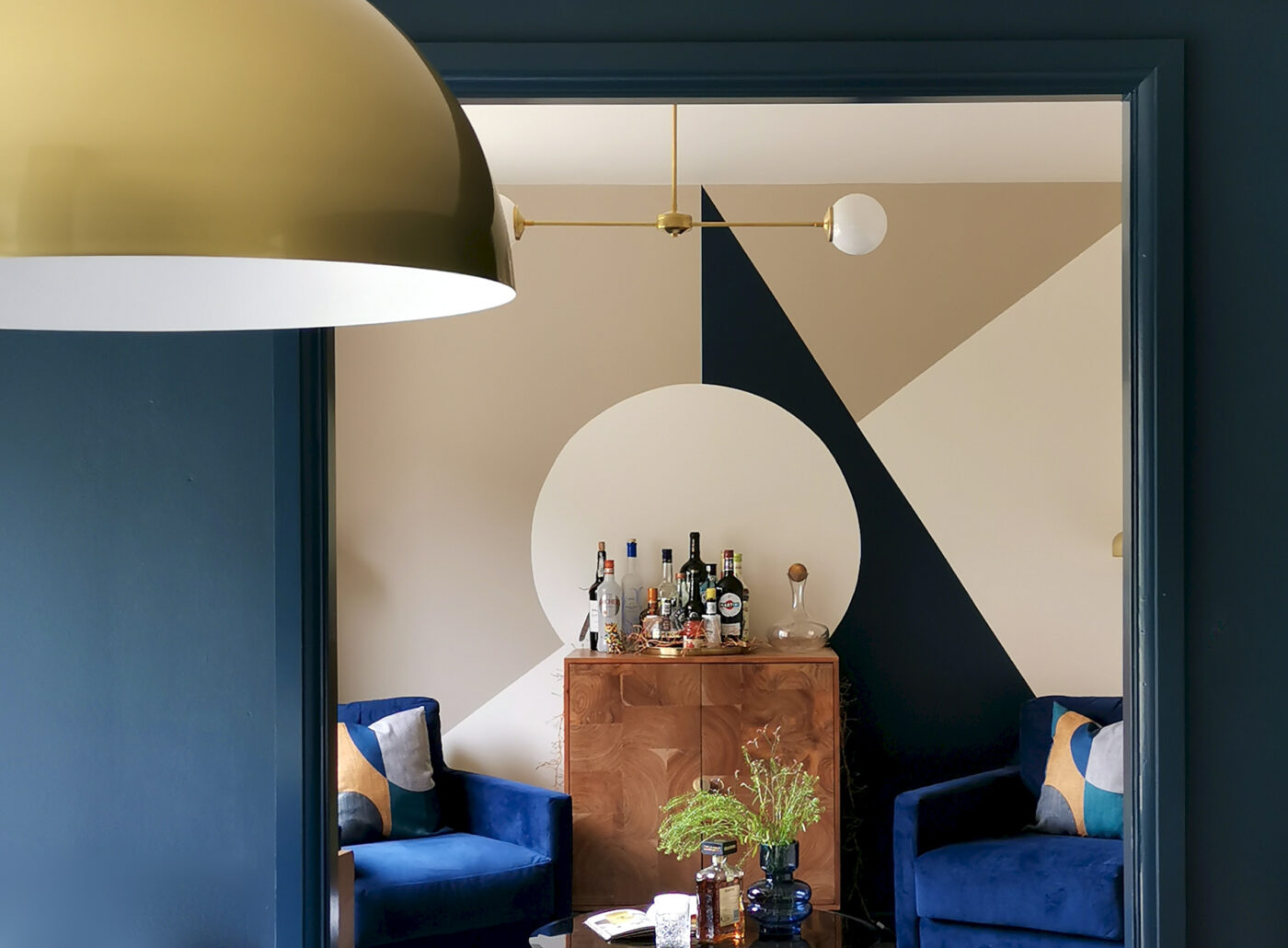
The double doors that lead into the Snug were removed (after a bit of convincing) and the paint design on the back wall of the Snug became a piece of art, all nicely framed by the old door architrave. By drawing your eye towards the back of the adjoining room, it makes this whole space feel soooo much bigger. There’s something called “shared space” between rooms – the passing space between one room and another. Doors block and eat up that shared space. But by removing the doors you don’t really need (the ones you never close) you gain back that shared space making the individual rooms feel slightly bigger and brighter that they actually are. Magic.

Walnut and Brass Handles

Brass Pendant Light – Pooky
The large brass pendant light is exactly what this space needed. An average sized light here would have been pretty boring. This one says, “look at me, i’m so beautiful and confident and I cast light all along this lovely table”. I did actually hear it say that.

Before
There wasn’t a lot to work with here, in fact the only thing staying was the carpet. This space was to become The Snug. A space to sit, chat, have a drink, play records etc. I believe this space is also used for the lady of the house to practice her Yoga.

The Snug – After
Because of the Yoga, the pendant light couldn’t hang very low for fear it being whacked by moving Yoga arms. So instead of it being large and low, we went large and loooong. Oh and for those who are wondering, yes, the coffee table gets moved to one side when it’s time for downward dog.

Painted Mural in F&B’s Dimity, Smoked Trout and Hague Blue (all colour matched in Dulux)
The asymmetric paint design whilst offsetting the symmetry of the furniture layout provides just enough detail to give this space its own identity… whilst simultaneously complementing the kitchen.
I can confirm that the drinks cabinet is 100% full.

Wall Lights & Ceiling Light – Spark & Bell / Vinyl Cabinet – La Redoute
The wall lights on either side of the opening were fitted at a jaunty angle to mimic the diagonal lines of the painted mural opposite.

So there it is, a good example of how to change the feel of a space without actually changing very much at all. It’s all about choosing pieces and colours that will:
- work with what you already have and
- give you the greatest impact
If impact is what you’re after that is…
Anyhoo, I’ll be back soon with the final reveal of the living room from this property. It’s a great before and after with some super special bespoke cabinetry that I can’t wait to share.
LOVE! LOVE! LOVE! What an amazing transformation:-)
Ha. Thank you very much Kate!! 🙂
LOVE! LOVE! LOVE!
As always a dynamic improvement Karenxxx
Many thanks!x
Ugh I’m obsessed with your work!
Haha – that made me laugh. Thank you!
I love your work Karen, and your advice. And your jokes.
Ah thank you Catherine. I’m glad i’m the only one that thinks i’m hilarious 😉
Fabulous transformation Karen. Easy when you know how heh.
Are you able to share where the walnut handles are from please?
Looking forward to the next update 😍
Thank you! 🙂
The handles were from Etsy – https://www.etsy.com/uk/listing/709656347/2-color-natural-wood-brass-door-knobs?
Wow! What a transformation! Just love all the tips. I learned a lot from this post. Thank you. Jean
Thanks Jean – really appreciate that. I’m glad it was helpful!x
Aaaaaaand this is why Karen is booked through the end of the year. Gorgeous.
Ah cheers Vickie – that’s lovely of you 🙂
Another fabulous transformation! It’s nice to see how to do a renovation/refresh when there isn’t the money to redo newish floors and kitchen cabinets. And that dining area light is perfection.
Thank you very much! 🙂
Love the light, and great transformation. Been looking for something like this for my kitchen / diner over my table. Can’t see it on pooky though. Bit worried wheter it would cast enough light though as have similar smaller pendant over my desk and not really bright enough. Maybe due to max wattage allowed?
Looks like it’s sold out then. It’s been a year since it was bought. Defo try a better bulb for your own light – a clear glass one. Shouldn’t be an issue with wattage now if you’re using an LED bulb as they’re all give off so little energy. Good luck!
I looked also for the light pendant, 😞😞😞. They seem to be pushing something very similar
Wow! I would definitely buy a book with all your designs in – just brilliant!