
Again, again, again…

Another final reveal. Yay! It’s been a busy time for photos, styling and all that shenanigans over the past several weeks. Today we’re back to see the final reveal of the Garden and Boot Room which leads off the kitchen you saw last week:


Victorian Cottage Kitchen – Final Reveal

Before
The brick wall you can see here is the original exterior wall of this Victorian cottage with a timber framed, single skin conservatory built onto the side. This space was originally going to get knocked down, rebuilt and extended as part of a big remodel which involved opening up this wall into the kitchen to provide a large open plan kitchen, diner, living space. But alas due to budget and planning constraints (and the fact we actually managed to give the homeowner the kitchen of her dreams without the need for oodles of structural work or an expensive extension) this room remained. It was a space that was sitting unused and a little neglected, so it was time to give it a purpose and reason to be.

Suggested layout and floorplan

Rough concept for The Garden Room
The homeowners run a small holiday let and are currently in the midst of converting and building another two bedroom holiday cottage in their attached outbuildings. You can read more about that project over here.

And now
(with Bobbi the pooch and building works outside)
This door you see here is the main rear access to the property from their substantial gardens, driveway and outdoor space. Now it’s become the guest entrance for for people to check in for their mini vacations. The Garden Room not only looks out onto the beautifully landscaped surroundings, but it acts as the perfect reception area for the holiday cottages.

Before
Before, this room was earmarked as the “special occasions” dining room. Those occasions that required more than four or six seats around a kitchen table. But apart from the view from the windows, this room wasn’t quite cutting the mustard, especially now the new kitchen layout allows eight to sit and feast around the new farmhouse table.

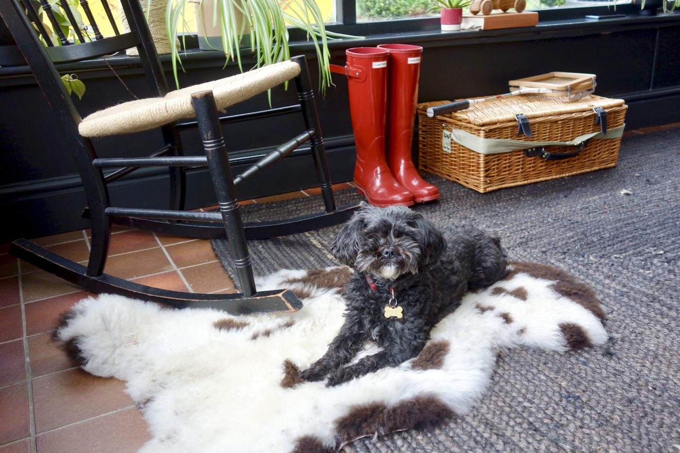
After with vintage rocking chair
In its new incarnation, the room feels warm, rich and welcoming. And all we really did was:
- some remedial work that needed doing anyway
- paint
- buy a couple of pieces of furniture old and new
- and use some clever styling tricks to hide and “disguise” some of the less desirable interior features

Before
Large oak table, chairs and bench that were barely used, but took up the majority of the space. These were sold and the money raised from them was put back into the pot for this room.

After
There’s now plenty of space for the homeowners and visiting guests to sit and relax. Admittedly the view isn’t quite as beautiful as it will be once all of the works are done. The skip sure did ruin my photoshoot. I mean I can use a plant or two to cover most “issues” but a skip? I’m not that good!

Before
The original cream scheme just looked a little “meh” in this space. It needed a kick in order to bring it on a par with the newly designed kitchen space.

After
As I’ve written many times before on these pages, black is a magical colour. It acts as the perfect foil to whatever sits in front of it. And this room didn’t actually have that many walls as three of them were mainly glass. So by painting out the walls and woodwork in Paint and Paper Libray’s New Black, it both framed the greenery that surrounds this room but also hid a multitude of sins.

The dark walls help to hide some of the necessary cables and pipework that run down the side of the brick wall. Any cabling or pipes that were now obsolete were disconnected, the light switch was rewired into some conduit and a full length shelf now runs across the back wall;
- to add interest with plant pots and greenery
- to disguise the cables and boxing in that runs behind all of those plant pots
- to give your eye something to hook onto, taking it upwards towards the ceiling

The ceiling was painted the same colour as the ceiling in the kitchen, next door, but the timber beams were pained in black in order to make a feature of the basic structure. It adds a slight cottage-y vibe, but painted in black, I reckon it looks pretty cool.

This room is split into two as it has an exposed brick wall dividing the room. The opposite side (which is smaller and leads to a downstairs WC) has now been turned into the family’s boot room.

Before – an empty space used as a corridor to the downstairs WC

After – The Boot Room
A large bench sits by the window with storage for garden blankets for guests to use during their stay if they so wish.

Before

After
The large salvaged shelving rack provides ample shoe storage for the family whilst also looking very cool.

Before
The stench pipe obviously needed to stay, so it was boxed in, skimmed, painted over and a gallery wall hung to make a feature of what was originally a bit of an ugly space.

After
A coat rack was fixed to the brick wall and a free standing vintage mirror placed in the corner. This little area not only works brilliantly but now it looks slick as. I really love it.

Before – with Boris the (naughty) pooch

After
The artwork for this area was chosen carefully. It is one of the first things new guests will see upon their arrival. Karen, (the homeowner) has hens. Lots of them. All called Barbara. And with the Ikea EKTORP Sofa having lots of red in, this piece called Ofeilia by Sofia Bonati was perfect for this room.


So there you have it, the final reveal of the Garden and Boot Room. Just because a space has to be practical and perform quite pedestrian functions doesn’t mean it can’t look good, make you smile and be a space you want to hover in slightly longer than necessary.

And here’s a sly pic I took of my client sitting in her favourite spot, having a relaxing gaze out onto the garden…. just before she spots Boris (the naughty pooch) eating fish and chips out of a packet in the skip. Living the Yorkshire dream.
Oh and if you look very closely, you can see through the open door into the kitchen, with its brick formation tiled wall and exposed beams. An interior designer just doesn’t choose paint colours, artwork and cushions, we make connections between the rooms themselves, and the people that live there, we tell stories and give people something to talk about. I find this oh so important when designing, it’s never about just choosing stuff. There is always a reason and a backstory for each decision and it’s the backstory that gives a room authenticity and character, making it feel like it’s always been there, which is how all rooms at home should feel.
Really hope you guys like it!
Oh Karen, you’ve flippin’ well done it again….it’s looks amazing 😉………I def need you in my life!
Relatively small changes…huge difference. Must say homeowner looks really chilled in her new surroundings. Well done you.
Hi Karen, It’s never a surprise to see that you’ve absolutely nailed it! Why does anyone have white radiators. I lick of black paint works wonders. Not making it invisible, but making it look deliberate. Small touches like this amongst all the larger glorious changes are on point (as my son would say!)
Hello,
I’ve only just recently found your site/blog. Absolutely wonderful designs and transformations! Enjoying it very much! Though I must say, personally, I think your masterstroke is how you’ve succeeded in colour-coding the beige, carpet-matching-dog into the black of the painted brickwork. Quite extraordinary.