

Time to introduce you to a new project today. It’s a two bedroom apartment situated inside what was once one of the many impressive mansions built in Leeds, 300 years ago. This Georgian property certainly has the scale and proportion you would expect from this period. Just looking at this photo from the recent sales listing, you can see there is a real gem waiting to be loved, revived and restored.

The new homeowner is VERY keen to get the works done as quickly as possible, understandably. But as ever, i’ve had to put the brakes on a little in order to give this special building what it deserves. Because, whoever fitted this kitchen was clearly high on solvents:

Who on earth would fit a blue formica kitchen in a Georgian mansion? Definitely someone from the late 80’s early 90’s me thinks….
Here’s the apartment’s original floorplan to give you an idea of what rooms and spaces we are working with and how they all relate:
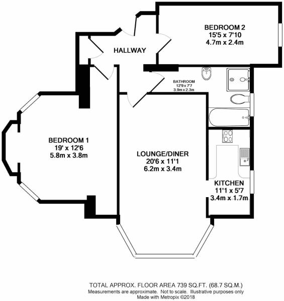
As you can see, the floorplan suggests there would have originally been three or even two large rooms, but it’s since been chopped up with internal walls and doors to form this two bedroom apartment. Probably during the late 60’s early 70’s based on the proportions and questionable choice of skirtings and architraves and other random mouldings. Fitting a 4″ skirting board in a Georgian room with 3.6m high ceilings should be a punishable offence. Leave it with me, i’m working on it….
Anyway, the wall between the kitchen and living space was the first to be knocked down. In fact, that was already down on my first visit and a steel put in its place.

So that was that done and the living/dining space was now a living, dining, kitchen space. Much better. But having three spaces all within view of each other meant that each space needed additional consideration. Originally, the new homeowner was going to leave this weird step in the HUGE bay window as was. Have a new carpet fitted and probably some kind of hard flooring in the kitchen. So that would have been three different floorings in one space.

So I said:
NO. No to that. One flooring please. Take that step out, the room isn’t big enough for an unnecessary divide. We will use furniture, lighting and rugs to zone each space, but the flooring must be the same to allow for a sense of continuum and shared space. It also allows you to move the furniture around more without being restricted by unnecessary change in floor level.
So the flooring was agreed and in fact it’s going to run directly through from the front door. A grey oak vertical board running from the front door all the way to those bloody gorgeous bay windows where the dining table will be.

In fact, would you like to see my newly suggested floorplan?

Ignore the other rooms for now, as we’re focusing on the living space and hallway at the mo. You can see on the above drawing that i’ve suggested taking down a rather oddly placed wall in the entrance hall. By removing this metre of wall it will immediately make the entrance feel more spacious and improve the light levels. The ceiling had also been lowered to 2.4m, making it feel like a cave in there.
Not cool. So I said:
Hey, how about knocking this wall down here and getting rid of this ridiculously low and unnecessarily 70’s ceiling?
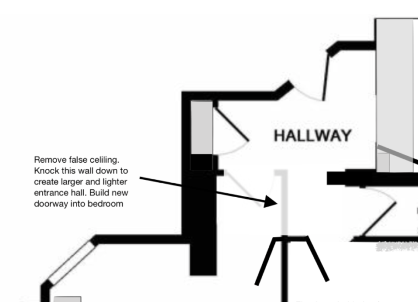
Turns out he loved that idea too (yes!!) so much so, a week later, on my second visit where I went to chat through my design for the living space and kitchen it was already down and new studwork up for the new entrance to the bedroom.

That’s an extra square meter of floorspace, originally just wasted and un-usable in the bedroom, but it’s going to make such a difference to this small entrance hall, I promise!

Can you see on the floor where the old wall would have been? That wall made it feel like a tunnel here and blocked light from the master bedroom. And now it’s all open it just feels so much better. NEVER underestimate the value and liminal spaces. Those spaces we pass through on our journey to somewhere else, they are as important as any other room and have a huge impact on how we feel at home. Shit hallways make us feel just that. Shit.

And here’s the ceiling, all pulled down. Hoorah! You can see where it was originally and where it once would have been. Now we’ve got the height back in here, it means we can play around with super cool lighting. Exactly what hallways were made for no!?
So to end today’s project intro, i’m going to show you what the plans are for the kitchen/dining spaces, design wise. I know you’ve seen the overall layout already, but here are some visuals to help you see where we’re headed…

Dining area in bay window
The ceiling has gone dark! Yes I know. Controversial for those traditionalists out there, but I wanted to flip this room on its head. The ceilings are SOOO high, I mean, you could build a mezzanine in here, that I actually wanted to try and bring it down a little, visually to make it feel more cosy and less like a ballroom. By painting the ceiling in Paint & Paper Libray’s Perse Grey, it’s going to add so much drama without needing to actually do that much else. Which is brilliant when you are working on a period property of this scale on a modest budget. I’m so very excited to see this for real. It’s going to look reet good.
Here’s the kitchen concept….
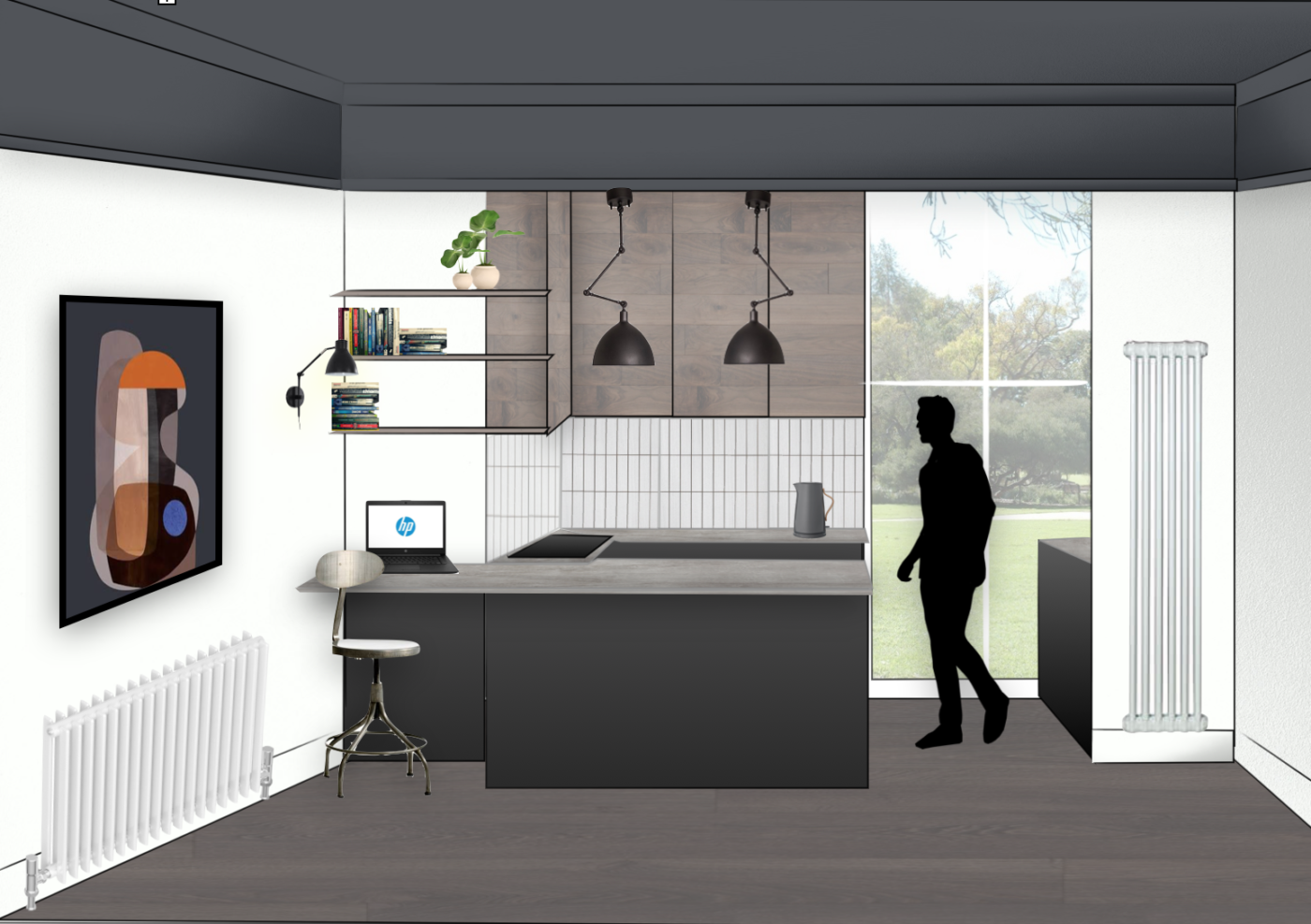
Open plan kitchen with small work space

I’m so pleased the homeowner got me on board early doors as his original plan was to fit a white gloss kitchen. I actually joked with him during the consult about the worst thing him doing would be to fit a white gloss kitchen **cue awkward pause**.

So I said:
You have these HUGE windows and are surrounded by greenery and nature, you want to be bringing in natural materials and texture, not glossy, synthetic surfaces. Let’s go graphite matt for the base cabinets to echo the ceiling and use a wood finish for the high level wall cabinets to connect with the great outdoors. Then we’ll add a stone, concrete effect worktop to add movement and soften the link between the two cabinet materials.
I have no idea if those were my exact words btw, but it sounds like something i’d say. And luckily he was totally on board with the whole idea. Including the dark ceiling. Get the flip in.
So that’s your lot for today. As always i’d love to hear your thoughts in this new chunky project. I’m also working on the bedroom and hallway at the moment so will hopefully be back soon with more updates to share.
THAT is a gorgeous flat! I’m really excited about seeing this one finished. The bay window alone had my heart rate up.
Yes me too!!
Great space, look forward to watching the progress! Slightly off-point, can I ask which software you use for the mock-up with the person on to show scale, is this still the Mac equivalent of Word you’ve mentioned before?
Yup:)