
Hello there, wasn’t sure if i’d make it onto the blog this week, but i’ve managed to squeeze a little one in. I’m catching you up on another project. It’s the master bedroom of a house i’ve been working in for about 10 months now. The homeowner moved from a flat into a four bedroom Georgian property. The plot this beautiful stone built house sits in had been bought by developers, the property then chopped to make three individual houses. From the outside it’s beautiful and full of character, but internally, it was somewhat lacking so we’ve been working hard to bring it back to life.

Living Room in Little Greene Grey Stone

We’ve just about completed the living room (still got to take proper photos of that) and made progress on the stairs, landing and guest bedrooms but now we’re onto the top floor. This is (was) the master suite, on the second floor set in the eaves of the house.
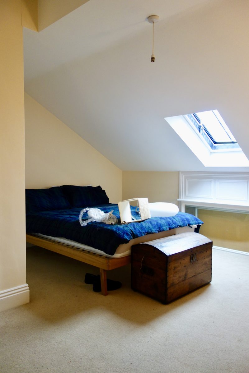
Can you see what would have originally been the real height of the ceiling below? The windows in this place are all over the shop as the developers converted what would have been a two storey house with a small loft/crawl space into a three storey house. They’ve lowered what would have been 3.3m+ high ceilings in both floors down to 2.4m in order to get in an extra floor, which then maximised the number of rooms and obviously their profits. Bit of a tragedy really. I would have loved to have seen the original building before it was “cut and shut”.
Back to this room:
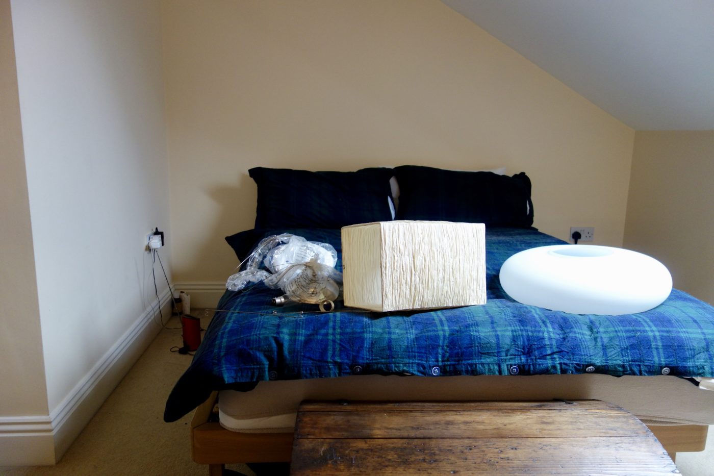
The only thing that’s staying is the chest at the foot of the bed. The rest is going. In fact you can see i’ve already started to take down the light fitting ready for the new pendant to be fitted. There it is on the bed, that big, white, glass Opal Drum Light. If you’d like to see how that fits into the whole new scheme, this is where this room is headed:
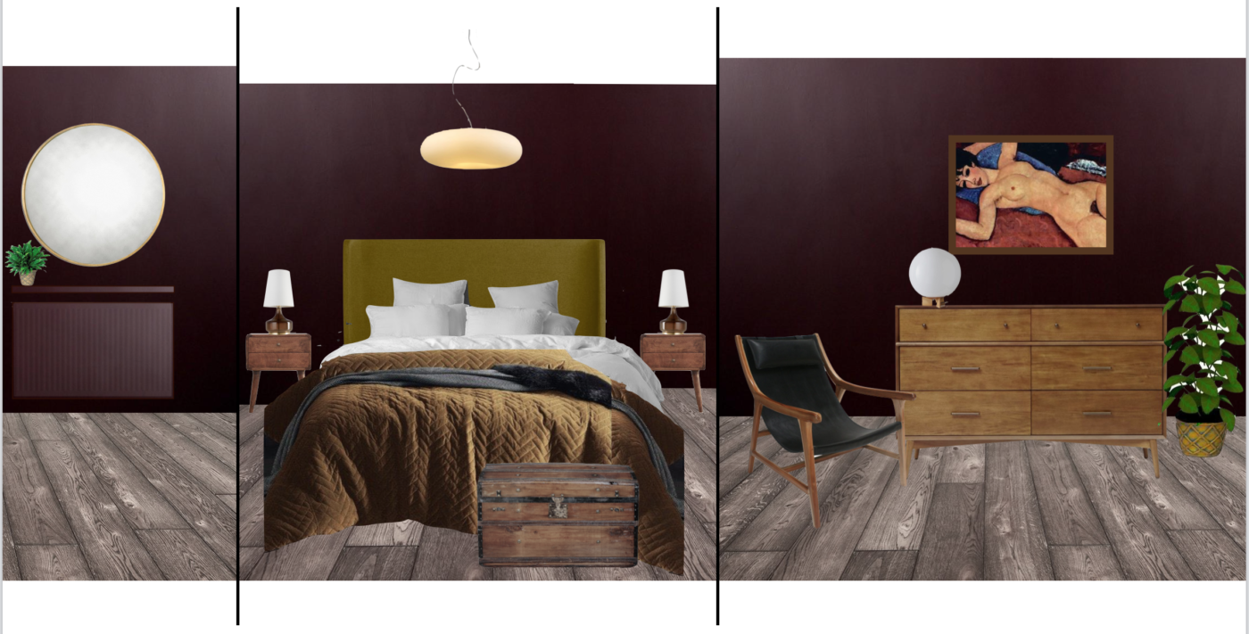
- Walls, woodwork and ceiling in Abigail Ahern’s Mulberry Red
- Roscoe Bed from MADE
- Atley, Smoke Table Lamps from John Lewis
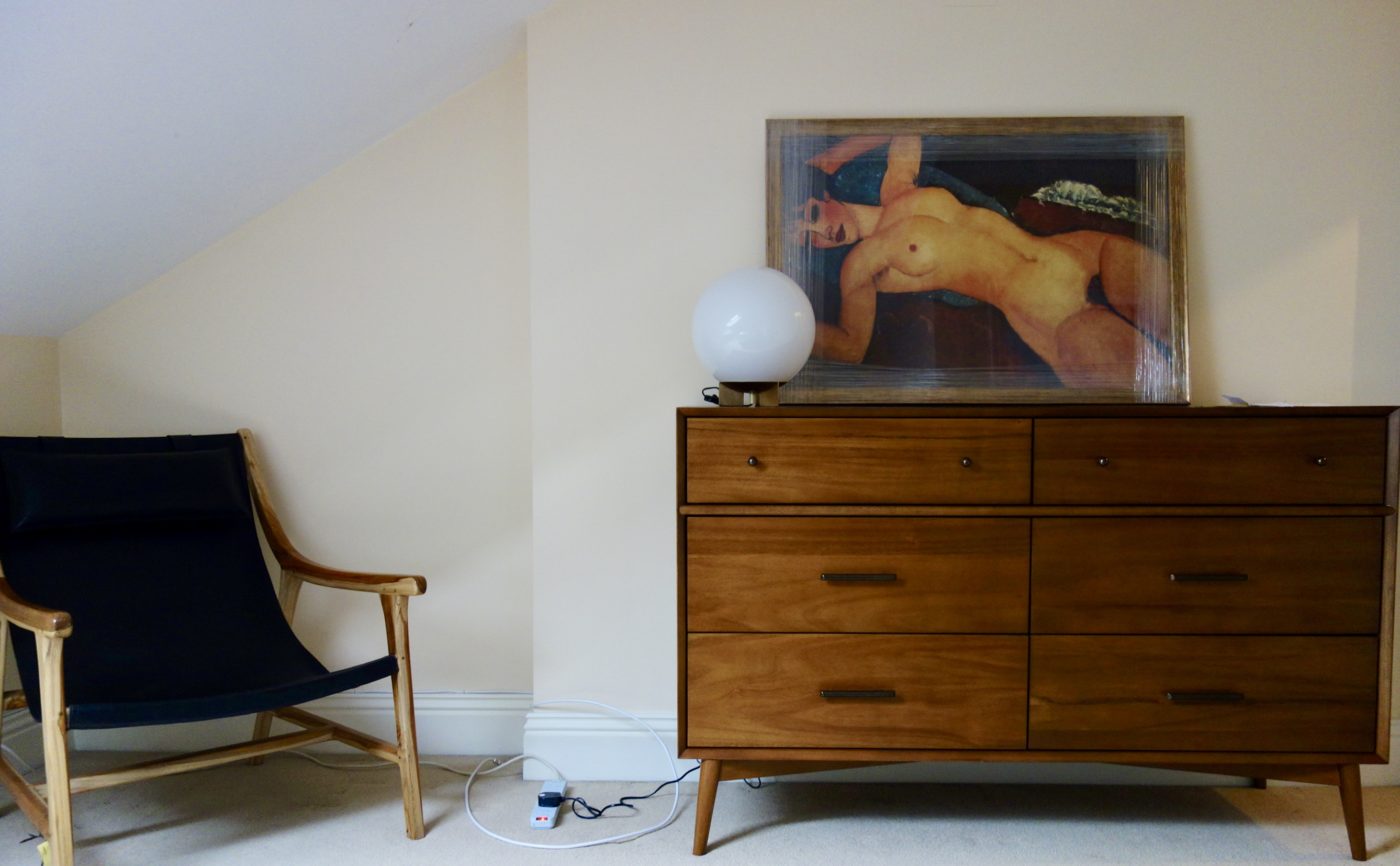
- Chest of Drawers and Globe table lamp from Westelm
- Leather sling chair from Souk Collective
- Mansion Velvet Bedspread from Wallace Cotton
The artwork was bought by the client specifically for this room and the rest of the space was designed to work around it.
First decision to make was the wall colour. Upon first meeting in March 2018, the homeowner was a little tentative with his hues, sticking with blues and light, taupe-y greys. But upon suggesting a deep, muddy red for the walls to pull in the backdrop of the nude, he jumped right on board.

He liked the overall concept so much, he went off and bought nearly the whole bloomin’ shopping list before we’d even had our second meeting.

Which explains why there is a load of new furniture in the room before ANY of the work is actually done. A case of the impatient homeowner. I’m sure you all know (are) someone like that.
A bit back to front, but a few weeks later, the room has its new floor and wall colour and is starting to come together. Here’s a pic sent by my client last week:

Project in progress
Still LOTS to do in here, hang artwork, a BIG round mirror, the new bed to arrive, bedsides and more lamps. All of which will make the biggest of differences. Not to mention the obligatory plant family, because everyone gets one whether they want one or not. But I also need to convince my client that I need to do something with that glazed window peeking up from the bedroom below. Tricky one. But ‘half glazed windows from the floor below’ aside…. do you like where this room is headed?
Oh yes. I love the colour of the wall in the living room! Bedroom colour is very brave but I think it looks so inviting.. That chest of drawers and the chair are just what I need. 😍. Love it.
Thanks Judith, really glad you like it… so far! 🙂
I love most of your projects and how brave you are with colours! Mulberry red has added so much warms and dimension to the room, which looked plain and uninviting before. I used the Little Greene’s ADVENTURER (7) for my bedroom. I was very nervous but the result is beautiful. Please, give us more colours!
Ooh yes, I love that colour too! It’s a colour i’ve been trying to get someone to go for for AGES!
And thank you for your kind words about the Mulberry Red too. I can’t wait to actually see it for myself!
If it’s their forever home I reckon I would have been tempted to un-chop it and turn it back into a two storey house with 3m+ ceilings… Lovely start either way, very curious to see what you’ll do with that odd bit of window!
Ha, yeah me too! It’s going to be a tricky one for sure!!
I have this colour in my bedroom, so am very excited to see your mood board and the matching with the green/chartreuse. I love this colour, when it was a sample on my wall one of my friends suggested that it was ‘purple’, I indignantly explained why it was ‘not f*cking purple’. It’s been affectionately known as ‘its not f*cking purple’ since. We all agree now that it’s a complex colour!
On the paint itself, I ordered and paid for my Abigail Ahern paint for the top Coats but started with a colour matched Valpar for the base coat – I knew it would take three coats. I was really pleased with the Valspar paint and was kicking myself for spending the extra money, I’m so glad I did, the Abigail Ahern paint (manufactured by Craig and Rose) is a delight to paint with and the depth of colour is magical. Mine is in a north facing bedroom so no sunny sunshine but it still captures the light differently at different times of day. It’s a private joy that can never be captured by photography! Well not mine anyway! So will watch with wonder as you bring another beautiful space to life.
Ha. It’s defo not effing purple! I really don’t like purple at all, so i’d be gutted if someone referred to this colour as that!!
Can’t believe the developers slapped a ceiling across a window! Or maybe I can… absolutely love that colour. It’s just gorgeous, and it’s going to look amazing with the Modigliani print.
Yep. On two floors. It’s not an easy one to deal with tbh. No idea what i’m going to do with this one, but i’m sure i’ll be able to sort something **she says**
I’m sure you will, too! I like your solutions to problems like this, and look forward to seeing what you suggest. I’ve come back to your blog just to look at Mulberry Red again. It’s beautiful.
Ha. Thank you! Btw, good spot on the Modigliani print earlier 🙂
Get your client down to my friend’s make your own stained glass course, they can make whatever they like to go in there then 🙂 (A stained glass Modigliani?)