
Hello everyone, I’m back this week with a little look at how to connect your rooms at home. What does that mean exactly?
One of the keys to a successful home interior is having a sense of cohesion and “flow”. The rooms and spaces between should connect with the surrounding ones. For example, let’s say you’ve got three bedrooms on a floor, like most people and you want them all to have their own identity but also not look like a patchwork quilt from the landing, it’s good to consider how these spaces connect as a whole. Often, people run the flooring throughout to make the overall space feel larger. We all know that the less breaks in a colour or pattern, the better, as the eye continues further along the space.
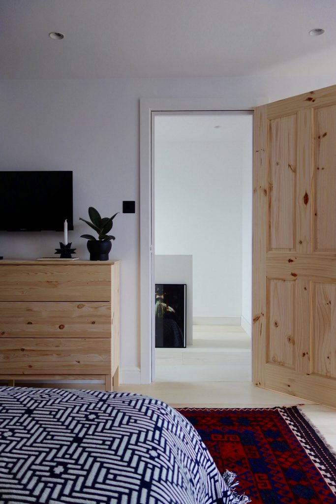
Flooring continues on from our loft bedroom to landing with no threshold to break the line’s eye.
Another way to do is is choose a colour palette, and stick to that for a floor, even better, a whole house if you’re being really clever. I don’t mean paint or wallpaper everywhere in the same colour or pattern, but consider how each room looks next to each other, because when you’re standing in the hallway or on the landing you’ll have several shots of colour coming right at you. Do they work together? Do they compliment? Contrast? Or just look plain awful side by side?

Our home is mainly black and white. White kitchen. Black living room. Our hallway is a fairly good introduction as to what’s on the ground floor.
During any initial consult for one room, I always ask to be taken around the rest of the house so I can see what kinds of colours, styles and designs the homeowners are drawn to. Like i’ve always said, my biggest stimulus for any room i’ve worked on is you, your loves and your belongings. There’s also nearly always a piece of furniture that’s in the wrong room and can be used in the one i’m about to work in.

The coffee table for this living room was found in one of the spare bedrooms
Hallways and landings are some of the hardest areas to plan for as those spaces connect to every room in the house. So you have to look at how each room looks from the landing space and how the landing space appears from inside each room. It’s one of the reasons that most hallways are painted in neutral colours as it’s just easier. It sits back and let’s your rooms do the talking.

Neutral doesn’t have to be boring by the way, Farrow & Ball’s Peignoir and Worsted were used in this Victorian hallway, stairs and landing to great effect. A constrasting pop of colour in the form of Inchyra Blue was chosen for the home office and on the front door directly below. I was pretty happy how the use of colour here tied the two floors together, with the open door to the office inviting you inside.
But what if you want to do something slightly different for your hallway, go bold, add some colour but also want it to work with the other rooms at home?
Good question at the back there!
And the answer, try colour blocking. Here are the perfect set of photos to show you several different ways to do it, tying in several rooms and spaces with the greatest of ease.
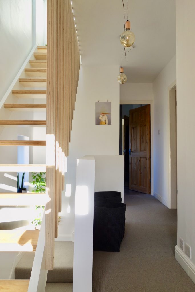
Nearly the whole second floor of the Edwardian refurb i’ve been working on, used the simple, yet striking palette of a dark grey, off white and bright yellow. And it starts on the floor below when you come up the second flight of stairs. So your eyes have a hint at what’s to come!

This period property, although having high ceilings, doesn’t have a dado or picture rail in the hallways, so I suggested they paint one on. In yellow. Because, why not? Everything below was painted dark and the top section left a soft, off-white. This form of colour blocking, whilst looking pretty darn cool (yes, I just said darn) is also a really practical solution to keeping those high traffic areas in good nick. Especially as this will eventually be the floor for the kid’s bedrooms, so lots of toys, bags and juice bottles will be dragged up these here stairs.

The is the floor where the family bathroom is, which will only really be used by kids and overnight guests as the two bedrooms on the floor below already have en-suites. With this in mind, they wanted to go “family friendly” with brights and clashing geometrics.

This is a naturally dark room as the roof hangs lower than the top of the window, so not a lot of light gets in here. And as it’s a room where you need to actually do stuff, like make sure you’ve not got lippy on your teeth or scrambled egg in your hair (yes that has happened to me before), going dark wasn’t the solution.

I suggested painting the back wall in Little Greene’s Trumpet Yellow and as the wall sloped into the ceiling, the ceiling got the Trumpet treatment too. And it hasn’t half brightened up this space.

These guys have worked really hard on this bathroom, they pretty much chose the tiles, furniture and did all of the work themselves. Yes, they chose hexagon wall tiles and triangular floor tiles for their first tiling project. Rather you than me, Mr and Mrs R!

I “assisted” on this one, making suggestions for the Trumpet wall and ceiling, the lighting, wall mirror… and finished off with the styling and accessories. The rest was all them!

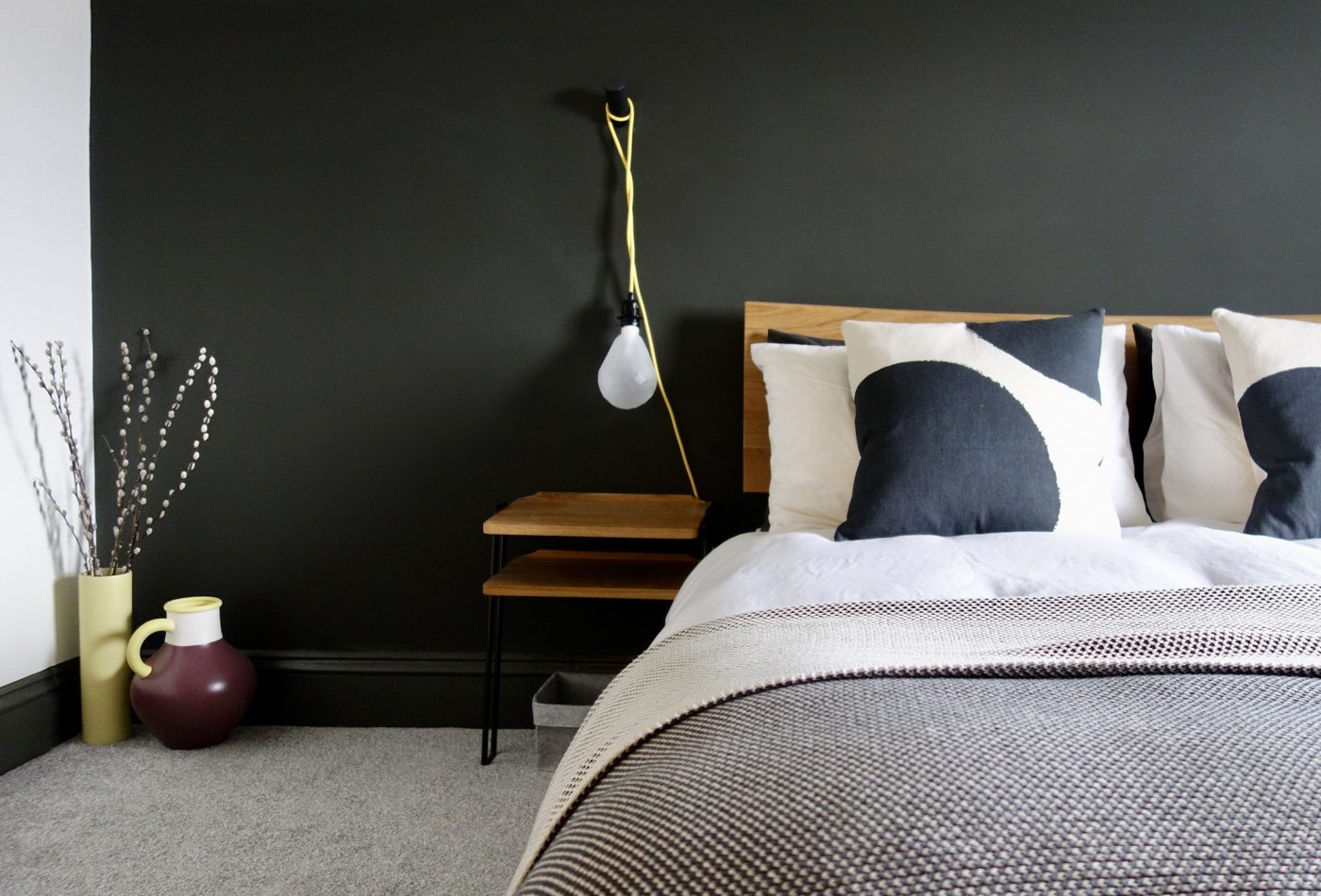
So, onto the bedroom next door, how does the colour palette work there?
This time, it’s a light ceiling, dark walls and yellow accents, highlighting the period, architectural details such as the cast iron fireplace and sloped beam….

… which I suggested we take across the ceiling to the light fitting to make it appear like a huge floor lamp. I really wanted the yellow stripe to continue down from the beam to the top of the fireplace to complete the line, but the homeowners like it as is.
 And as they did all the work themselves and I don’t have a key to their house where I can let myself in and paint that last bit, they won. So for now, i’ll just edit one on:

There! 🙂

Baya Nest light from Dowsing & Reynolds
The rest of the room has a paired back, relaxed, Scandi vibe. The monochrome backdrop feels warm with the mixed mid-tone woods and little pops of yellow throughout the room.
Peg wall lights from Dowsing & Reynolds with Geometric Light Bulbs

Clock from MADE and hanging rail from La Redoute

Cushion covers from H&M Home, bedspread from MADE
And for the final room on this floor, which I had literally nothing to do with, apart from ordering a light and a bulb, this is how they continued the colour theme into the new nursery:

Great isn’t it? I am taking no credit whatsoever for this room. But I thought some of you guys would like to see how they’ve made a nursery in off white and grey look anything but boring. And very gender neutral.

So there you have it, it’s ended up being a much longer post than I imagined, but I hope it’s helped some of you out there who are struggling to work out how the hell to pick a colour scheme? Uhhming and ahhing on how to connect those difficult spaces and how to add colour at home without it taking over*. It’s this kind of stuff we’ll be discussing at length at the up and coming Interior Design Surgery in Yorkshire. Booked ya ticket yet?

* For those maximalists out there, those of you who love to colour clash, pattern clash and just generally, go mental, you can completely ignore everything i’ve just written. As you were.
SaveSave
Nice article and photos. Did I see some photo twice? Does some photos dublicates? Have a good day.
I’ve been thinking a lot about this since we moved house and there were a couple of colours that when we did move out of our last house were constants through the spaces (I had a lot of black, white and gold too). I want to change my palette a bit here but I’m a little afraid every room will have the same exact colours because those are the ones I’m really drawn to at the moment! 😉 I need to pull together a palette of complimentary colours I think! xx